Iconography
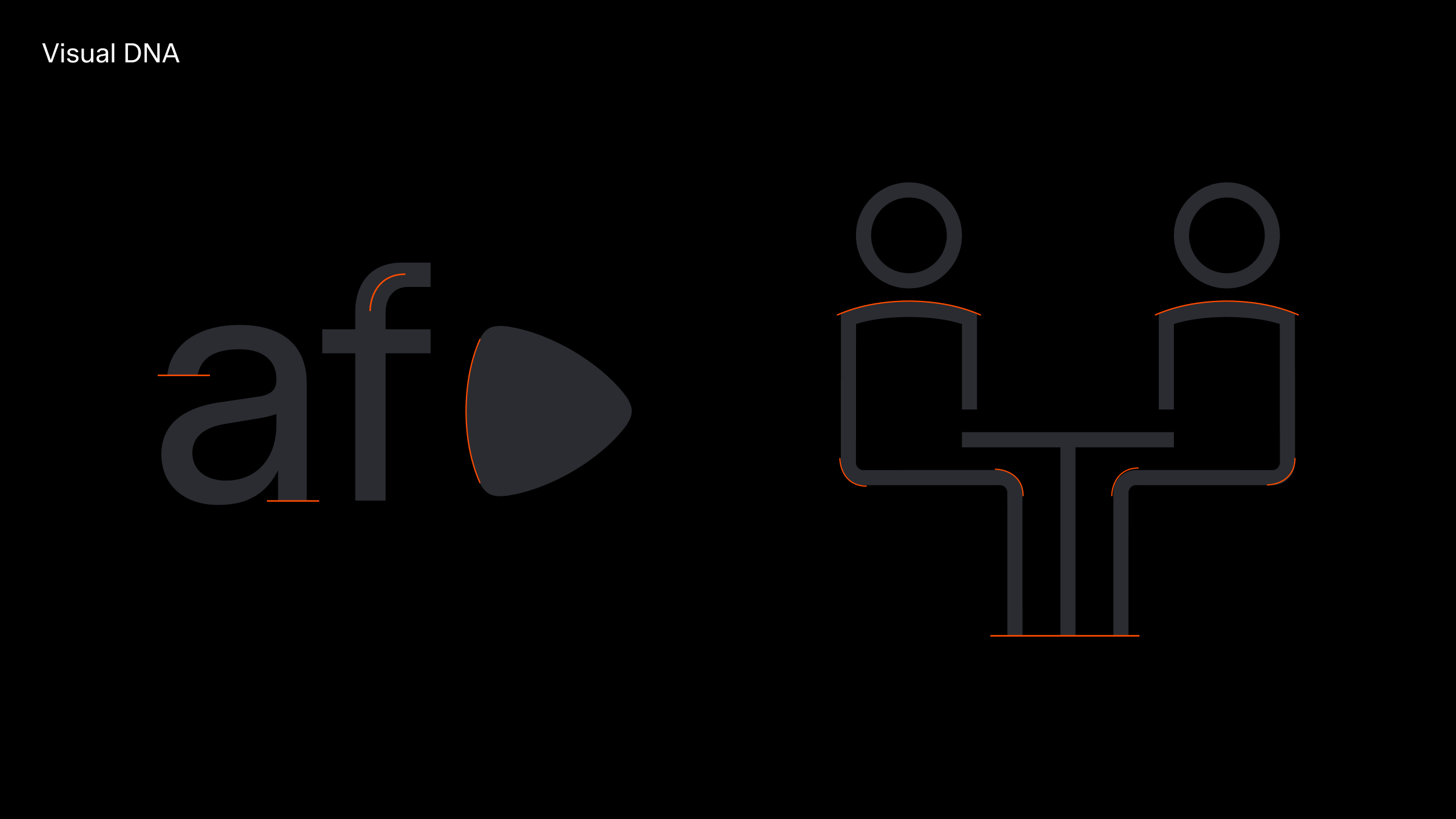
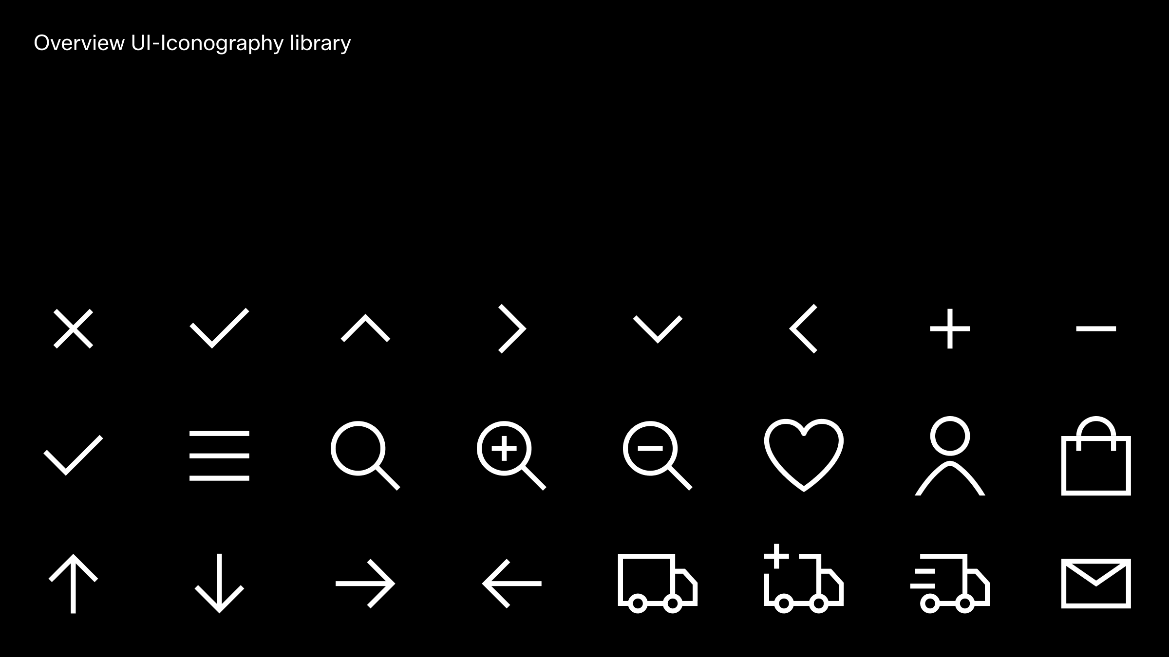
Iconography is a powerful functional tool and should never be used as decoration. It serves as a universal language, designed to be clear and direct, helping people navigate seamlessly across international audiences. Zalando’s iconography library ranges from highly functional UI icons, optimised for small sizes in digital contexts, to way finding pictograms, primarily used for navigation in physical environments.UI Icons
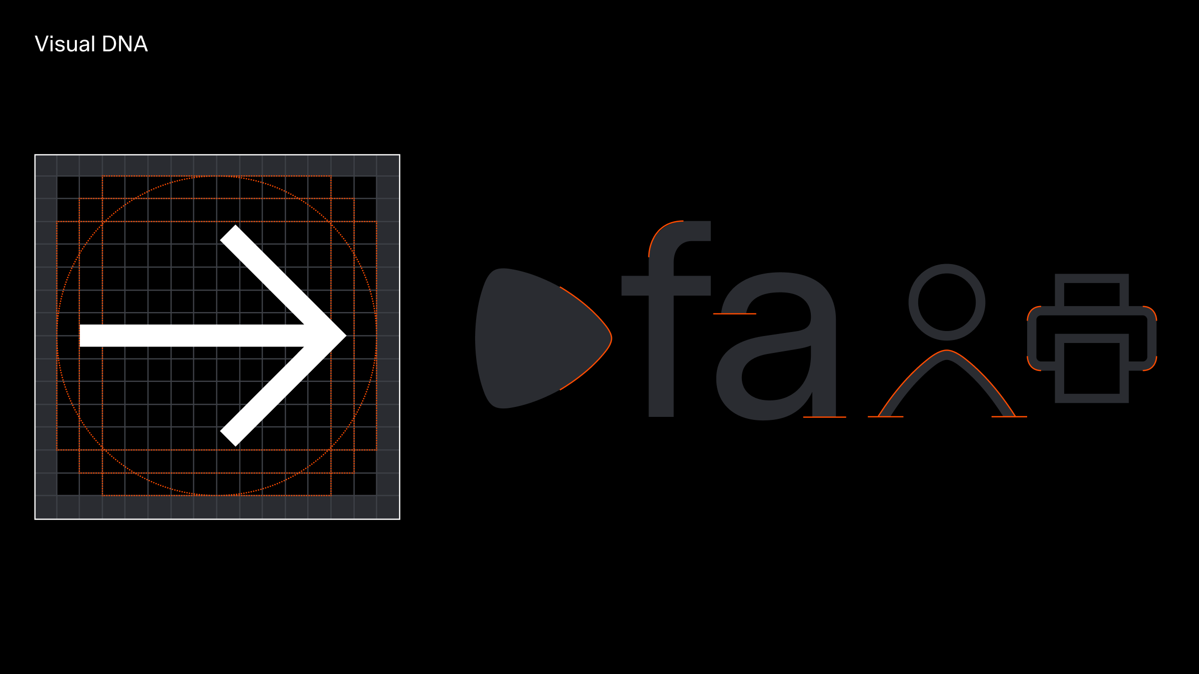
Our UI icons facilitate navigation and differentiate categories across our on-product environments. Each icon is thoughtfully designed to reflect the essence of our brand mark and typeface, creating a cohesive and unified visual identity.
Overview
The UI icons have been redesigned and optimised to align more seamlessly with the Zalando typeface. They have also been simplified to ensure clarity and effectiveness at smaller sizes.
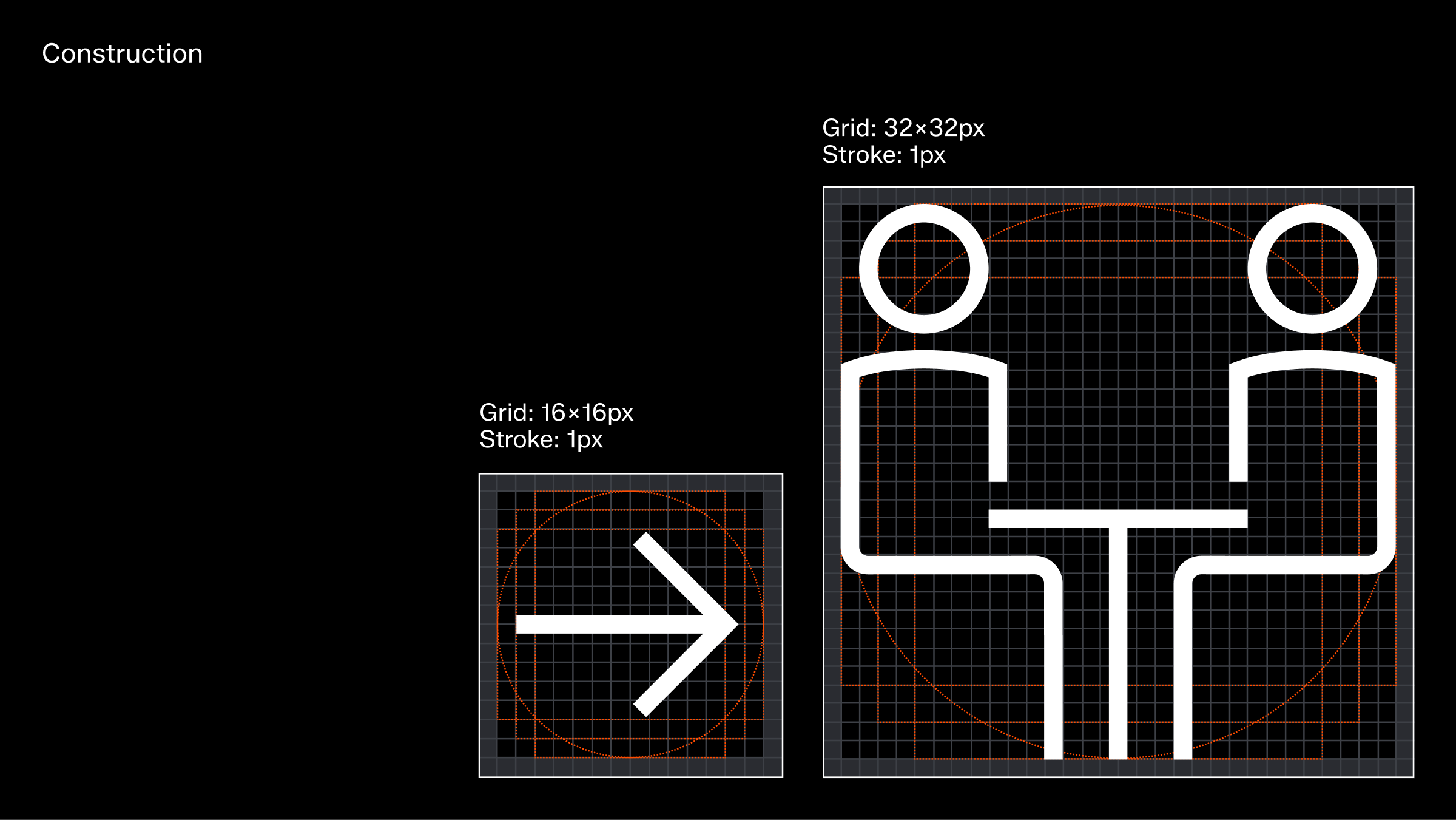
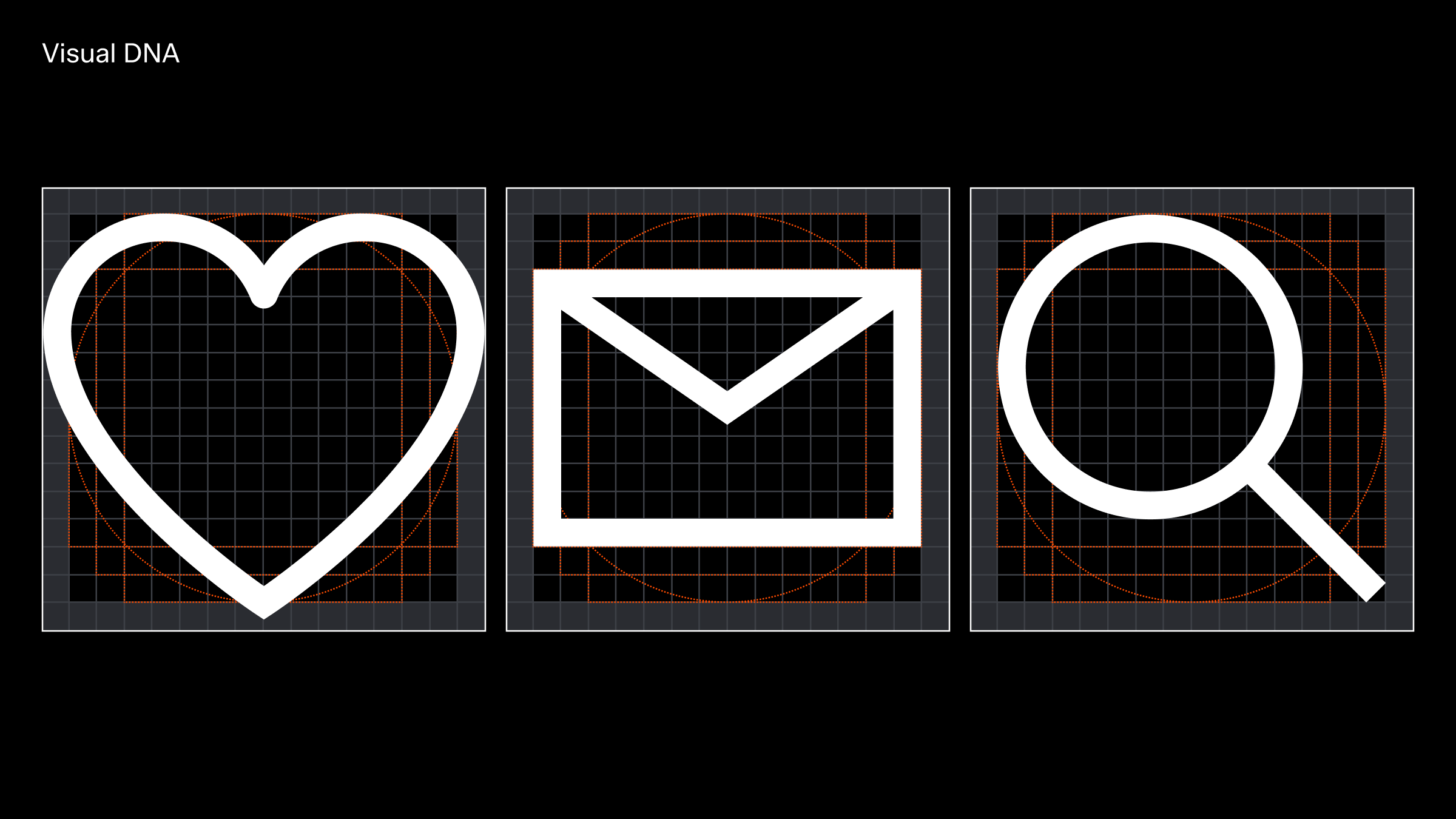
Construction
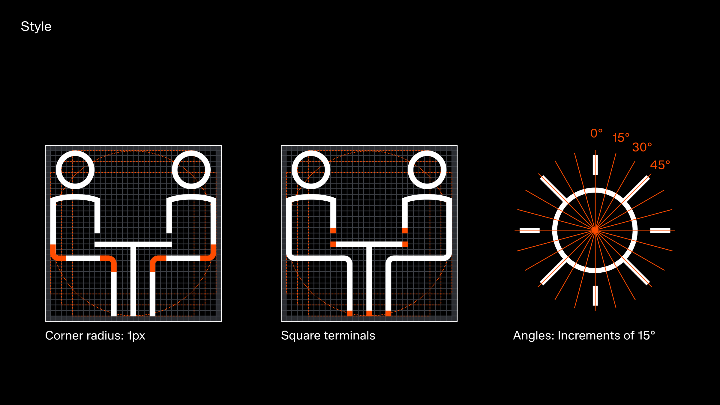
The UI icons are crafted on a 16x16px grid with a 1px stroke weight as a starting point, guided by key shapes as a foundational principle. While rooted in our previously established system, they have been refined to align optically with the new typeface and to better reflect our updated visual identity.
These icons are purely functional and must never be used as decorative elements.
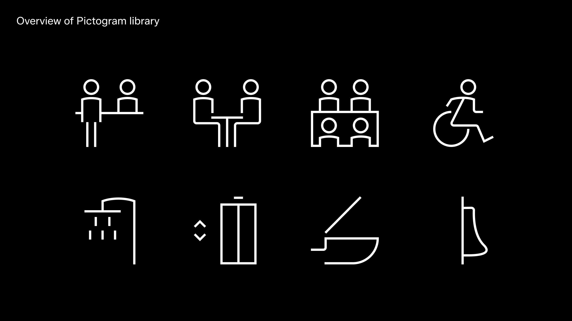
Pictogram
Like the UI icons, our pictograms are rooted in the same visual DNA and design principles. However, they serve a different purpose, functioning as wayfinding elements with a more decorative quality.
To accommodate this, the grid size is doubled from 16x16px to 32x32px as the starting point. Despite this increase, the same stroke weight is maintained to ensure a cohesive visual identity and a strong connection to our UI iconography.