Core expression
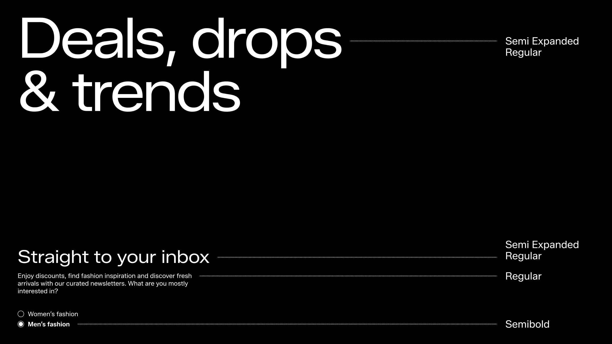
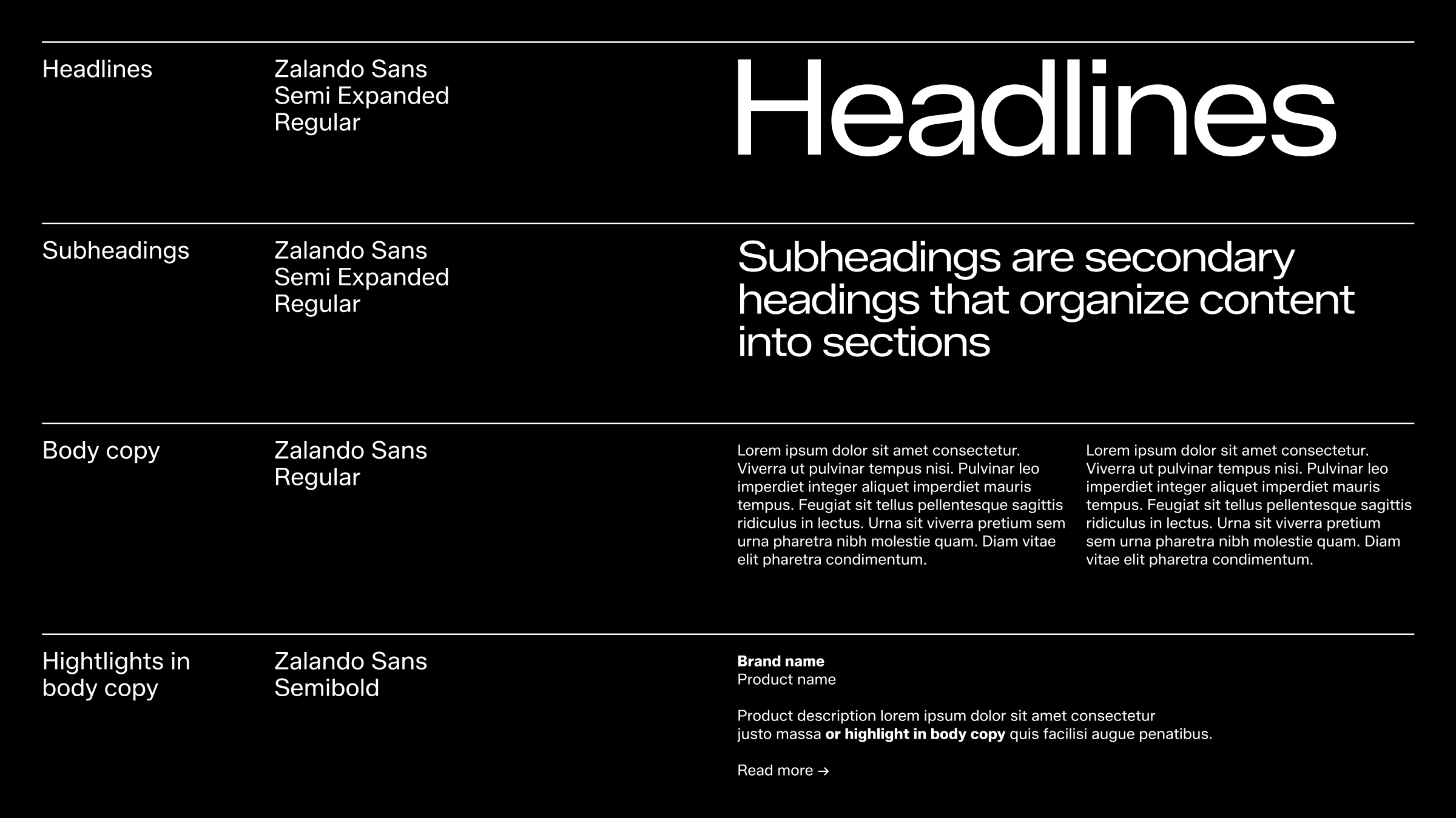
In our Core Expression – typography, consistency and hierarchy are essential to achieving the desired look and feel. The weights from our Zalando typeface have been carefully selected to embody our brand at its core. Semi Expanded Regular serves as the main driving force, crafting a bold and confident expression that visually echoes our word mark, establishing a clear DNA and strong connection.
Paired with the Regular weight for body copy, we ensure accessibility needs and requirements are met, resulting in an aesthetic that is both expressive and functional. The Semibold weight also plays a role in the core expression, primarily addressing functional needs within weight hierarchy to enhance user experience.
Together, these three weights are the true champions of our core expression, creating a powerful yet flexible identity that is unmistakably associated with Zalando.
Definition
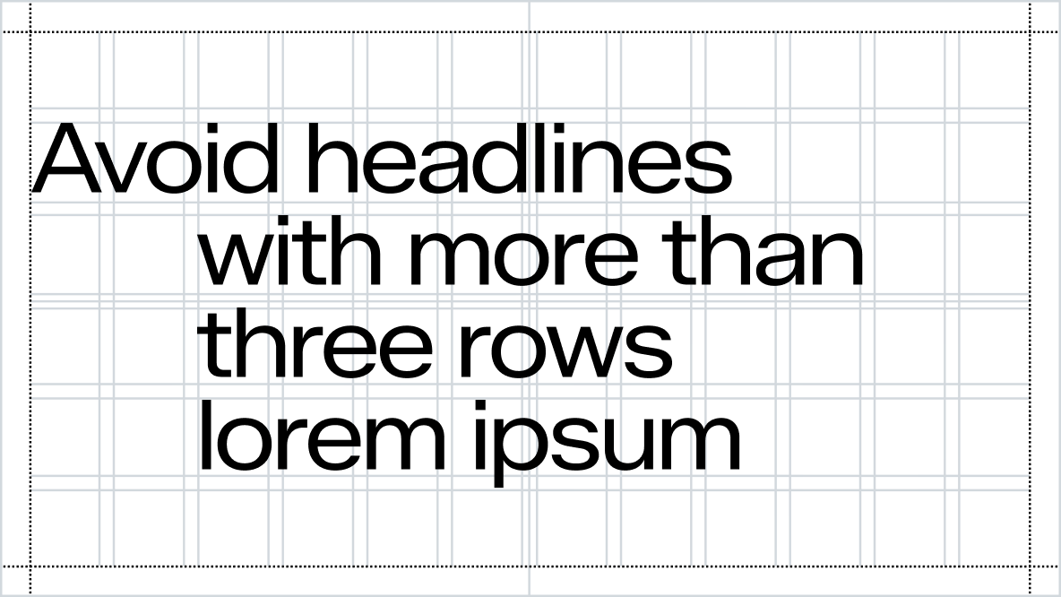
A well-defined type structure enhances readability by intuitively guiding the reader's eye, emphasising key information, and enabling quick scanning—crucial for clear and effective communication, especially in complex texts. The headline serves as the main message, heading, or title, while subheadings act as smaller, secondary headlines that typically elaborate on the main headline. Together, they create a structured flow of information that ensures the reader can easily navigate and understand the content.
Please always stick to the pre-defined styles for Core Expression unless you have special approval from the Brand Design Team.
Hierarchy
When pairing typefaces, contrast is essential for creating a clear content hierarchy and enhancing communication. Our core expression is built on a robust and distinct size hierarchy to capture attention and ensure recognition. We proudly utilise our typeface, always maintaining harmony with surrounding text and assets. Adequate weight hierarchy is vital for functionality, particularly in smaller sizes.
To achieve effective typeface pairing, consider these two approaches:
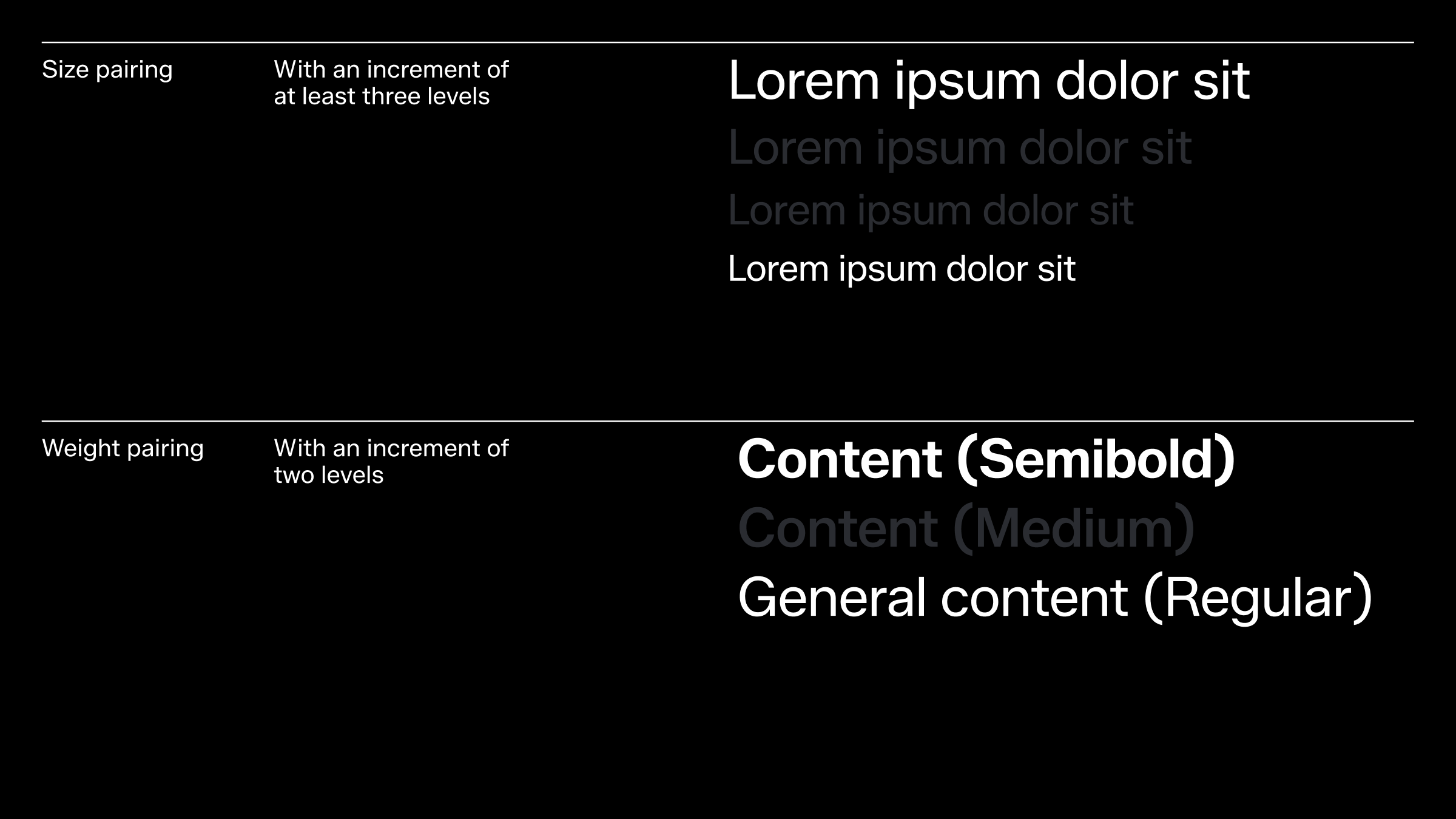
Size Pairing: Ensure a size difference of at least three levels on the type scale, such as moving from Size 1 to Size 4. These sizes are recommended starting points and should be adjusted to meet specific needs, such as on and off-product requirements.
Weight Pairing: Use type weights with a two-level difference, like transitioning from Regular to Semibold.
Settings
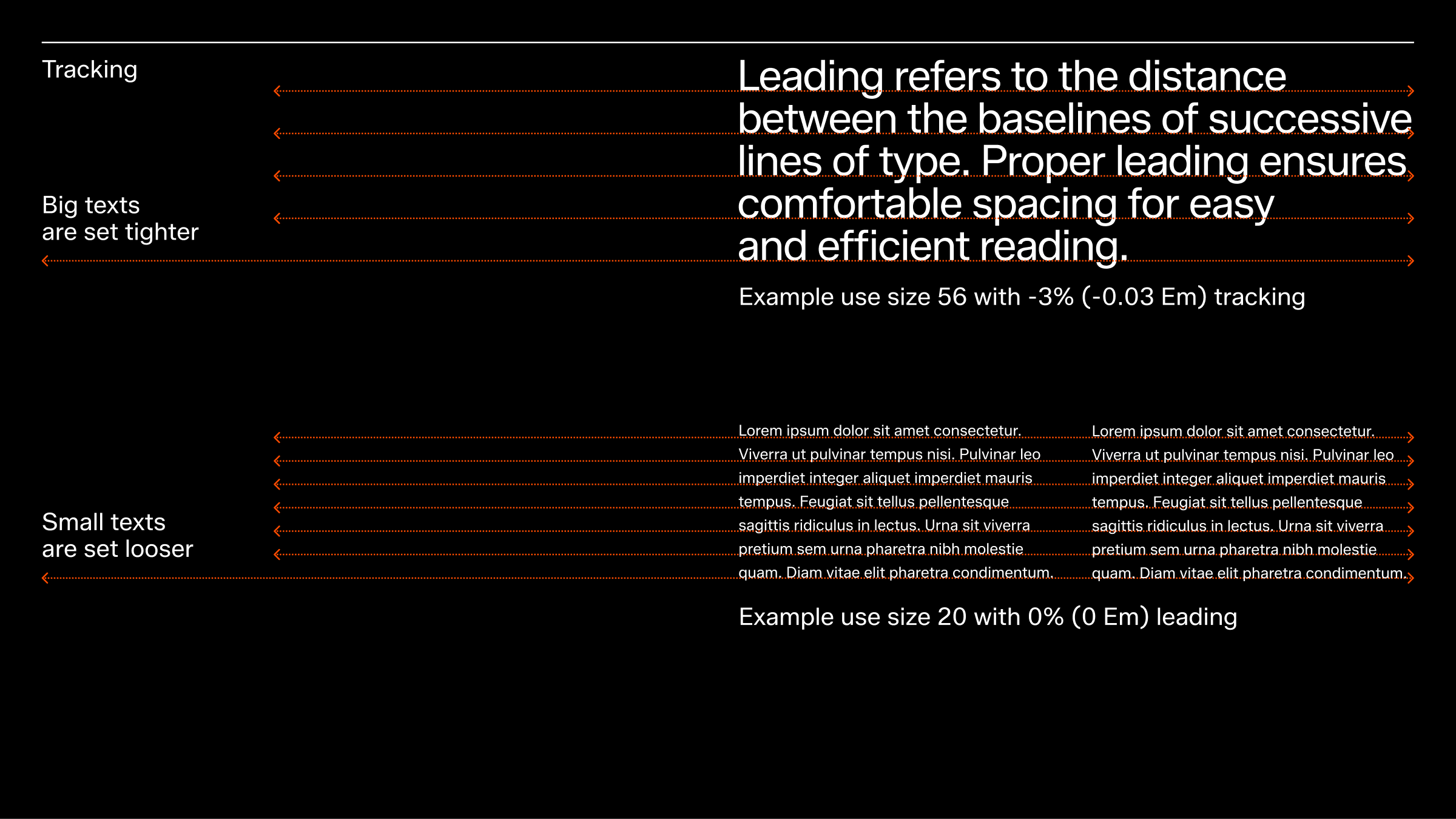
Leading and tracking are key elements in typesetting that influence text readability and appearance. A well-executed typesetting helps create a balanced and legible text layout.
Leading and tracking values should be adjusted according to the text size. For instance, long body copy in a small size may require larger leading and tracking to enhance readability, while headlines in larger text sizes can often use smaller leading and tracking while still maintaining readability. These recommendations are starting points and should be adjusted as needed, such as for on- or off-product applications.
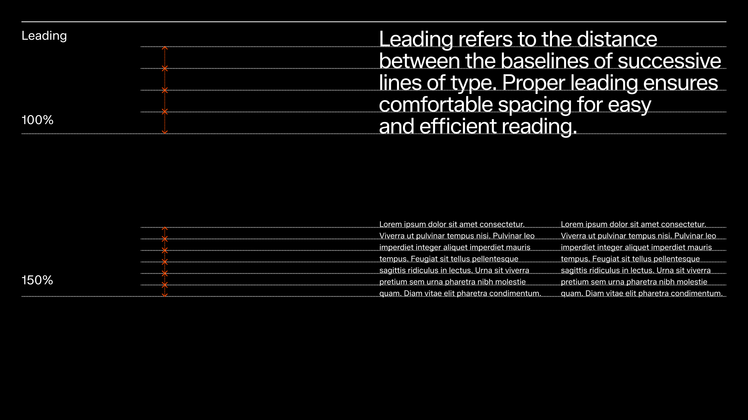

Example with big headline, featuring 85% line spacing and -4% letter spacing.
Example with body paragraphs, featuring 140% line spacing and 0% letter spacing.
Casing
Our default casing is sentence case, ensuring clarity and accessibility across all our touch points. If there is a need for an exception please consult the Brand Design of ZDS teams for review.
Writing rules
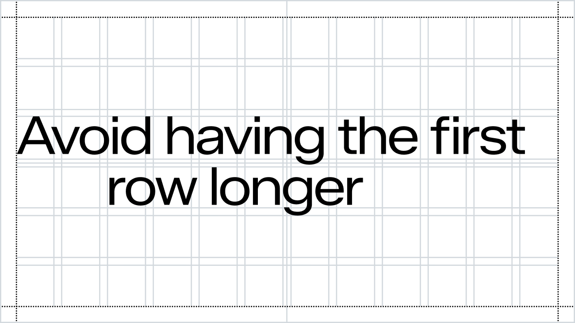
Larger headlines or main messages should be treated as visual elements that harmonise with the content. Additional punctuation, such as commas, colons, or dashes, can create awkward positioning and should generally be avoided. Using sentence case for headlines is sufficient to indicate that multiple lines are part of the same sentence. Below is an overview of common writing rules for Zalando.
Check the Writing section for consistent writing rules and how to speak Zalando.
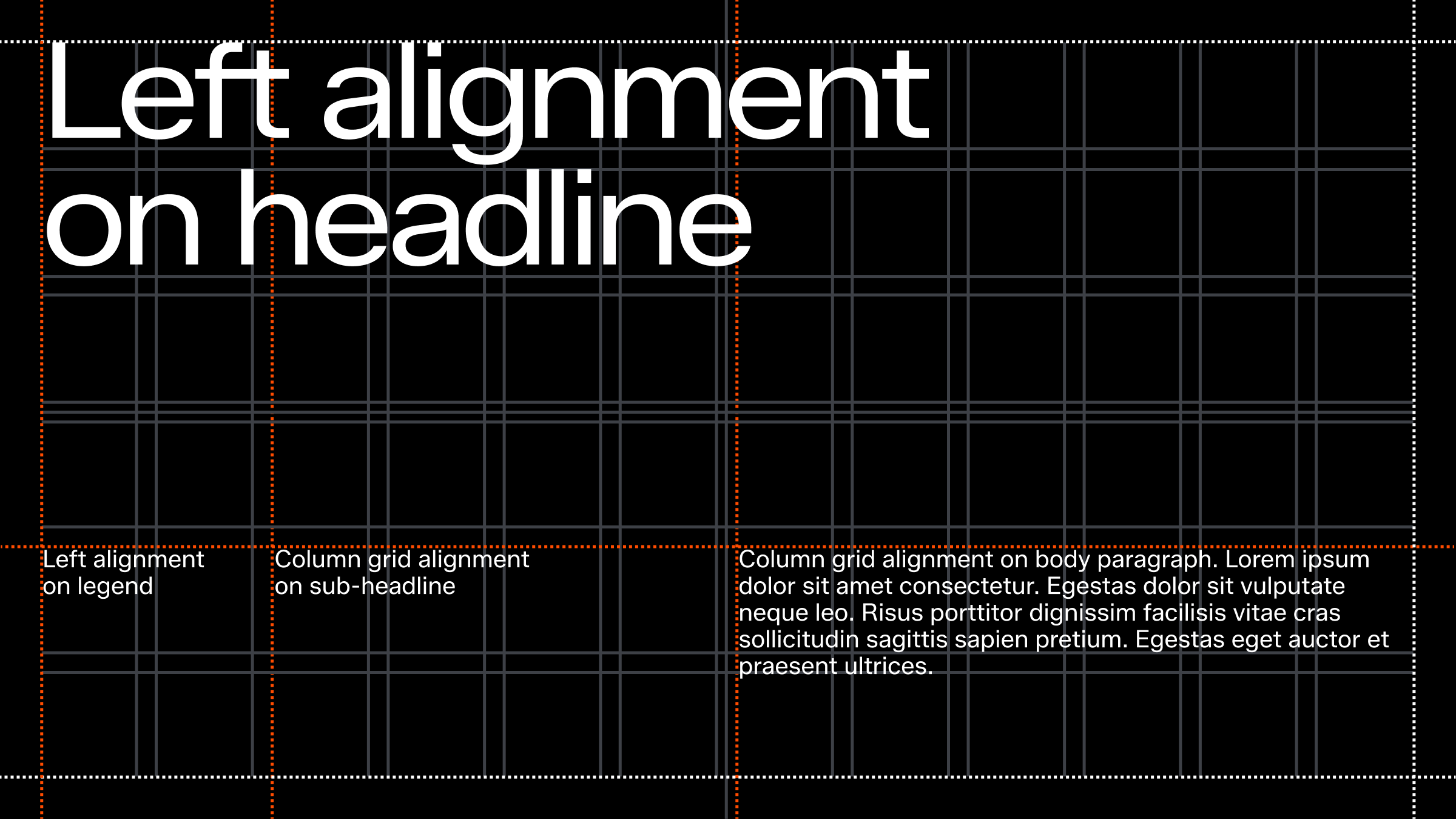
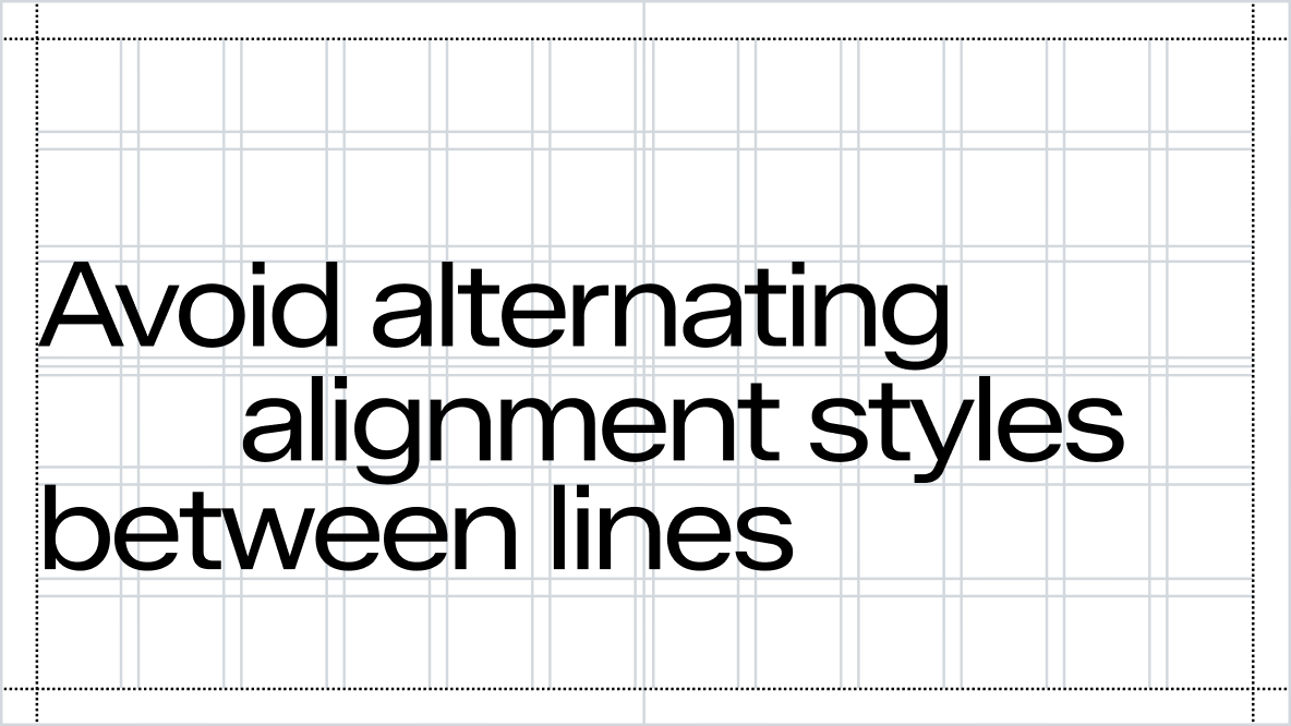
Alignment
Text should primarily be left-aligned. When working with multi-column layouts, ensure that text aligns with the column grid.
Indentation
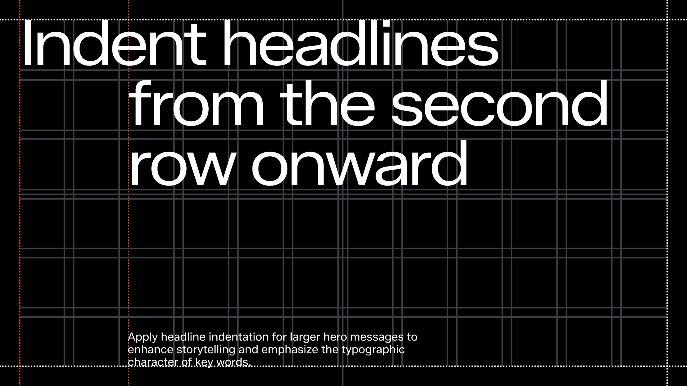
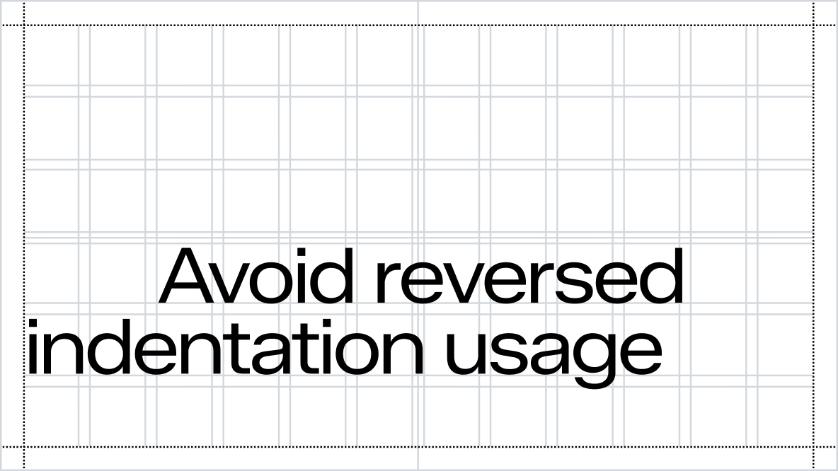
In addition to left-aligning text, indentation can be used to create a more expressive layout with typographic treatment.
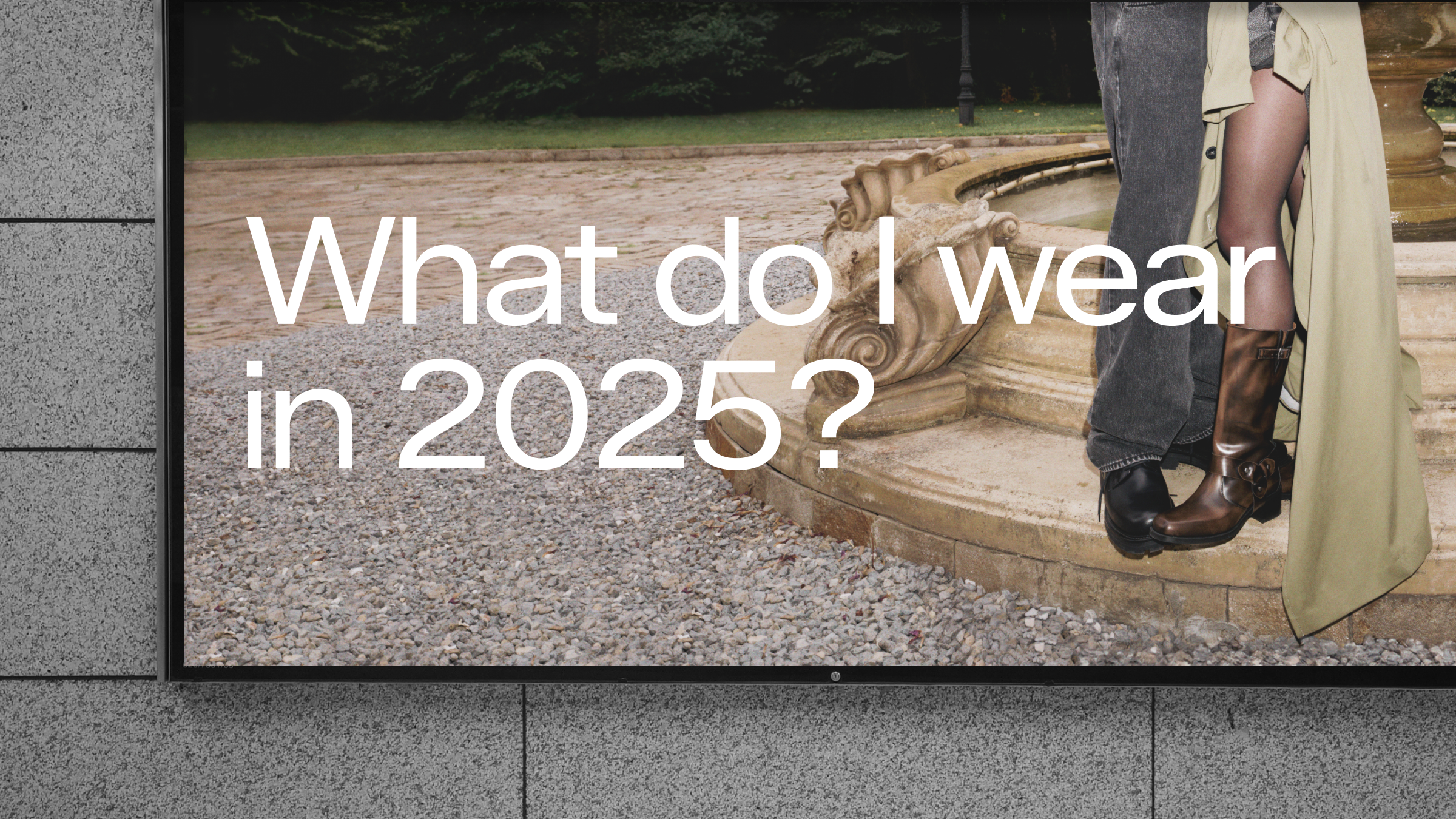
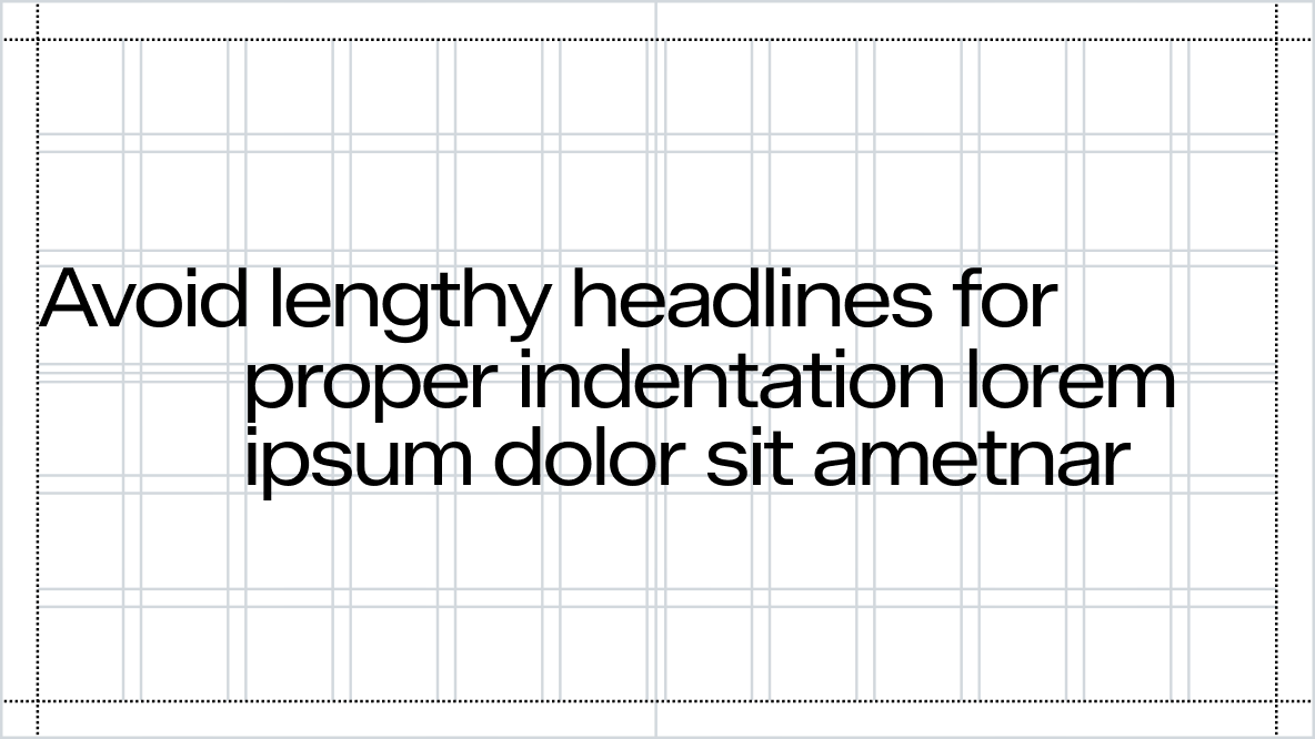
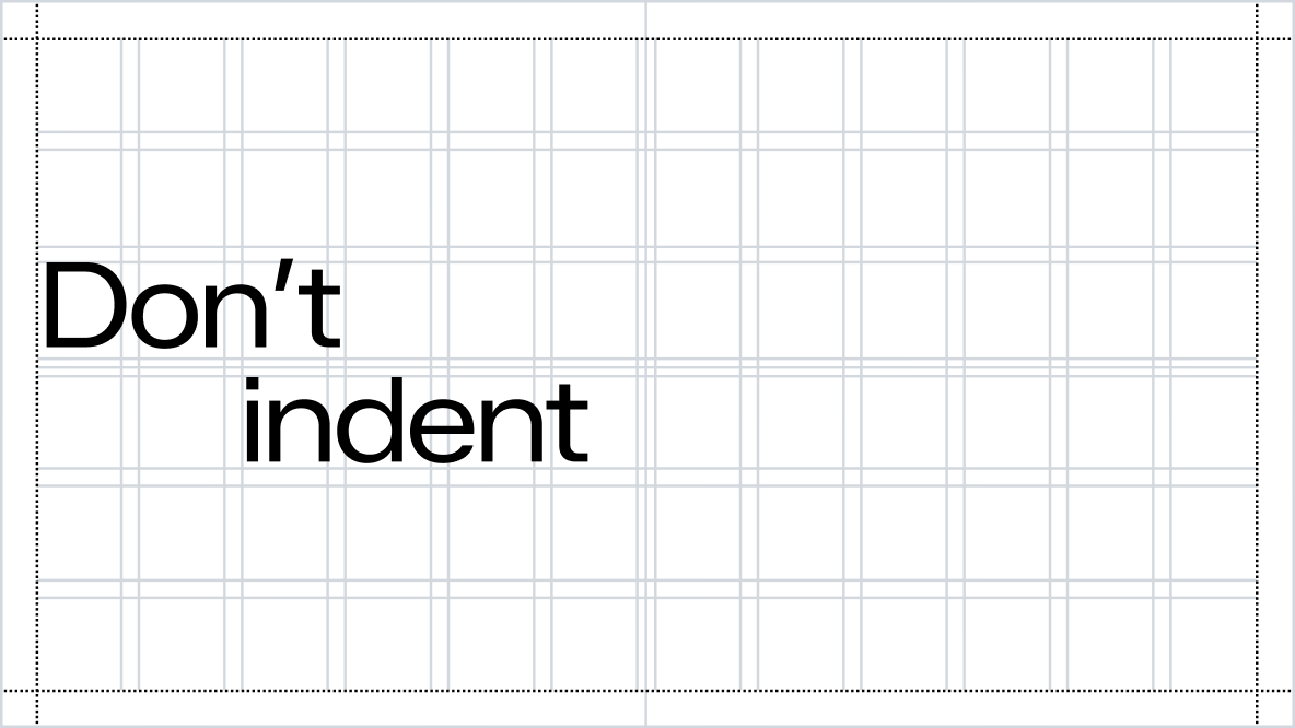
Apply headline indentation for larger hero messages to enhance storytelling and emphasize the typographic character of key words. Avoid overusing indentation and refrain from applying it to non-headline content.
Effective indentation requires skill and should be applied carefully, only when appropriate.
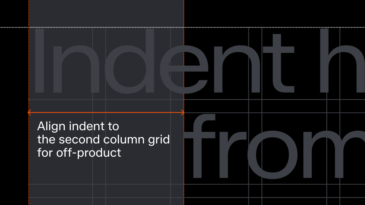
For off-product, we align indent to the second column grid.
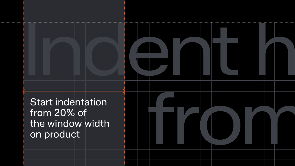
On product, we start indent at 20% of the window width, following the margin.
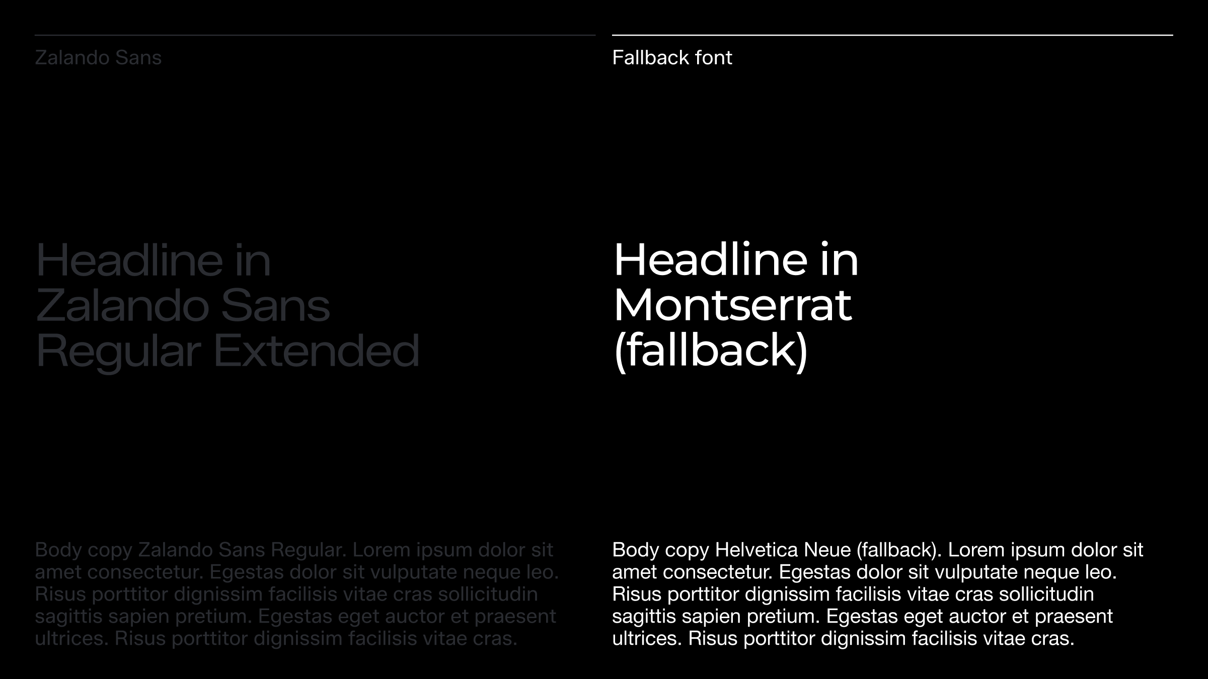
Fallback
Zalando Sans is one of our most powerful brand assets and should be used wherever possible within the organisation. However, when a system font is needed—one that requires no special license and is universally available—Montserrat is designated for headlines, and Helvetica Neue for body copy. Additionally, Helvetica is our fallback option for emails, as it is considered a reliable choice.
These fallback fonts have been carefully chosen to closely reflect our core expression and should always be the preferred alternative when Zalando Sans is not an option.
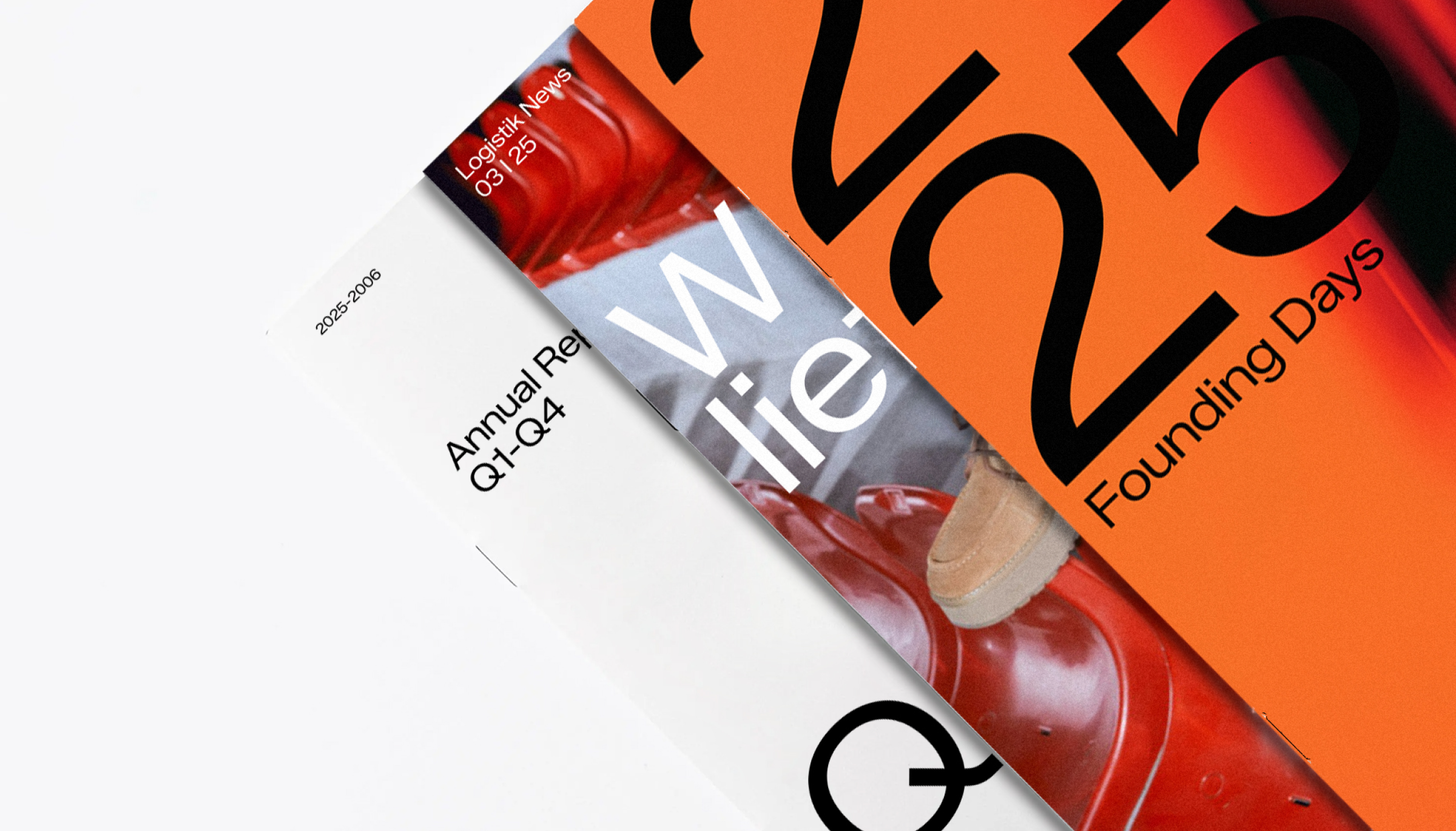
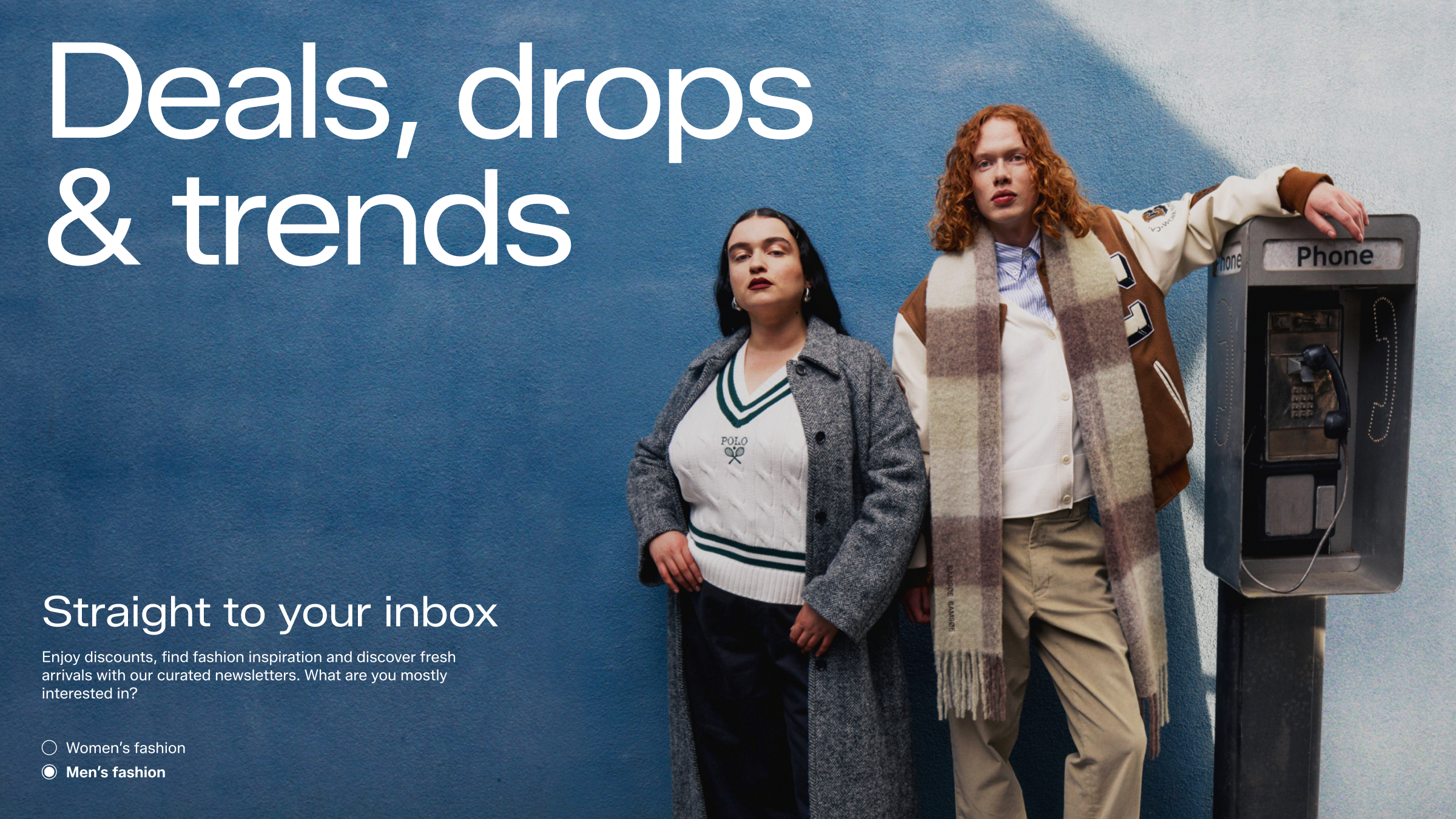
In use