Typography
Zalando Sans is a dynamic and versatile variable typeface family, designed to adapt seamlessly across tones and styles. This flexibility allows us to address diverse needs across categories and audiences, always with precision and accessibility at the heart. Typography is not just a functional tool but a defining cornerstone of the Zalando identity. It acts as a bold, expressive feature that reflects our modern brand essence. When used effectively, it becomes a powerful, recognisable element that will be closely associated with Zalando.Size hierarchy
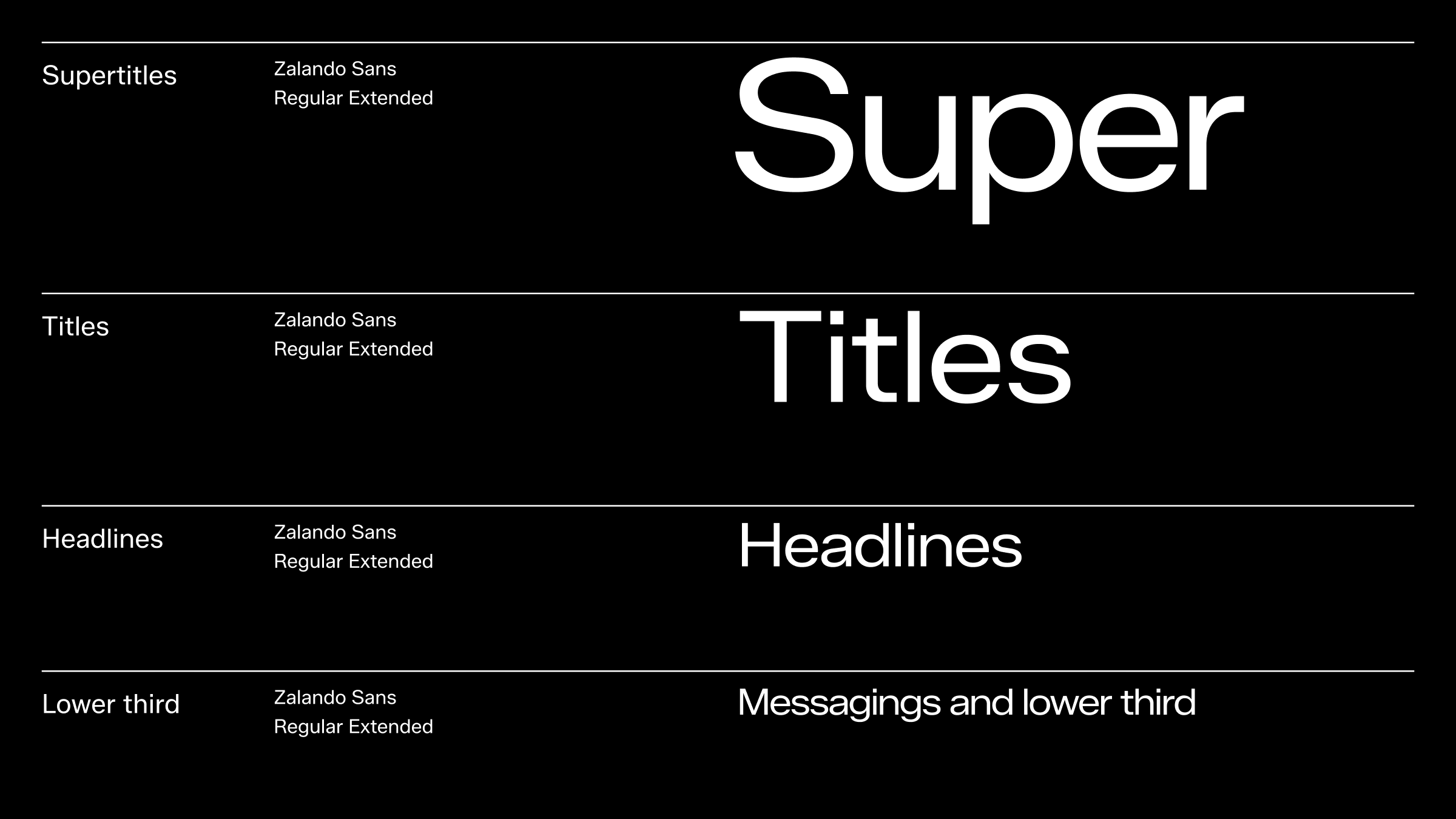
Our core expression is built on a robust and distinct size hierarchy to capture attention and ensure recognition. We proudly utilise our typeface, always maintaining harmony with surrounding text and assets.
In motion, just like in the rest of the brand, text sizes should follow a defined scale and hierarchy to ensure proper contrast and address internal needs.
Keep the number of type sizes in an application minimal and avoid using sizes that are too close in value to maintain clarity and consistency.
Below we have illustrated a suggested size hierarchy for the standard type categories for motion. For more information on size scale, size pairing and type hierarchy, please see the typography section.
Settings
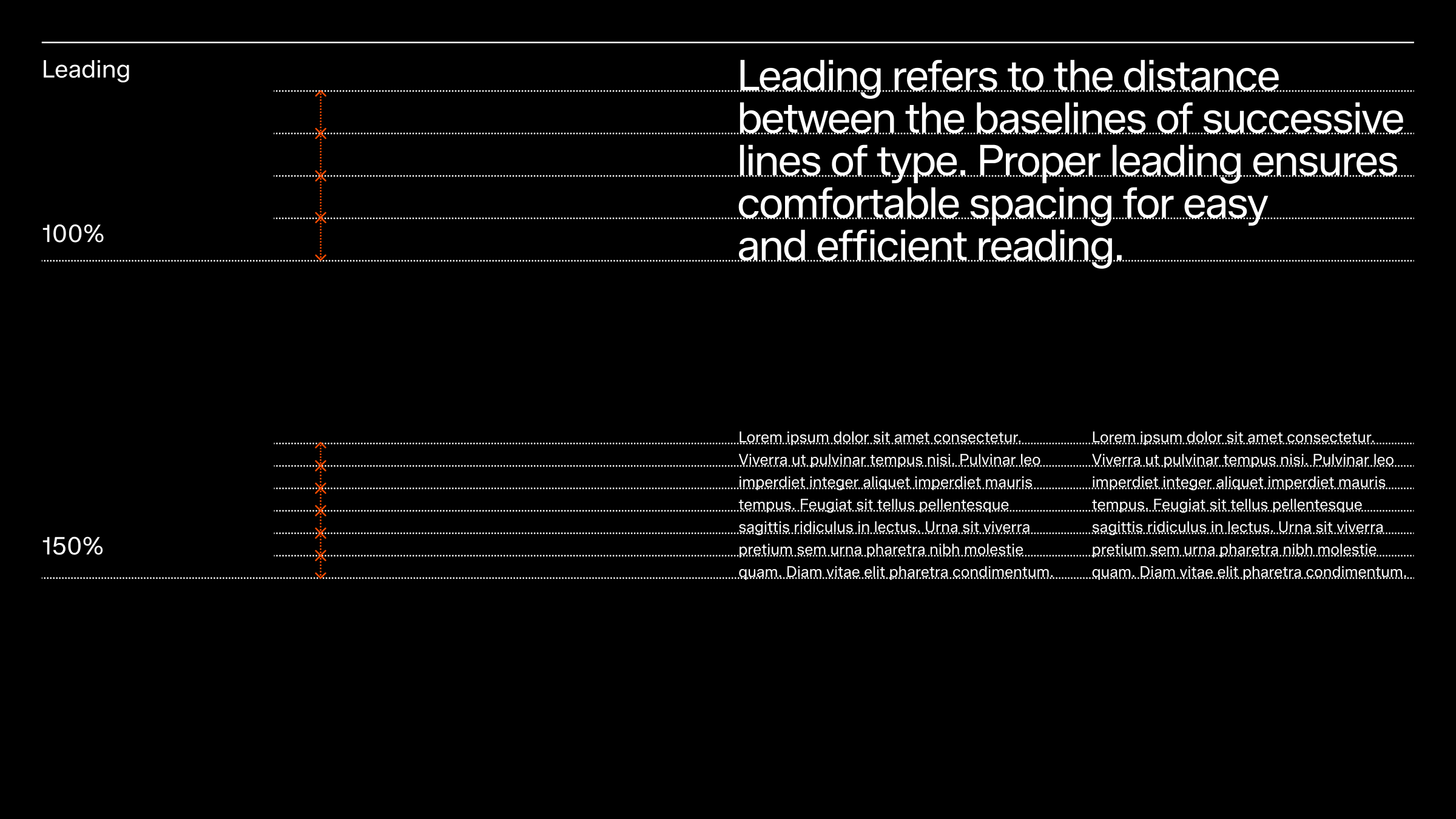
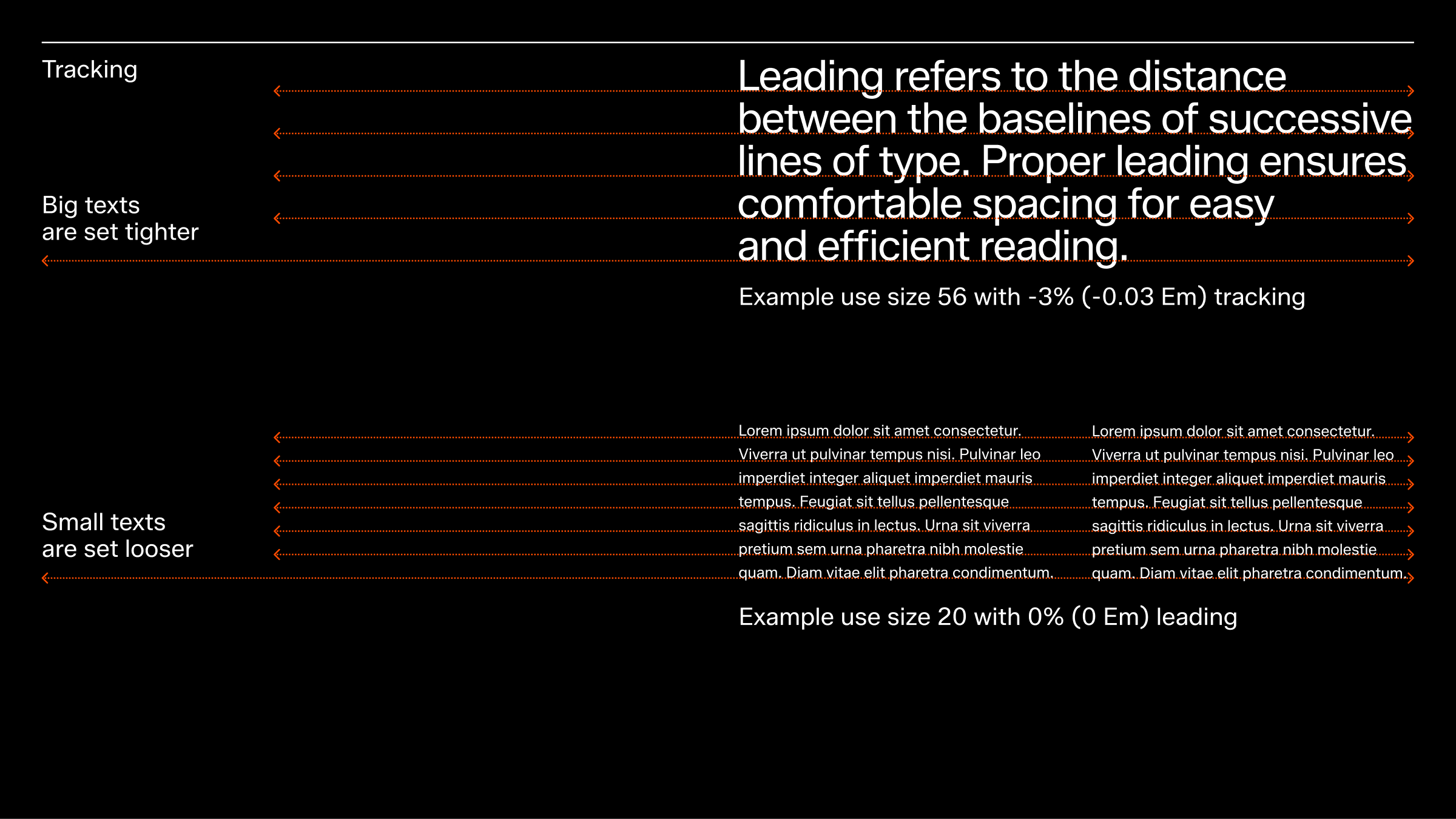
Leading and tracking are key elements in typesetting that influence text readability and appearance. A well-executed typesetting helps create a balanced and legible text layout.
Leading and tracking values should be adjusted according to the text size. For instance, long body copy in a small size may require larger leading and tracking to enhance readability, while headlines in larger text sizes can often use smaller leading and tracking while still maintaining readability. These recommendations are starting points and should be adjusted as needed, such as for on- or off-product applications.
Core typography animation
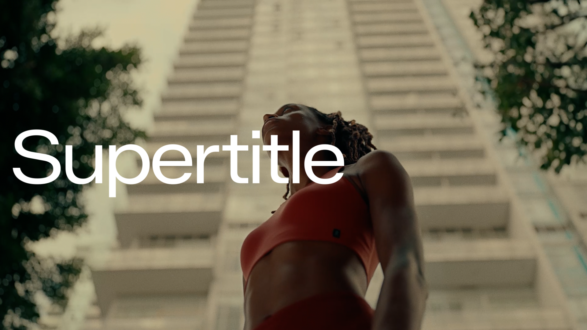
Our core typography animation has been designed to be both highly functional and versatile. It uses the same ‘ease in on enter’ principle as we do elsewhere in the motion language, only here, it is applied to text in the form of characters appearing.
The animation preset is a variant of a traditional write-on animation but instead of revealing characters from the beginning of a text, instead, it affects only the last line and last 5 characters of any block of text. We call this the “tail”.
Animating the tail only means we don’t have to wait for the first few characters to appear before we can begin to read the message. Instead, we can get straight to the point.
The preset can be used across all moving platforms, but take care not to create a distracting expression with overuse. For instance, in compositions containing several blocks of text, we like to animate only one of them, preferably the one that comes last in the order of reading.
Our core typography animation does not use any transition out. Here we instead prefer to use a simple hard cut as this is the most functional and efficient way to clear the information off-screen.
Below you can find an After Effects project file that includes templates for our most commonly used text plates in the following standard sizes:
9:16, 1080x1920px
16:9, HD, 1920x1080px
Functional layouts
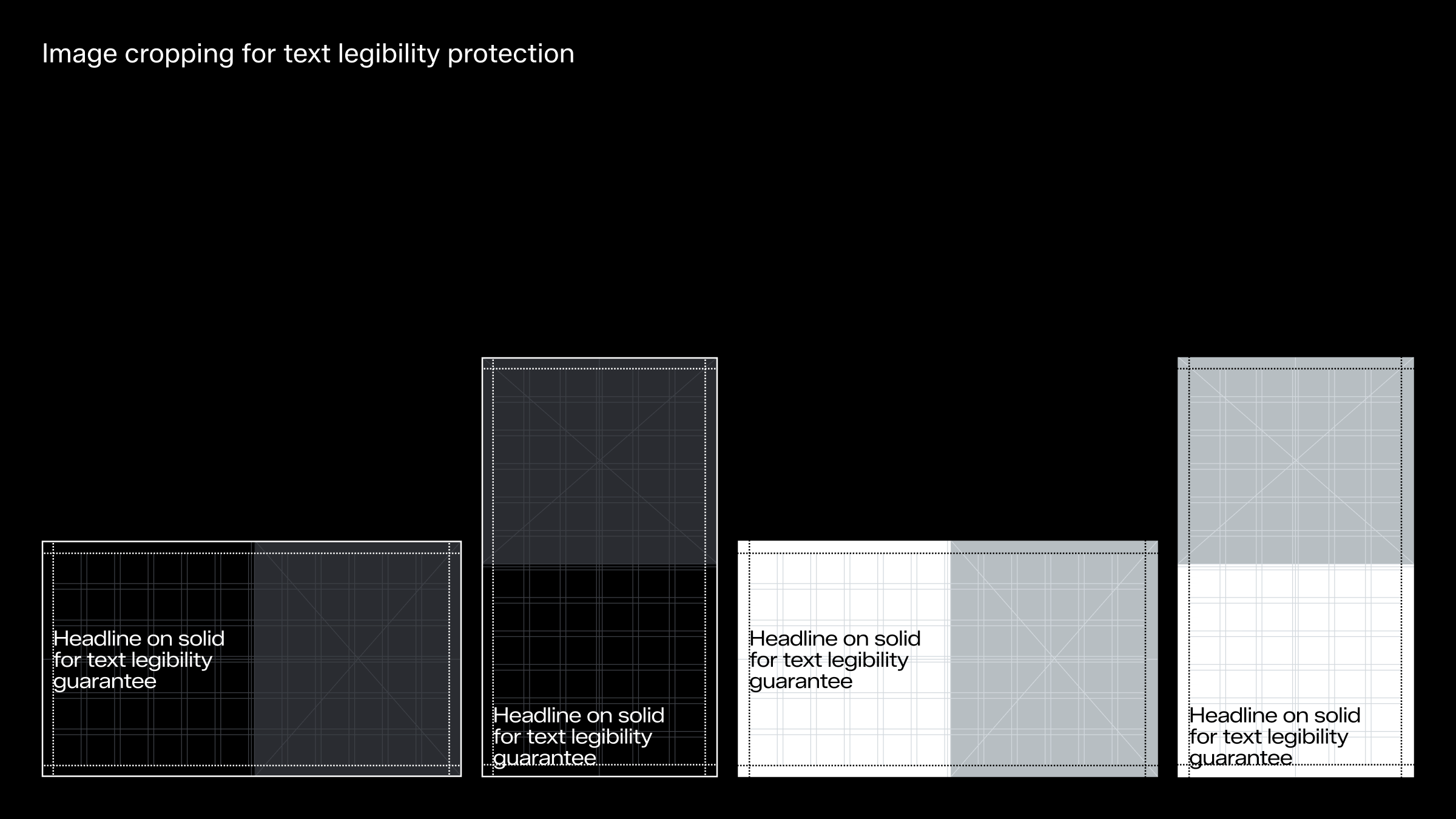
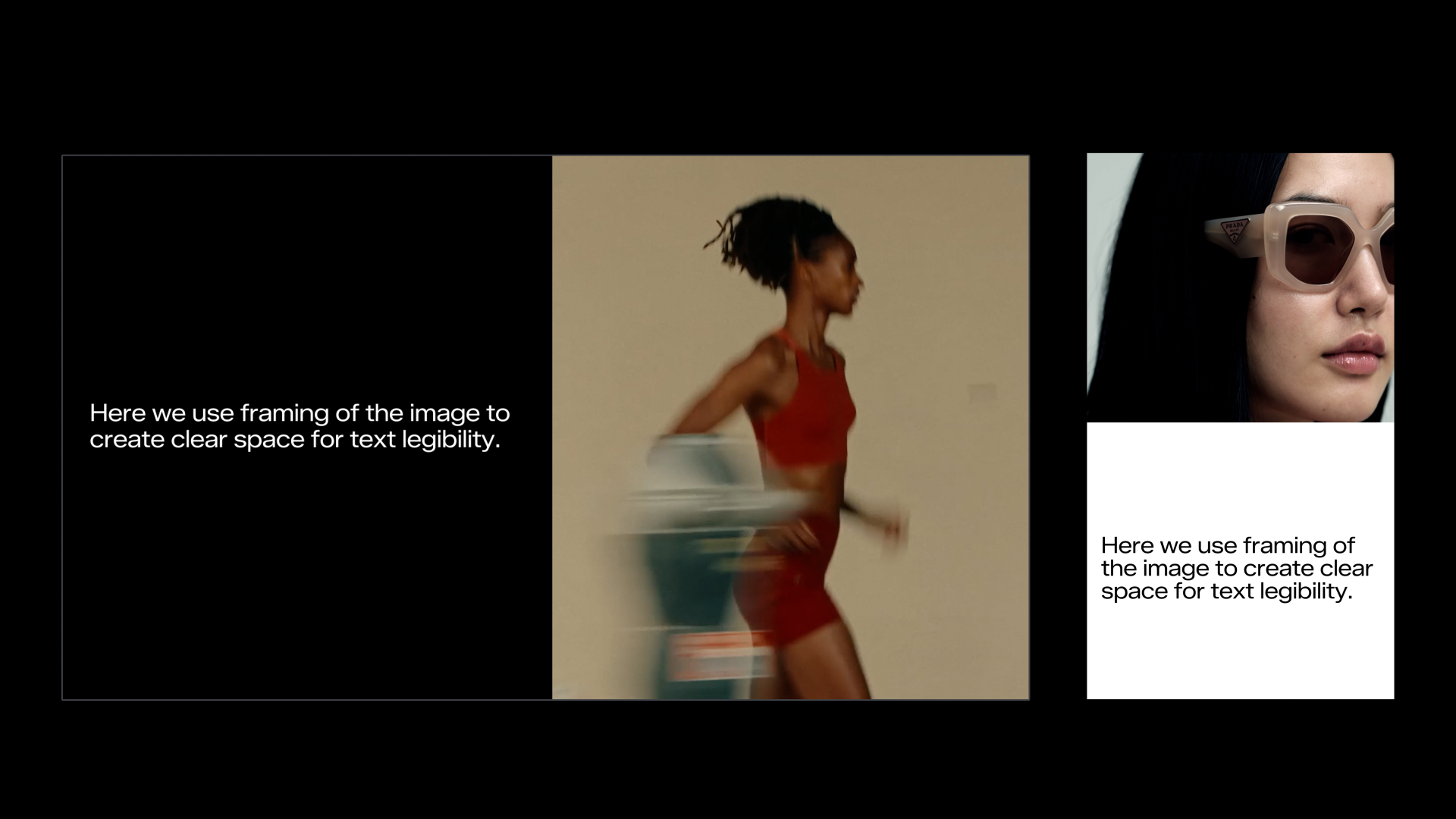
This layout option serves as a supportive and functional solution where you can crop, resize and/or reposition footage to create clear space for text. It helps to resolve legibility issues without introducing new elements to our toolkit. This fallback image treatment serves as a supportive and functional solution, rather than a defining feature of our brand.
Please note that the space created from cropping the image can only be filled with black or white. Frame amount is based and positioned on the grid available, with a 1/2 separation of the surface as a recommended starting point.
For further information on tools to help with text legibility, please refer to the accessibility chapter.
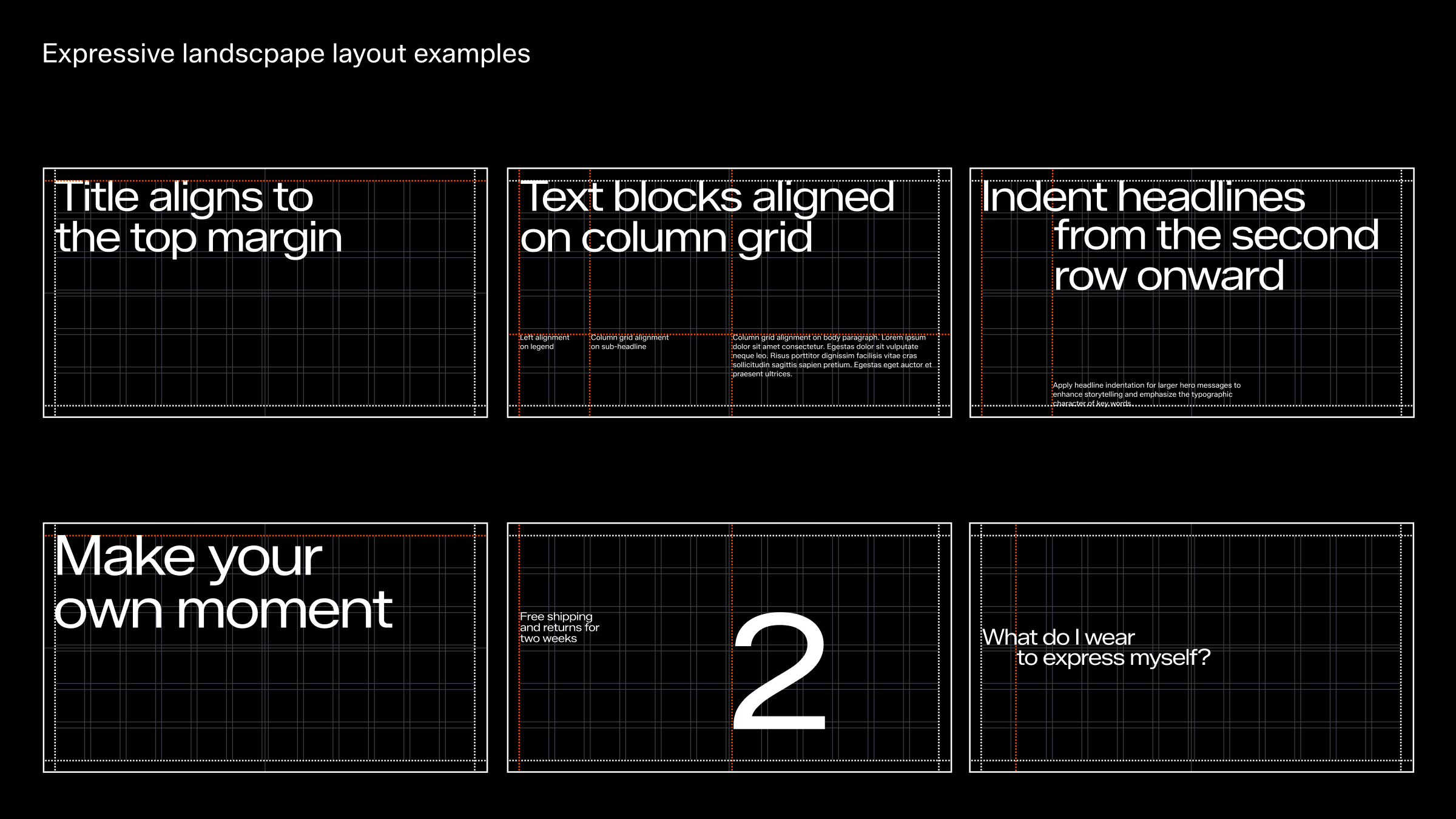
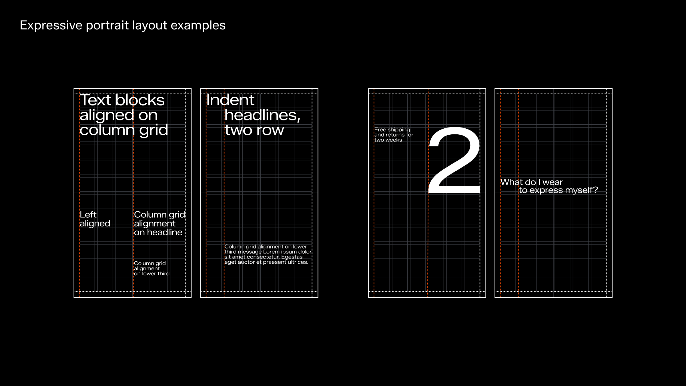
Dynamic placements
For expressive layouts, embrace a more dynamic use of the grid. This creates engaging designs with character, especially when typography is the focus. However, expressive layouts should always complement, not compete with, hero footage or key messages.
For more information on layout principles and references, please see the “Our expression” chapter.
Typography animation beyond core
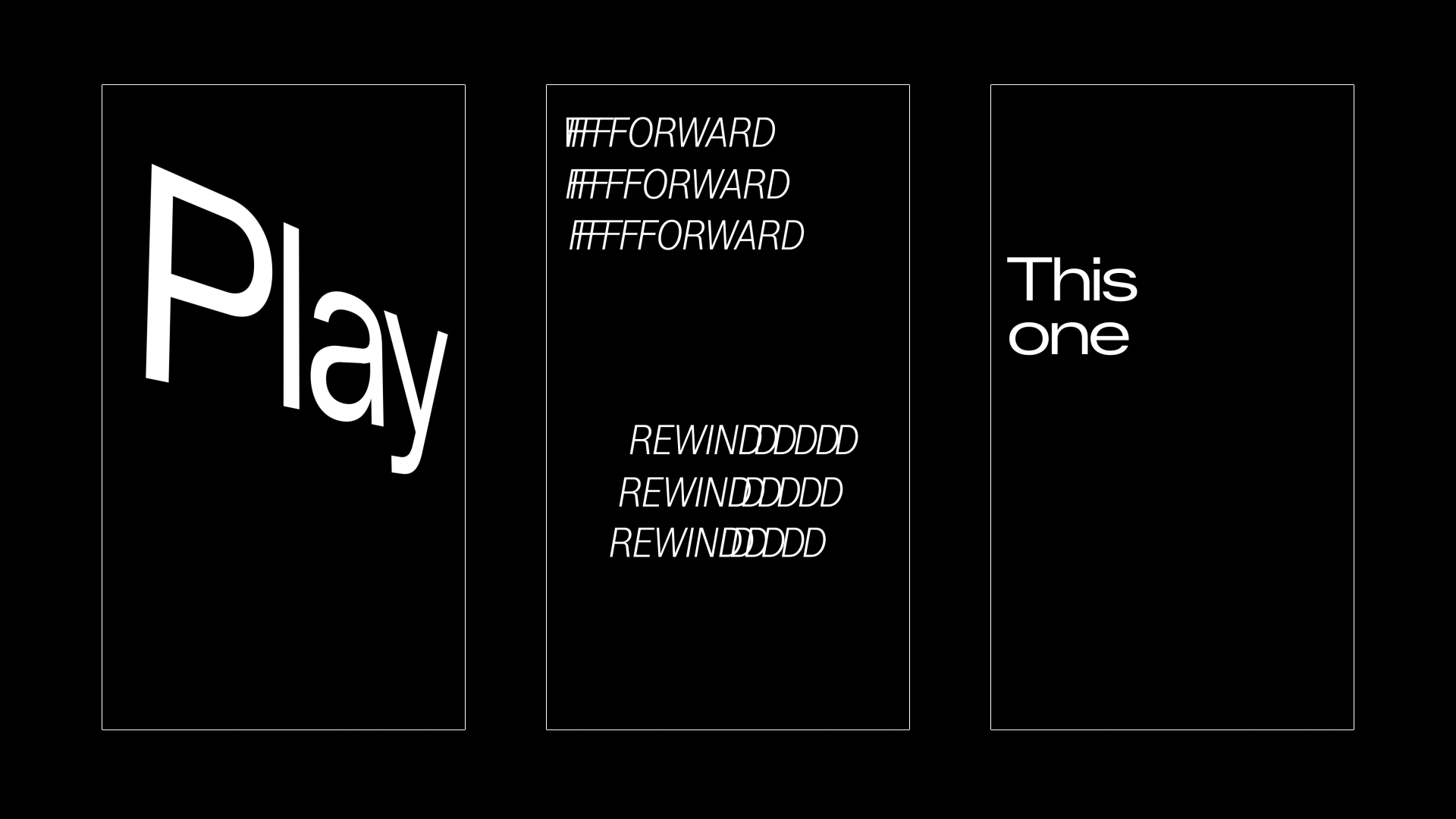
For times when typography itself can take a more leading role in a composition we like to reach beyond our core typography animation and apply more advanced motion to elevate the expression. When deciding on a motion to apply, always consider the text and the typography design. Most of the time, the superior motion to use, is one that underlines the word or message itself.
Here you can also find inspiration in our choreography. Below are some examples of how the choreography actions could be interpreted using kinetic typography.
Due to the bespoke nature of kinetic typography, the animations here are shown as notional examples only and would need to be designed, set and animated custom for each execution.