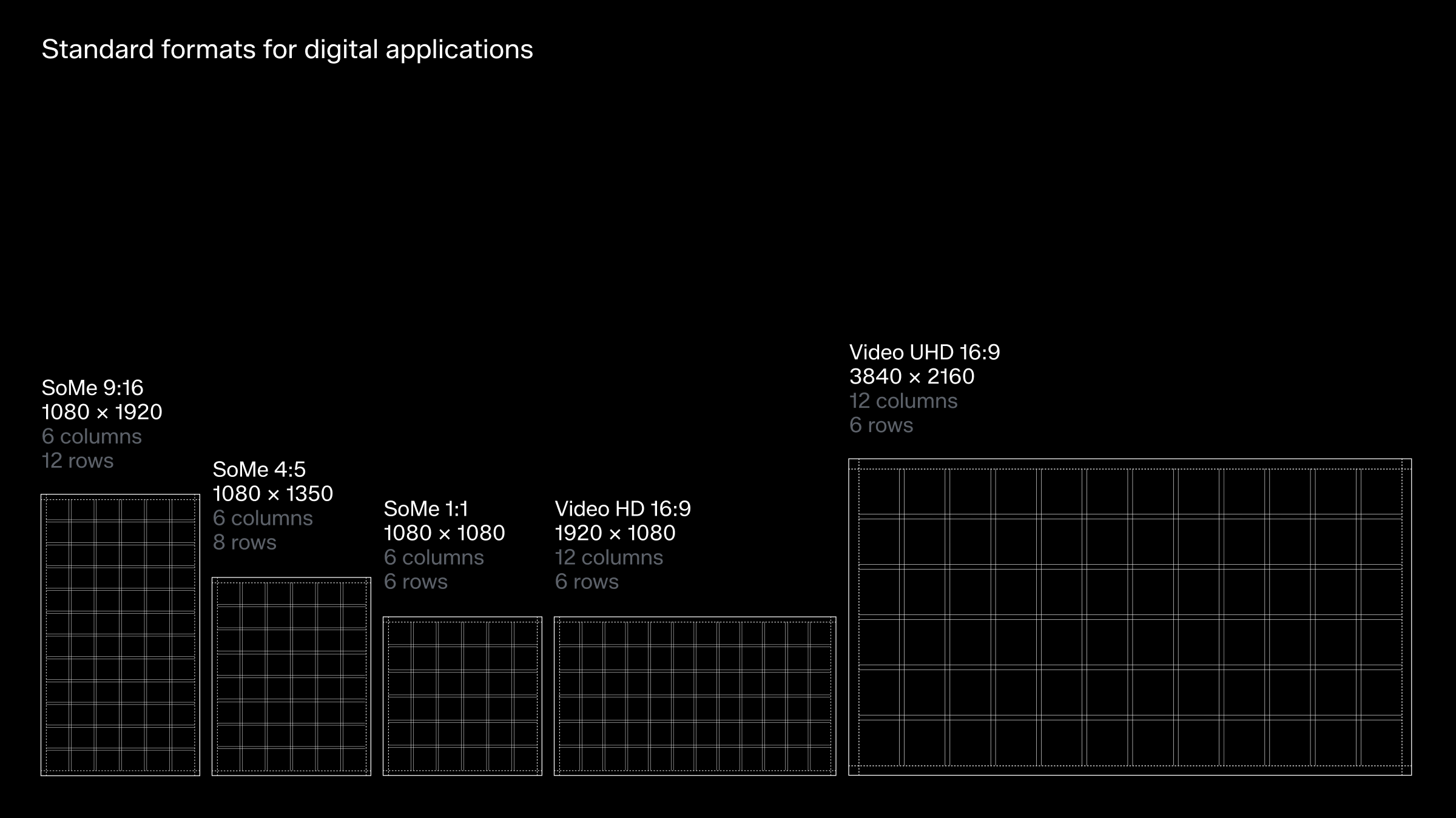
Grid system for motion
Grid & composition for standard video formats
Much like in our static expression, the grid system is the foundation of our brand identity also in motion. The grid, although invisible in the final result, serves as our most powerful tool in creating a recognisable and structured presence across all applications.
To maintain consistency in our visual identity, a cohesive yet flexible grid system is essential. It supports us in tailoring layouts to diverse audiences and contexts. Aligning each element to the grid ensures a harmonious and balanced design, reinforcing our brand's strength and clarity.
Below, you'll find predefined grids for standard formats, designed for versatility and featuring a centre cross for effortless vertical and horizontal alignment.
For more information on grids and guidance for constructing grids for new aspect ratios, please refer to the layout section.
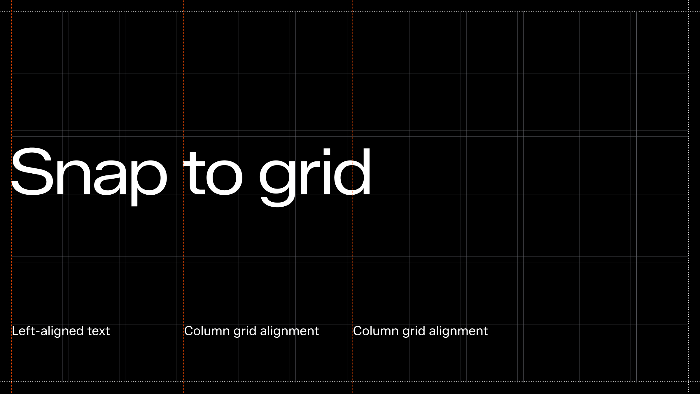
Layout principles
Our layout DNA can be distilled into four guiding principles that create a confident and bold “Zalando attitude.” Always align to the row and column grid, even for multiple text blocks. Left-align text to ensure structure and to enhance readability. Work with strong contrasts between elements in our layouts, particularly in typography. By using fewer but more distinctive font sizes, we create a clear and striking hierarchy. Embrace negative (empty) space to give content room to breathe.
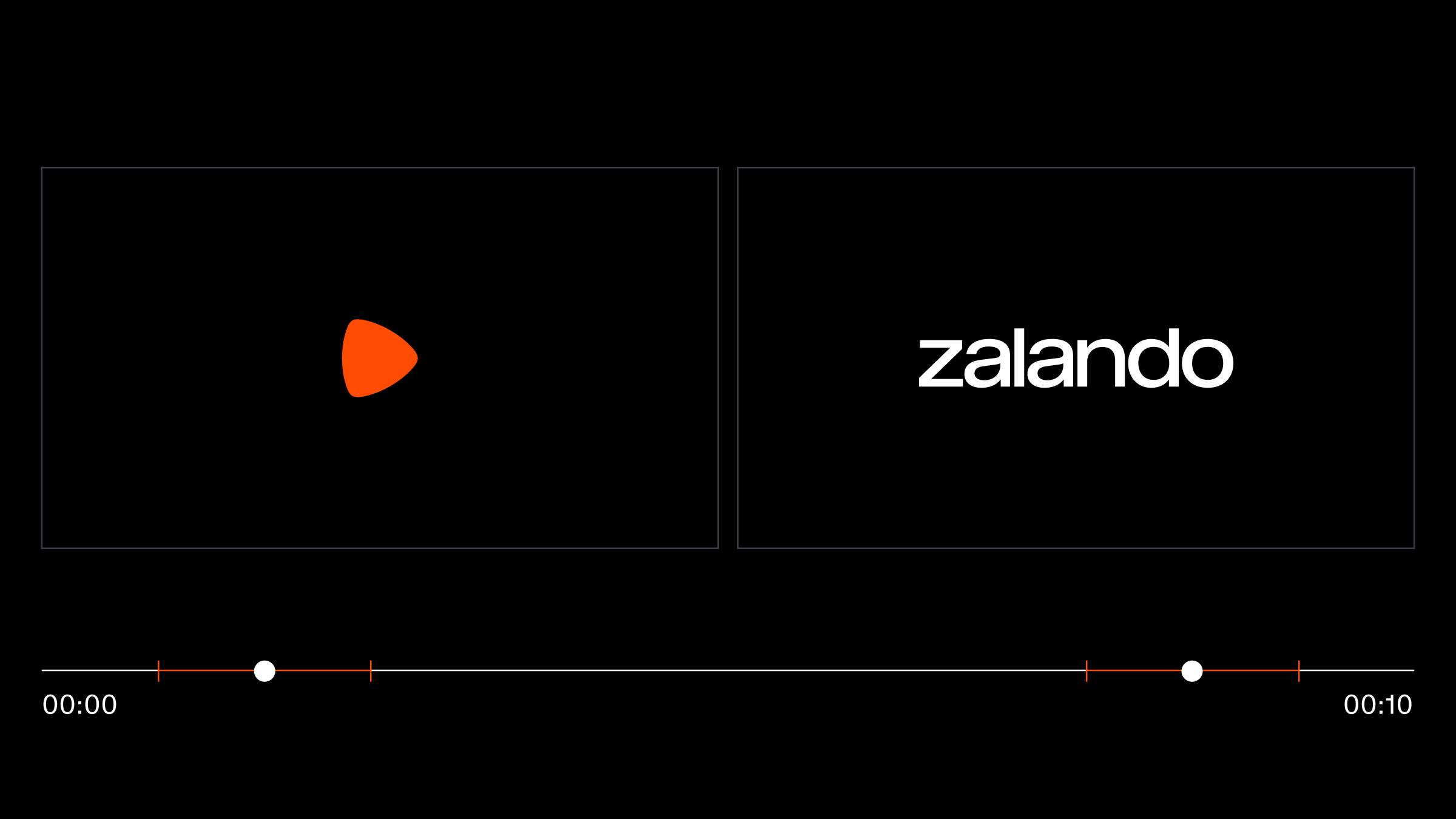
Logotype system in sequence
Our logotype placement is distinct because it always operates independently and is never used as part of a lock-up. Motion offers a great opportunity to demonstrate this approach, as it allows the logotypes to be cut on a timeline, ensuring they are never shown simultaneously within a single frame.
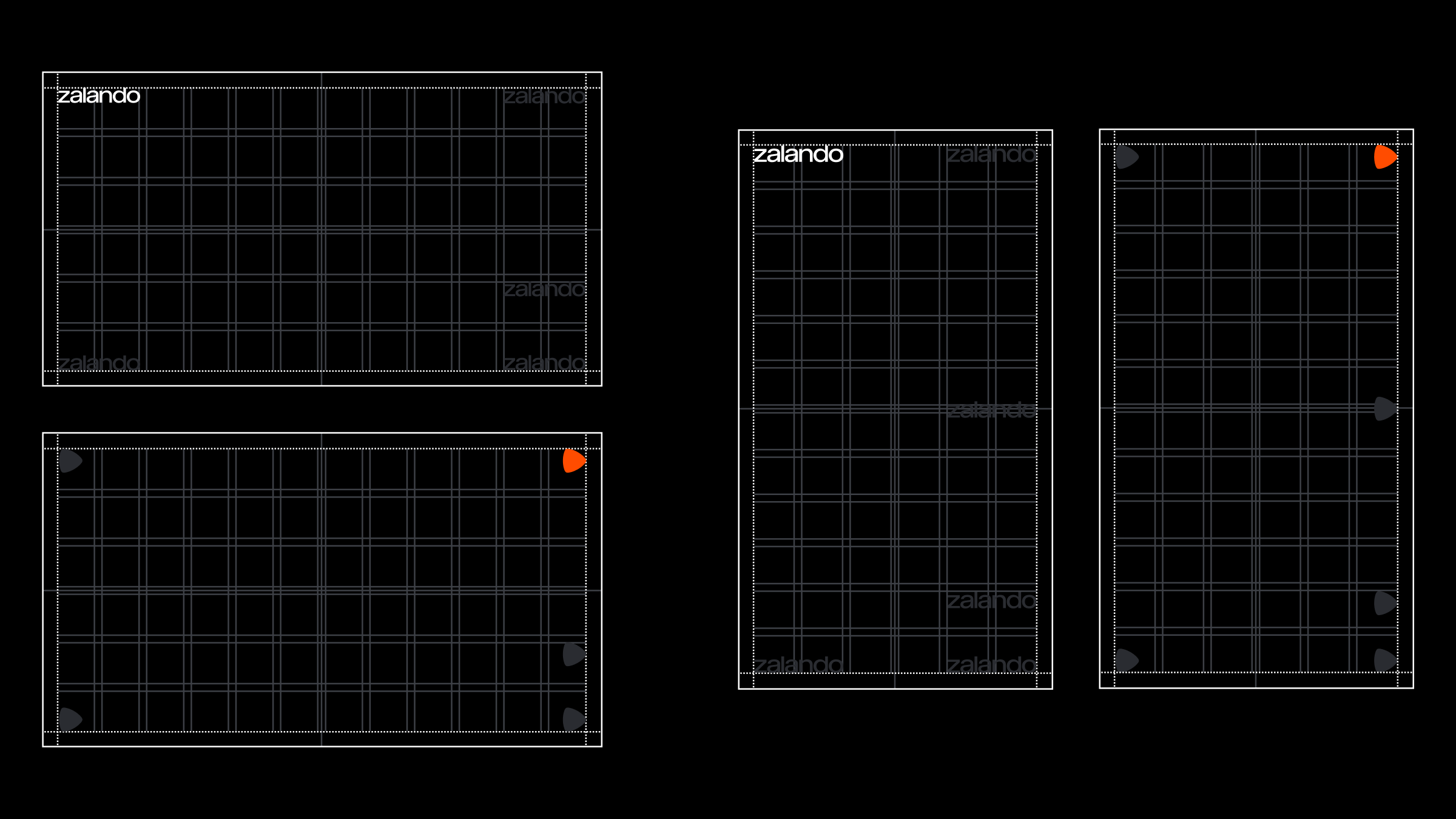
Watermark
In some instances when we require our logotypes to be consistently present as a watermark over motion visuals, please refer to available placements outlined below.