Application examples
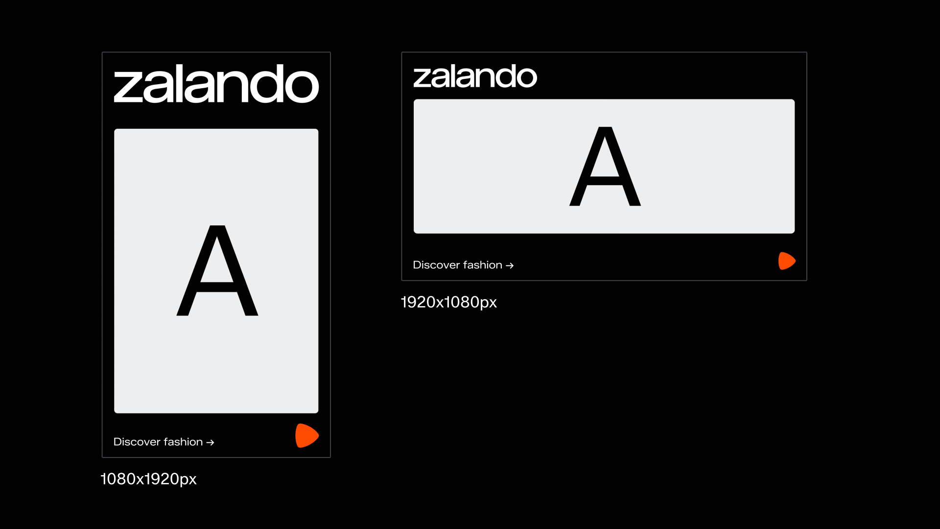
Mid funnel
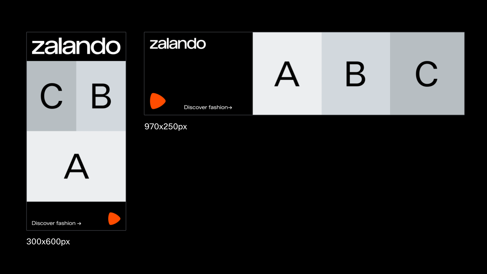
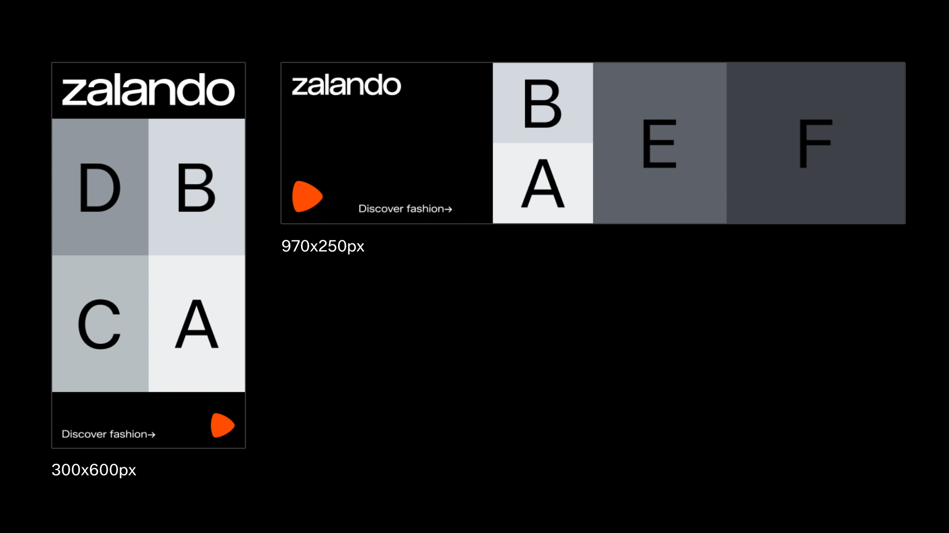
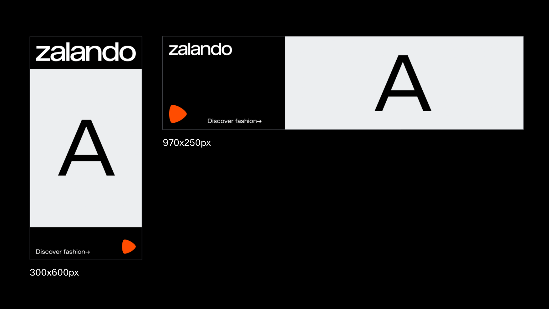
Our concept of choreography can be applied also on mid funnel motion. Below are notional examples of how the modes can be interpreted on mid funnel. Use these as building blocks to create a choreography in your designs in the same way as in upper funnel.
Mid funnel ads are distinguished by their focus on message and more premium content. Therefor designs for mid funnel use full bleed image and text blocks set to the grid.
When designing for mid funnel, please use the adapted grids for mid funnel composition sizes, here:
Play
Forward / Rewind

Shuffle

Pause
Repeat

Stop
Text legibility on mid-funnel
When we have limited control over visual assets, particularly for lower and mid-funnel materials, creating clear space by either moving or cropping image assets becomes a valuable tool. It helps resolve legibility issues without introducing new elements to our toolkit. This image crop can be animated in and out to allow the text position to adhere to format safe zones like in the examples below.

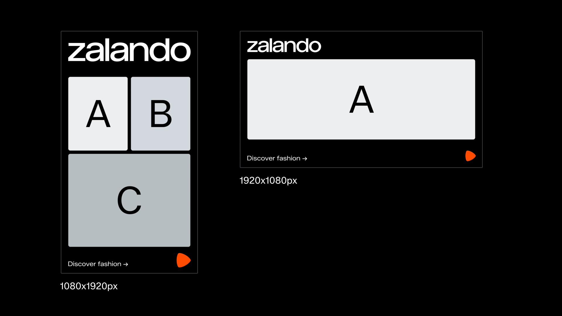
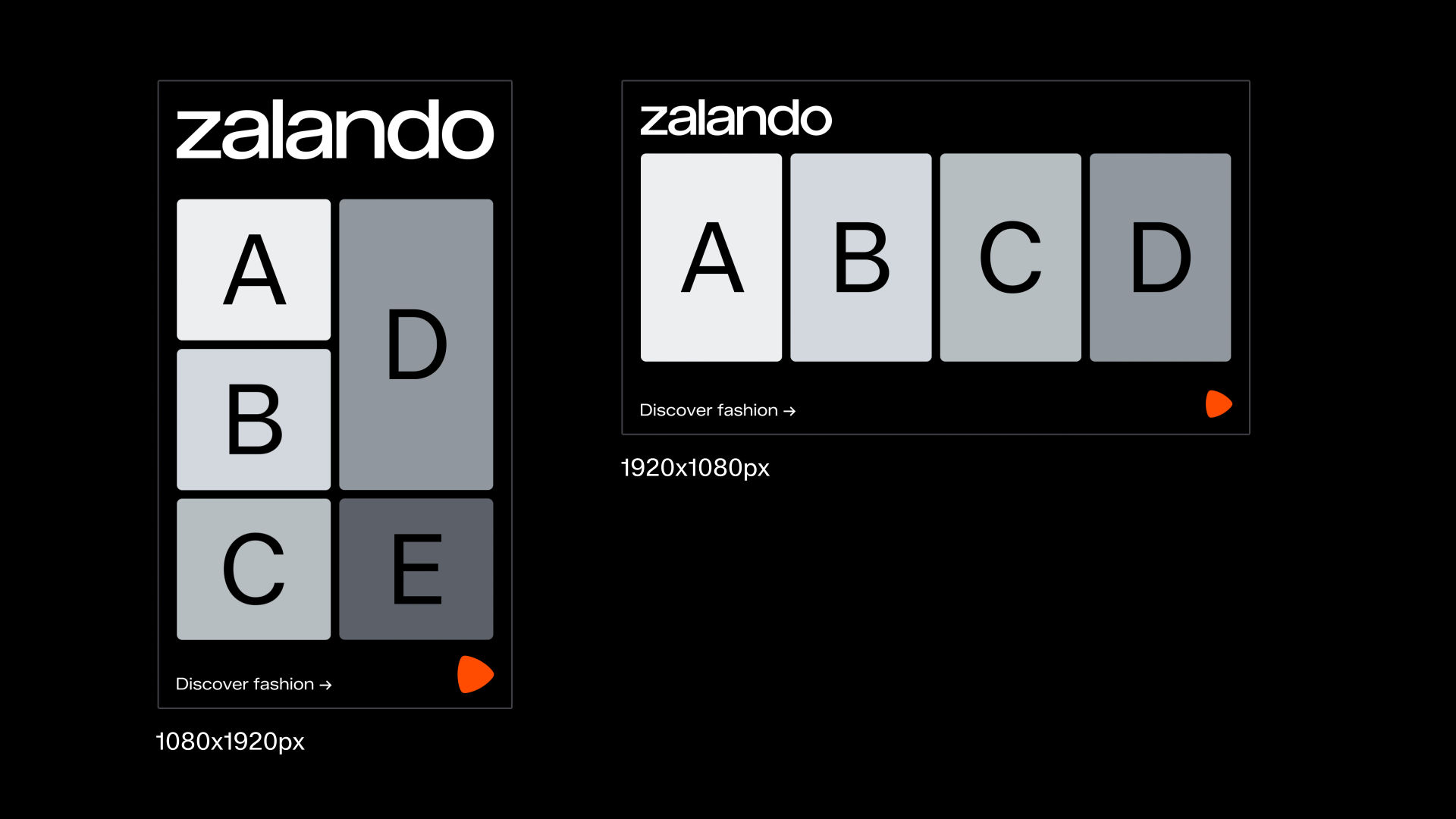
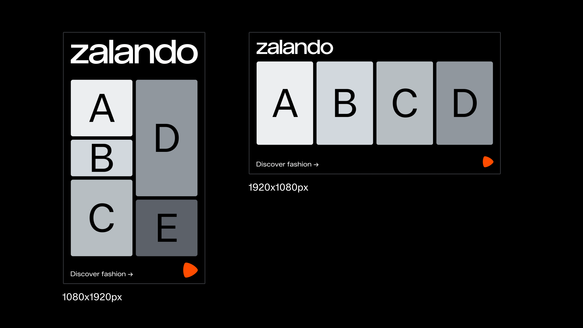
Lower funnel
Our concept of choreography can be applied also on lower funnel motion. Below are notional examples of how the modes can be interpreted on lower funnel. Use these as building blocks to create a choreography in your designs in the same way as in upper funnel.
Lower funnel ads are distinguished by their focus product driven imagery and content. Therefore the designs for lower funnel ads use product and imagery contained in cards with rounded corners set to the grid.
When designing for lower funnel, please use the adapted grid for lower funnel.
Play

Forward / Rewind
Shuffle
Pause
Repeat
Stop

Product
Our motion expression on product is based on the same animation principles as in the rest of our brand. But unlike other parts of the brand, motion on product, is predominantly controlled by user interaction and therefore we can’t apply the idea of choreography in quite the same way.
Here, instead, we put an emphasis on the context and inherent purpose of a particular motion and from this we can derive what duration, scale and interpolation to use.
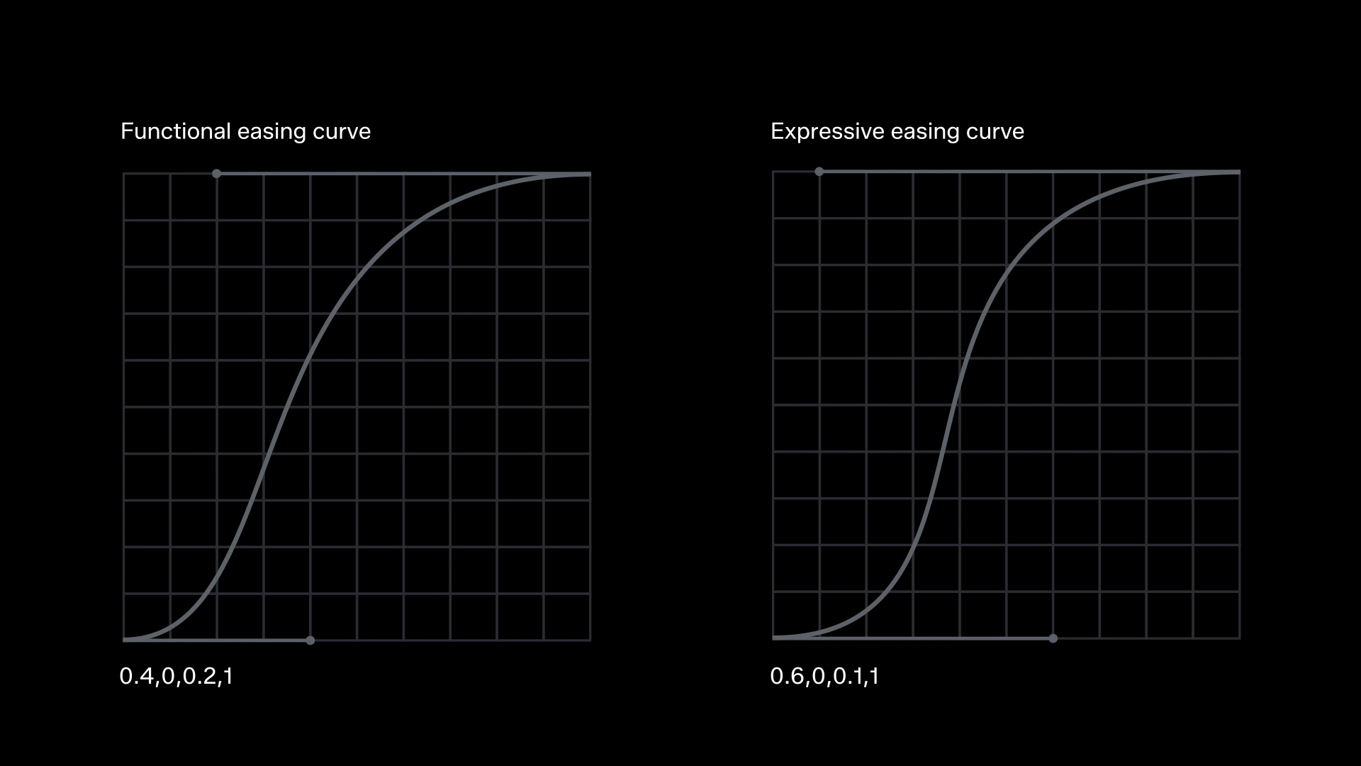
Interpolations on product
Much like with motion off product, we divide movements on product into two groups. Functional and expressive. We have two easing curves: one for functional usage, and one for expressive purposes.
The functional curve communicates the idea of performance and efficiency. This should be applied to actions that are functional in nature and use smaller components that need instant feedback, such as; toggle switches, tooltips, radio buttons, checkboxes and button hover etc.
The expressive curve can help build more of an emotional connection between the user and the interface. This should be applied to actions that make the experience more engaging and memorable, or that use larger components, such as moments of activation, inspiration, anticipation and celebration.
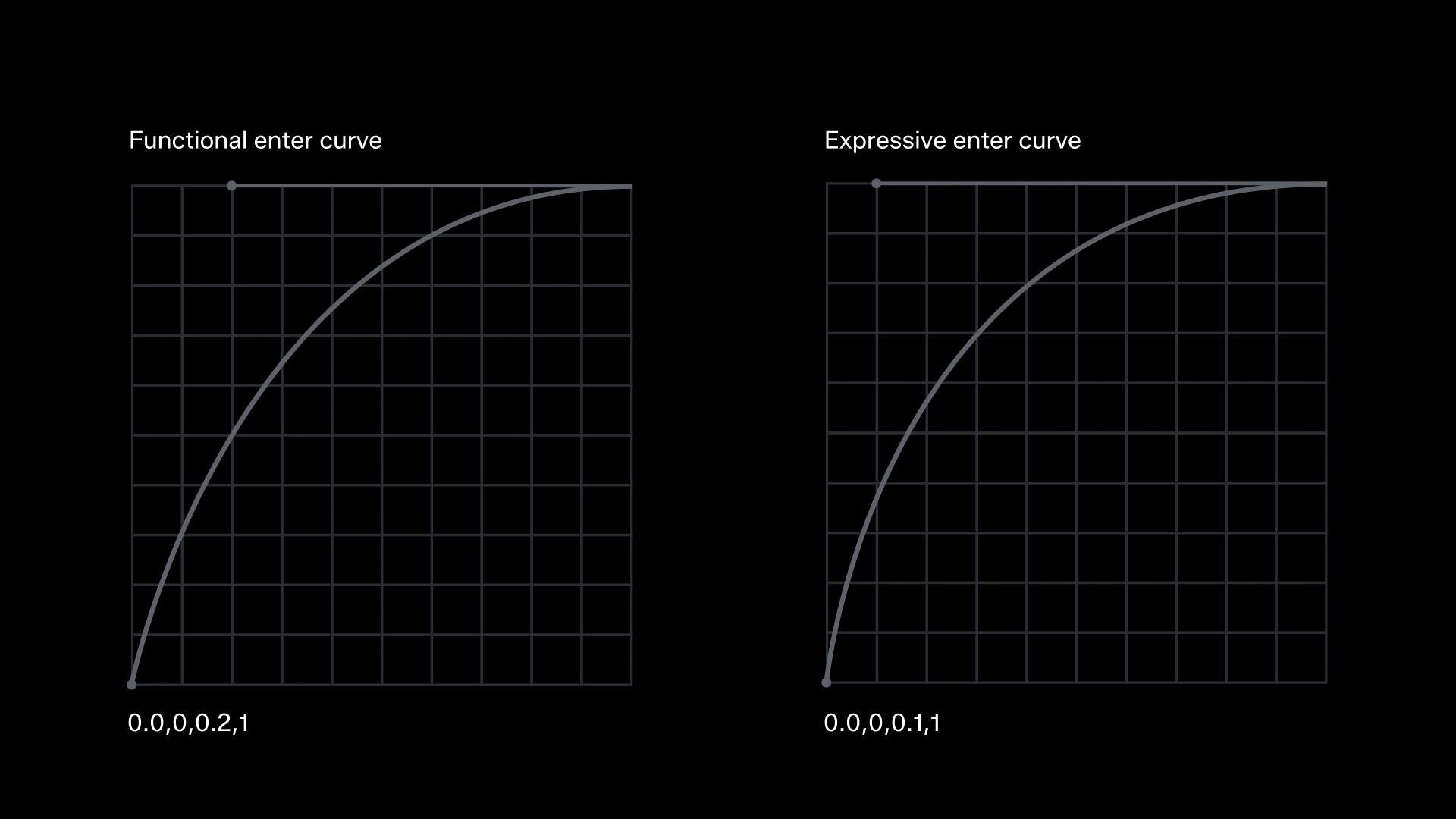
Ease in on enter on product
For elements that enter or appear on screen, it is recommended to use an ease in into the rest state. Here we also apply the functional or expressive interpolation curves, depending on the purpose of the motion, but we use only the latter half of the motion curve with a shorter duration.
Note that, in general, enter durations are longer than exit durations.
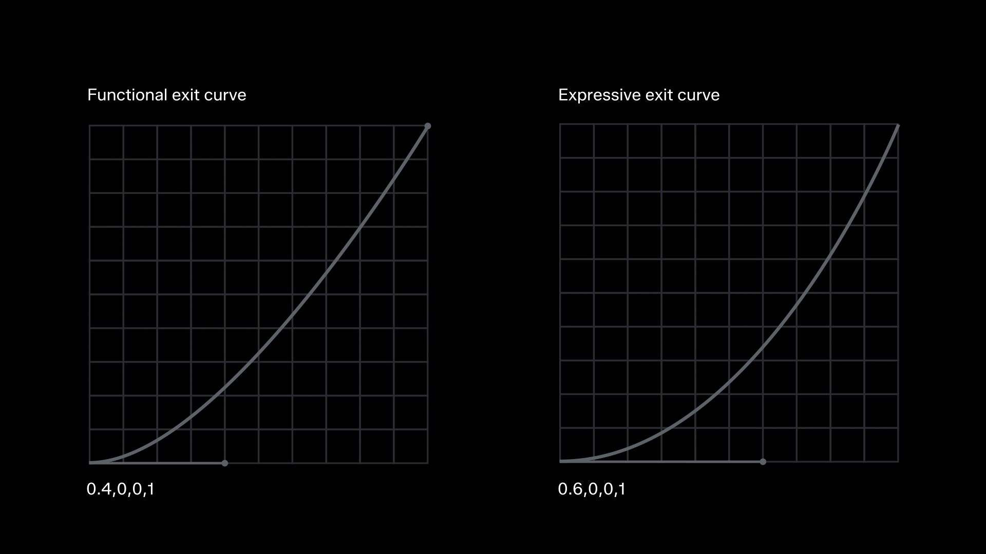
Ease out on exit on product
For elements that exit or disappear from screen, it is recommended to use an ease-out from the rest state. Here we also apply the functional or expressive interpolation curves, depending on the purpose of the motion, but we use only the first half of the motion curve with a shorter duration.
Note that, in general, exit durations are shorter than enter durations.
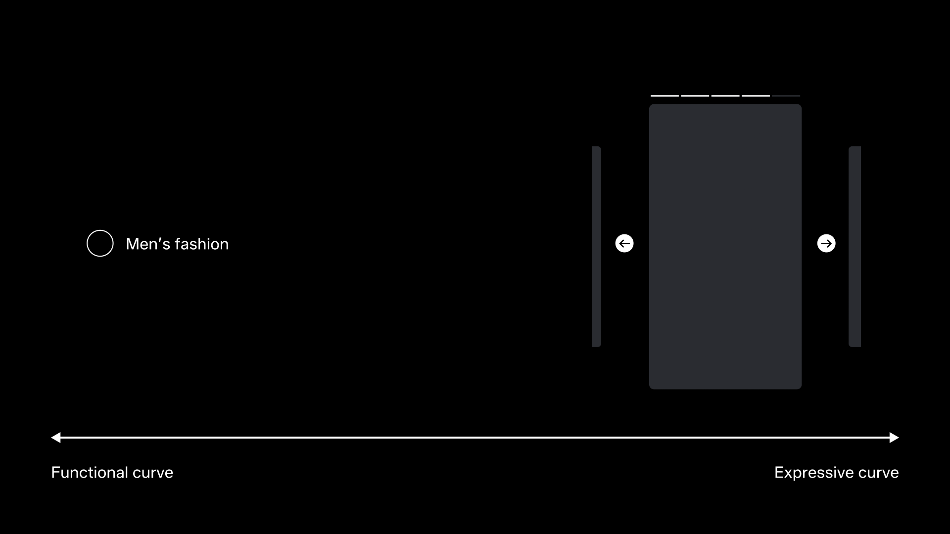
Scale of expression on product
On product, an action’s size on screen is also inherent to its purpose. Smaller actions and components should generally use a functional easing curve where whereas larger actions or components can use an expressive easing curve.
Below are a few notional examples of component sizes on a scale from functional to expressive.
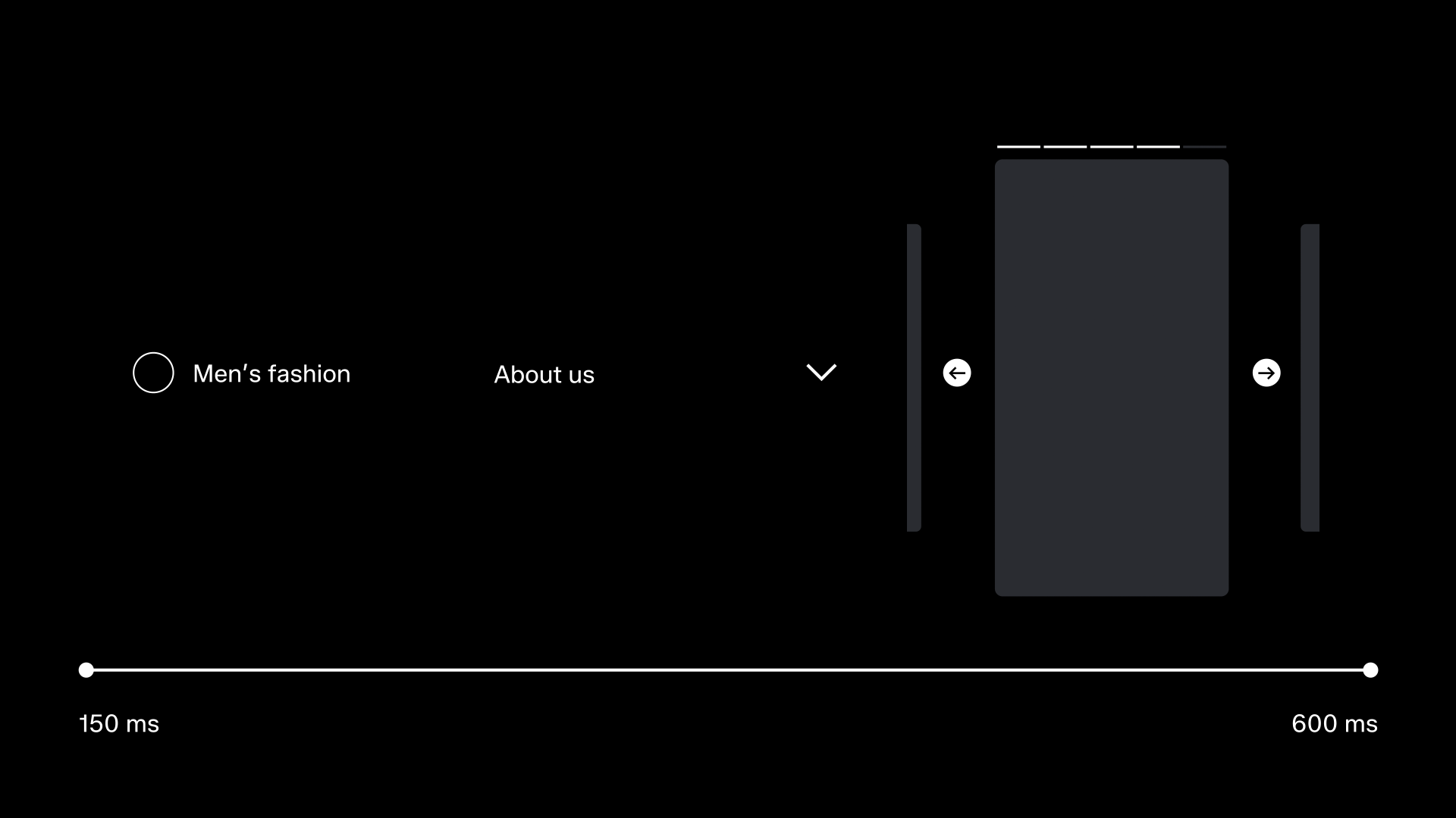
Durations on product
On product, an action’s size on screen is also inherent to its purpose. The size of a component also dictates the duration it requires to complete its motion. A smaller component requires a shorter duration, and a larger component requires a longer duration.
On product we keep our duration range between 150 ms and 600 ms.
Below are a few notional examples of component sizes on a scale from short to long duration.
Microinteractions
Microinteractions are key opportunities on product that allow us to enhance usability, increase interactivity, and create memorable experiences. They serve as an effective tool to elevate engagement while adding a sense of flair and fun to the product experience.
Below are three animated examples of how microinteractions could appear and come together to create unified expression across the entire app.

Add to wishlist

Add to cart
Fashion assistant