Word mark
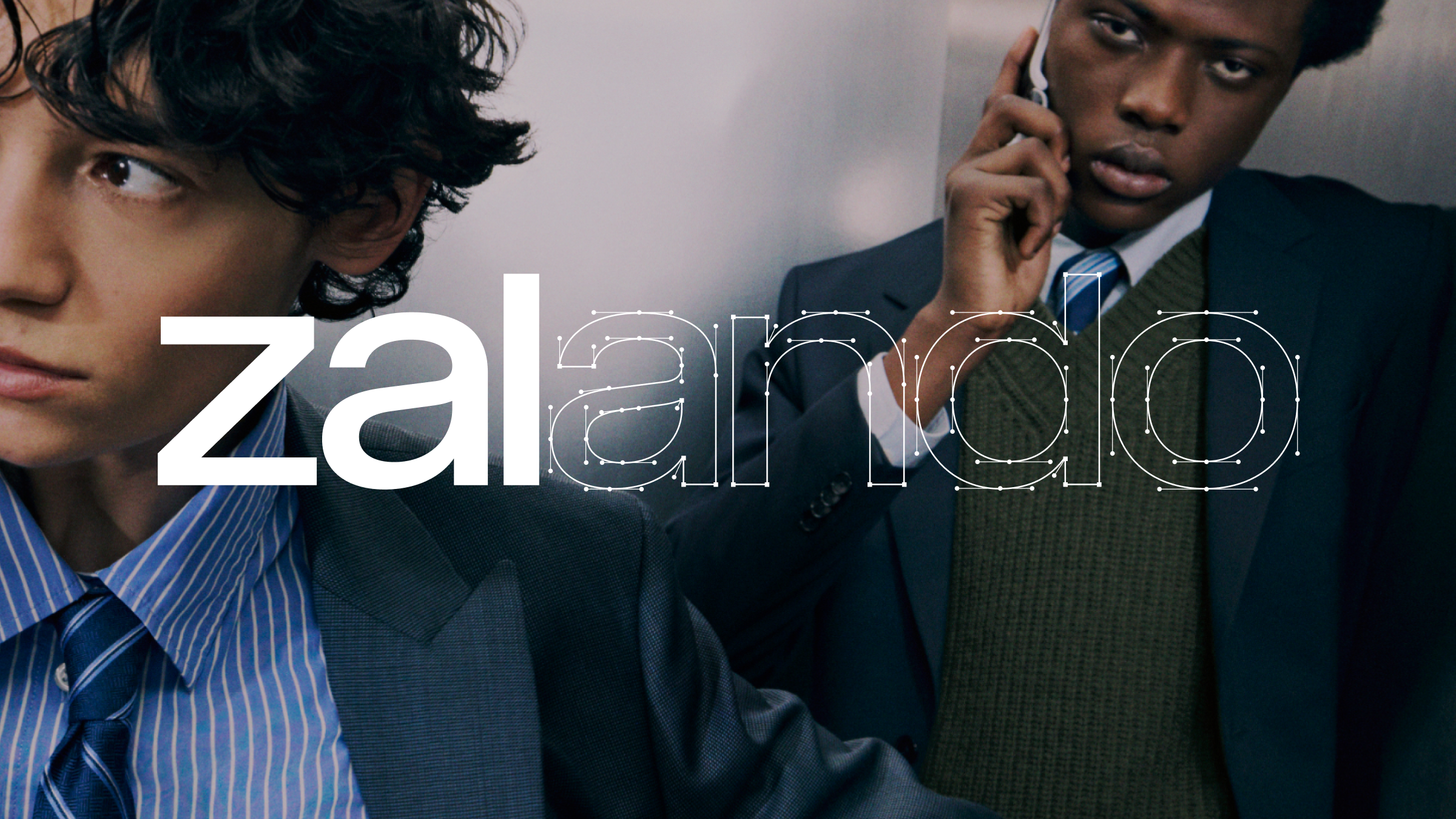
The updated word mark embodies Zalando’s refreshed vision and new brand direction. Designed to be both contemporary and timeless, this word mark has been optimized for scalability, ensuring it performs seamlessly across all platforms—from mobile apps to large-scale displays.Colour version
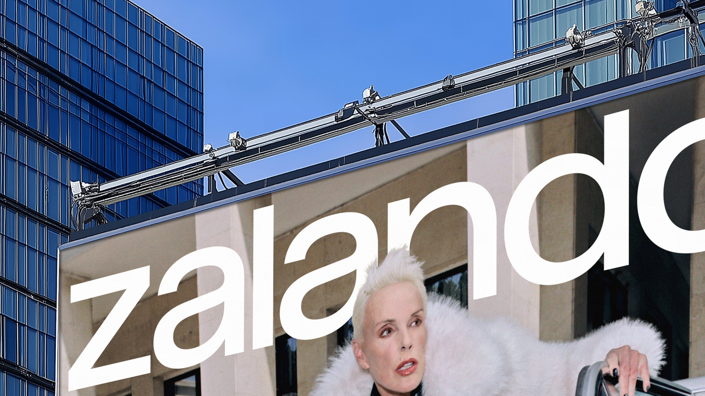
The word mark is available in two primary colour versions: white and black. In competitive environments, white is the dominant colour and should be used against dark backgrounds or dark image motifs. Conversely, the black version is suitable for owned environments and should be used against light backgrounds or light image motifs. Always ensure the version chosen offers the greatest contrast and legibility relative to the background.
The word mark must never be altered, recoloured or combined with other names or elements. The original word mark should always be used without modification. Never create a new version of the word mark.
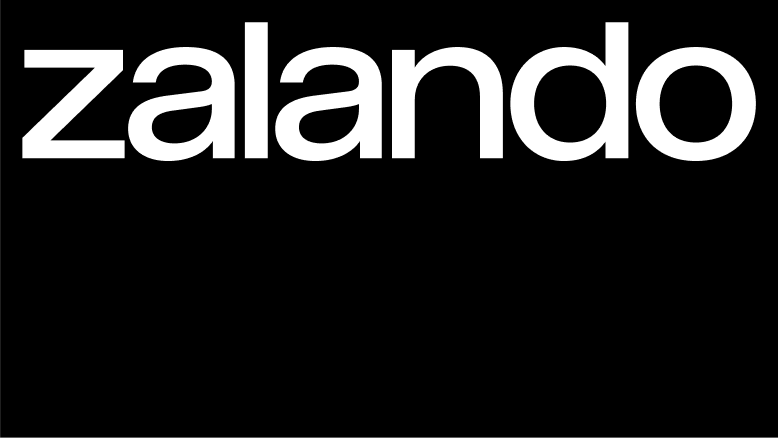
White on black
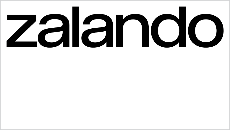
Black on white
Black on Zalando Orange
Contrast
To ensure the integrity and visibility of our word mark, it is crucial that it always maintains sufficient contrast against its background. Whether it is displayed on digital screens, printed materials or physical products, it should stand out distinctly, ensuring that its characters remain clear and well-defined at all times. Proper contrast not only enhances the aesthetic appeal but also reinforces brand recognition and consistency, making our logotype instantly recognisable and memorable to our audiences.
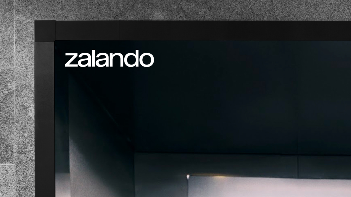
Black on images
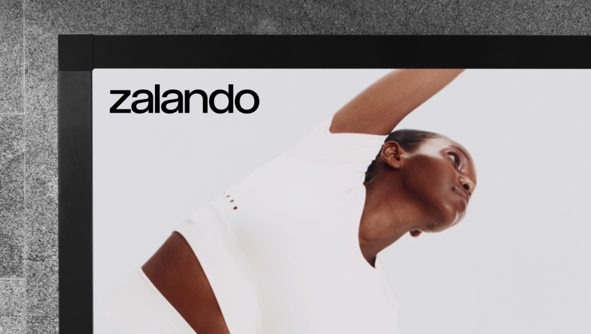
White on images
Clear space
When applying our word mark, it is paramount that it is given enough space from other elements on the canvas. Our recommended minimum clear space is equal to 1/2 of the word mark height.
Please note: For enlarged ‘masthead’ applications of the word mark the minimum clear space can be waived and clear space around the logo can be derived from the canvas margins.
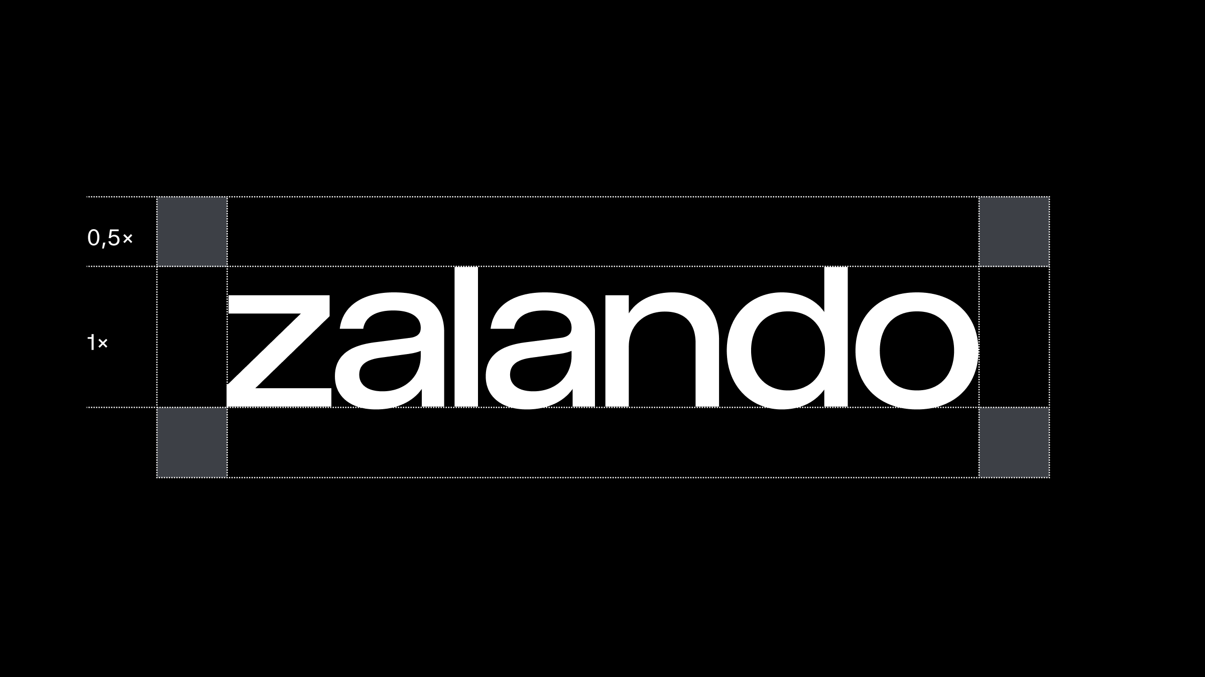
Our default minimum recommended clear space is equal to 1/2 of the word mark height.
Minimum size
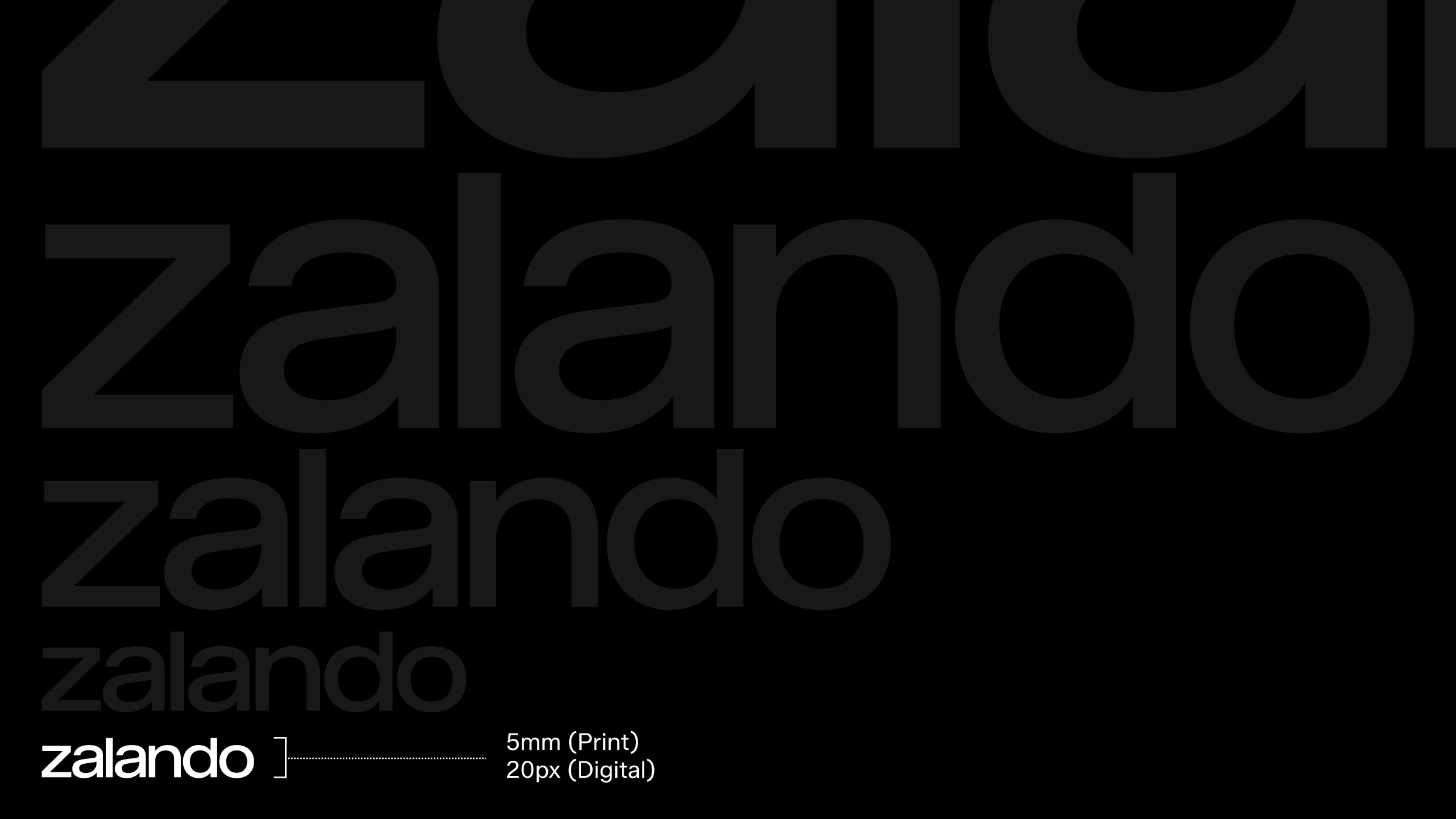
The minimum approved size for our word mark is 20 pixels in height, reserved for instances where technical constraints apply. However, our word mark is a key asset and should be given ample space and focus whenever possible. Showcasing it prominently reinforces its significance and enhances our brand's visibility.
Zalando in text
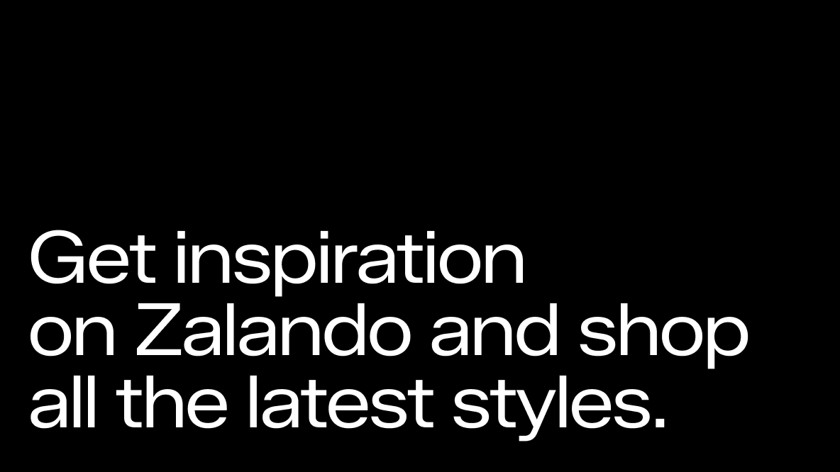
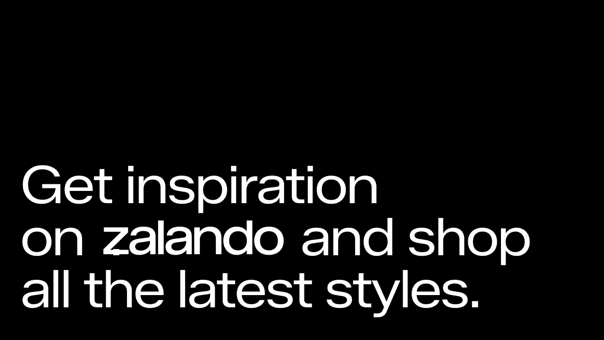
When mentioning Zalando in a paragraph or sentence, never use the logo. Instead, use our brand typeface and keep the text consistent with the surrounding content. Although our wordmark is in lowercase, always capitalise the 'Z' when writing Zalando in text.
In use
