Logo mechanics
The Zalando brand mark and word mark should not be combined as a fixed lock-up. This rule applies to all formats and must be consistently observed when applying the assets to any design. While both elements can appear on the same surface, they must always be placed separately. (We realise zalando.de still carries a lock-up and are working to remove this exception)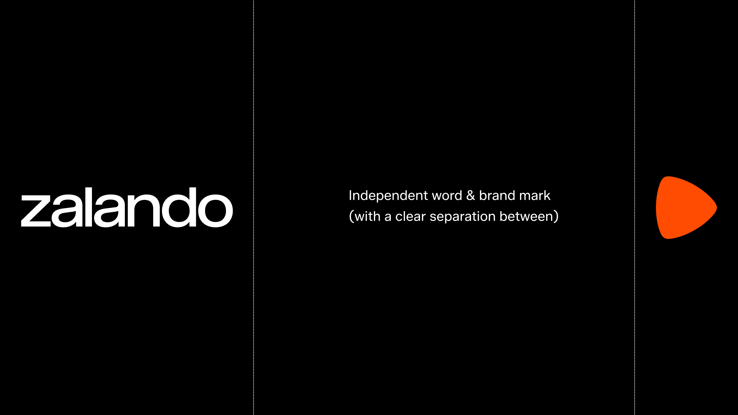
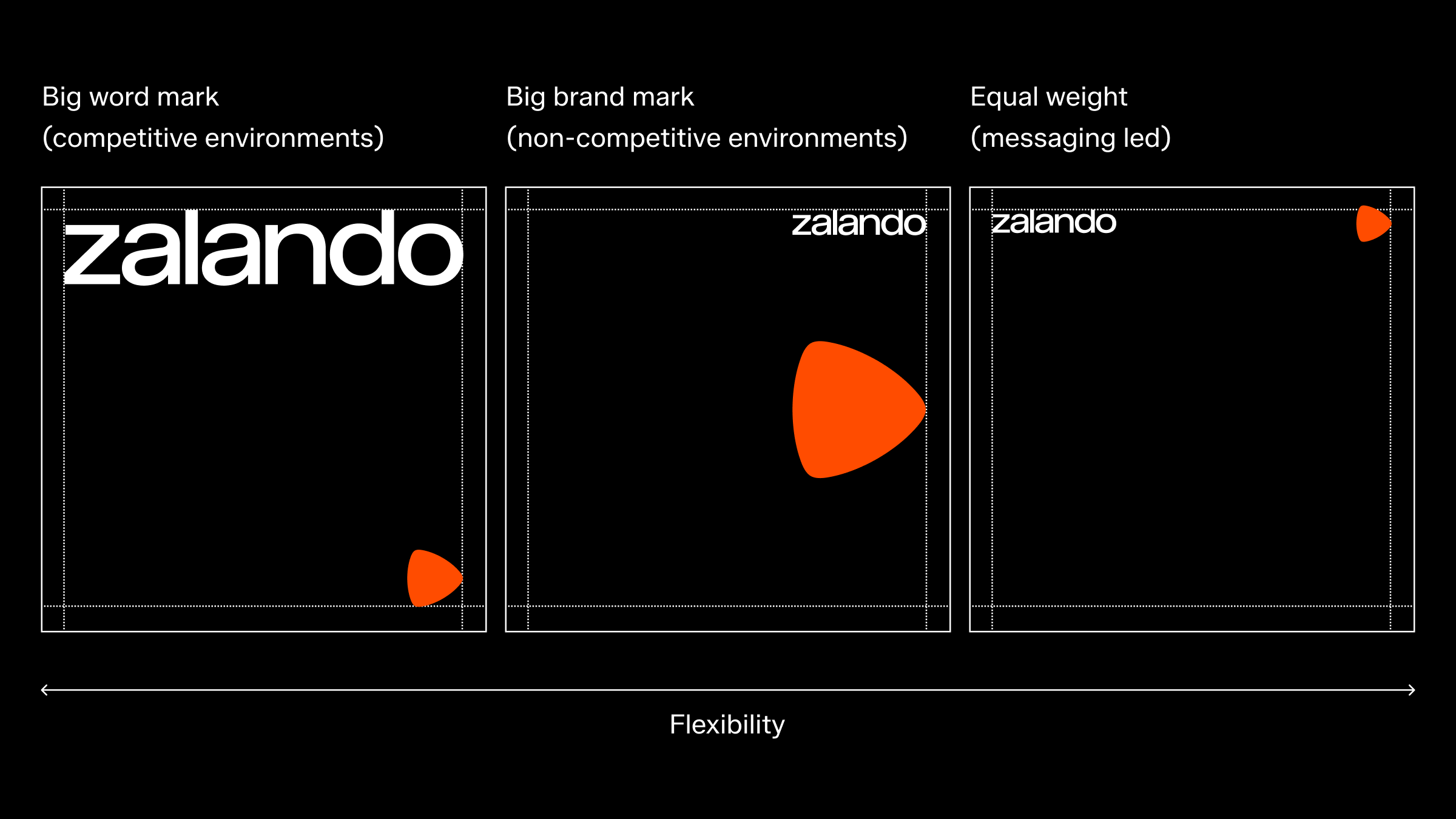
A flexible logo-system
Our word mark and brand mark have a flexible logo-system relationship, allowing for various layouts to fit multiple needs. These foundational guidelines are designed to maintain flexibility, supporting diverse brand expressions while avoiding excessive repetition.
We have three defined logo-system relationships; “Big word mark” (competitive environments), “Equal weight” (messaging led) and “Big brand mark” (owned environments). The order usually starts with our most important asset — the word mark, followed by our brand mark.
The system adapts to various contexts while maintaining strong brand presence. While we recommend specific placements, they can be adjusted to accommodate unique content needs. Avoid placing content near bottom margins in OOH settings for better legibility.
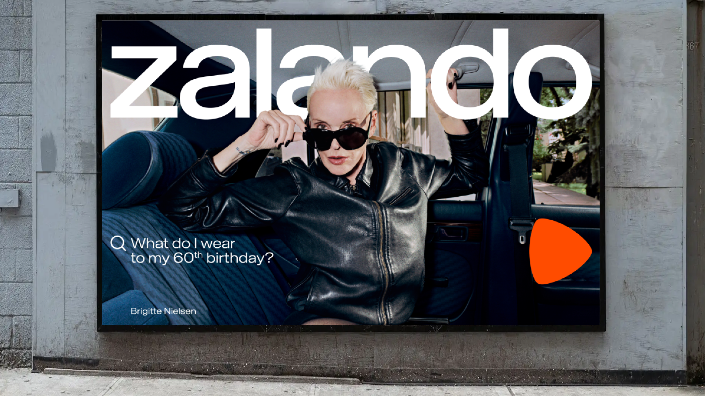
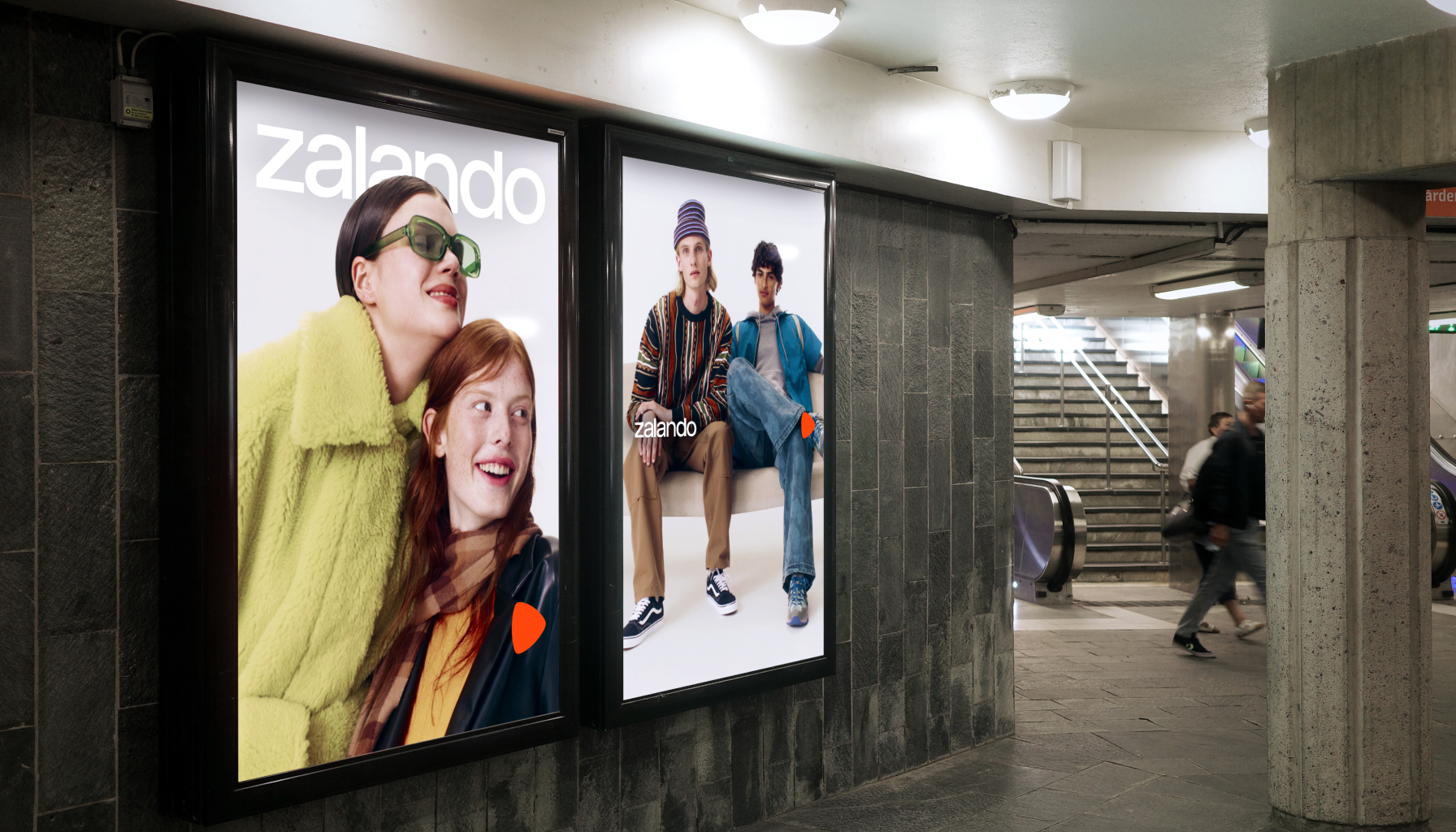
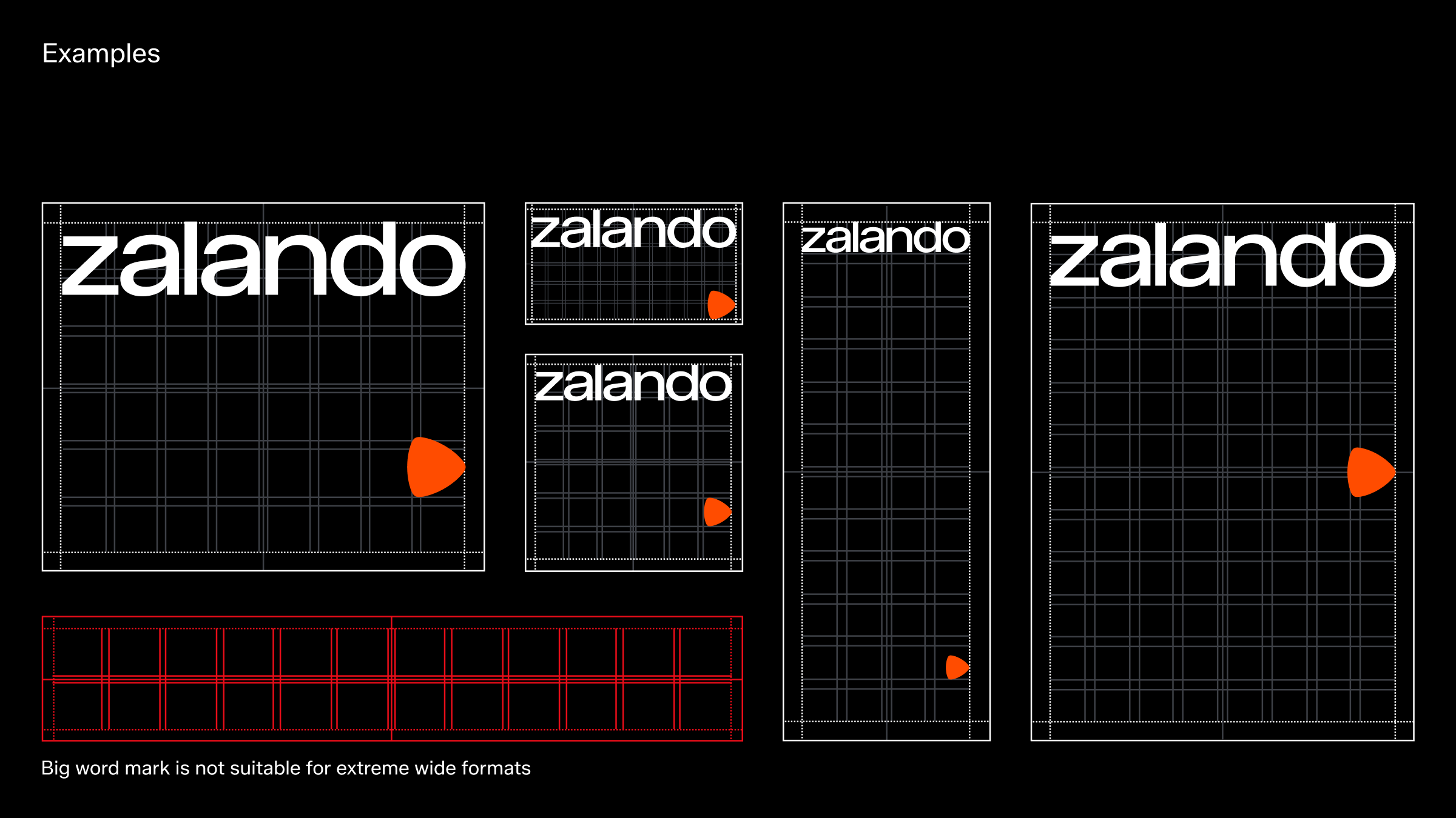
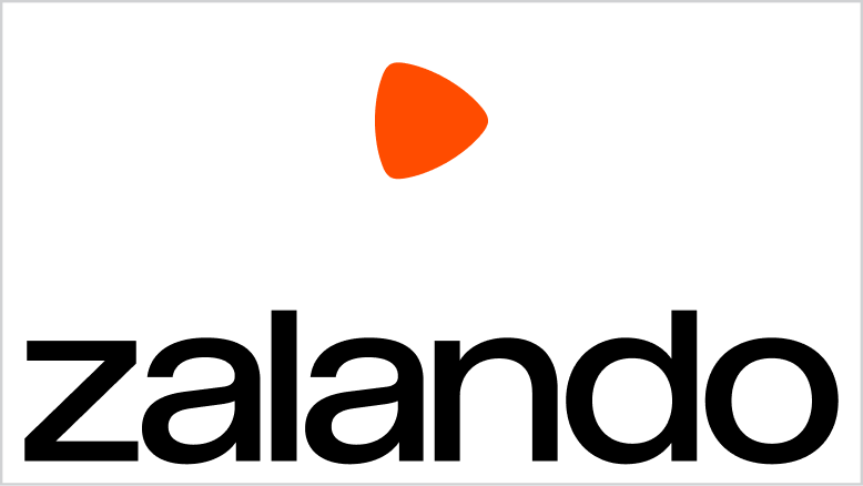
Big word mark
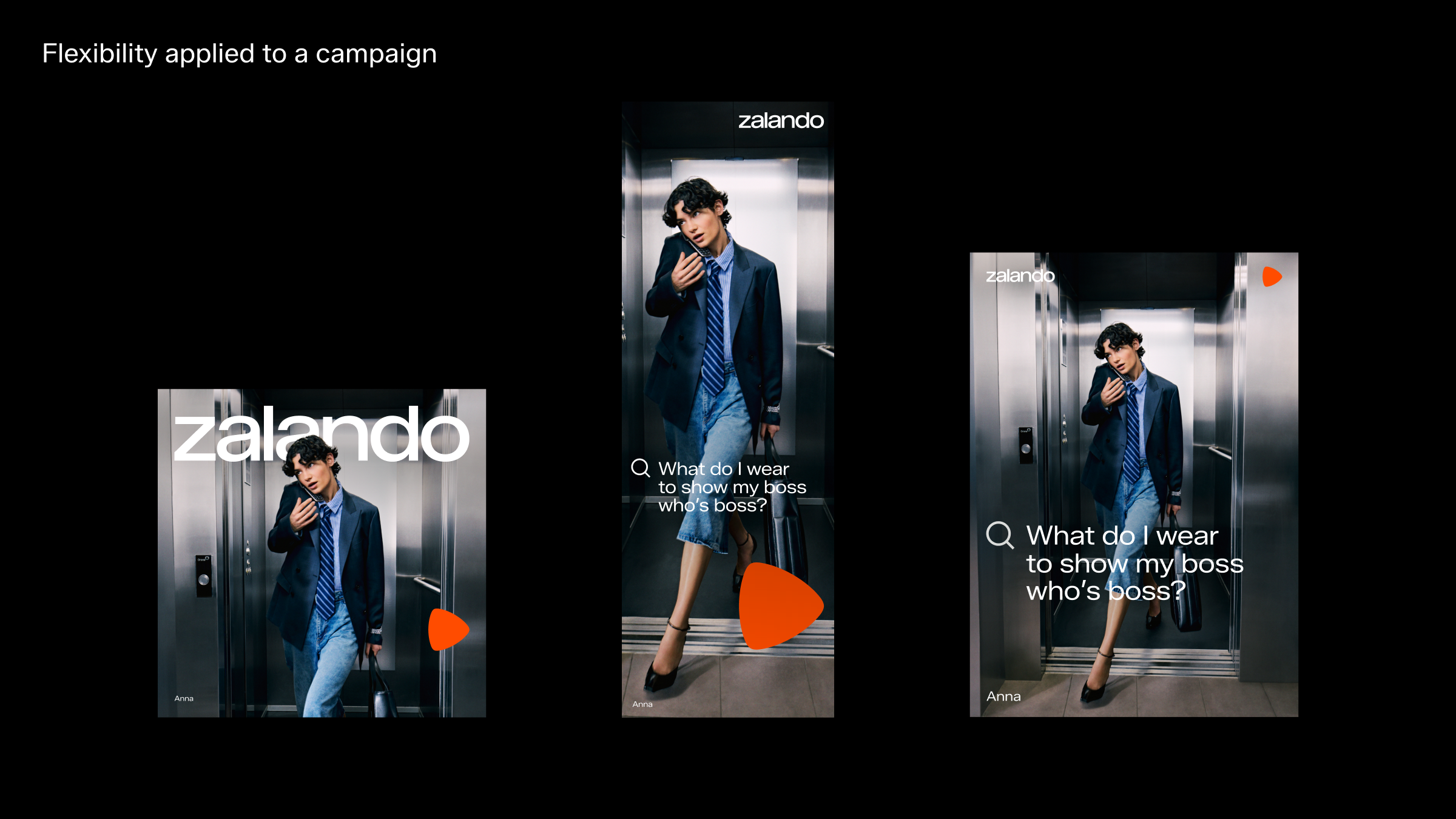
This expression is primarily used for major campaigns in competitive landscapes and in less educated markets where we aim to build brand awareness.
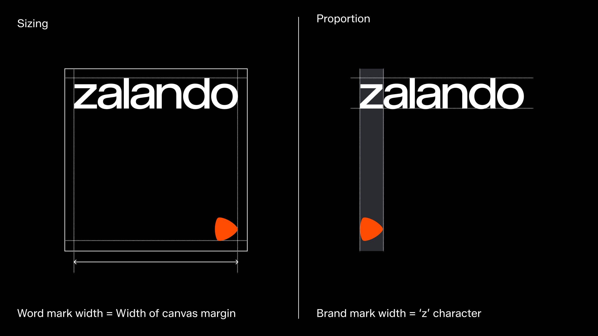
Taking inspiration from editorial content and magazines, this layout features our word mark spanning the entire width of the canvas, whether in landscape or portrait format. The brand mark remains in the background, supporting brand recognition. The minimum size of this logo composition is set by the brand mark's minimum size, which is 24px in height. And in this application, the minimum clear space of the word mark can be waived.
Please note: In order to get optimum balance between the word mark and brand mark, sometimes manual sizing adjustments may be required.
Placement
The default placement for the brand mark is vertically right-aligned with the word mark. Alternative left-alignment is acceptable if more suitable. To avoid interference with background content like photography, alternative placements on the grid is allowed. Our emphasis on whitespace and contrast leads to positioning the brand mark and word mark far apart—one at the top margin and the other at the bottom—creating a clean, modern look that highlights each element distinctly. While this layout ensures clarity and impact, it remains flexible for unique situations.
For legibility reasons, avoid putting content towards the bottom margin when in OOH environments.
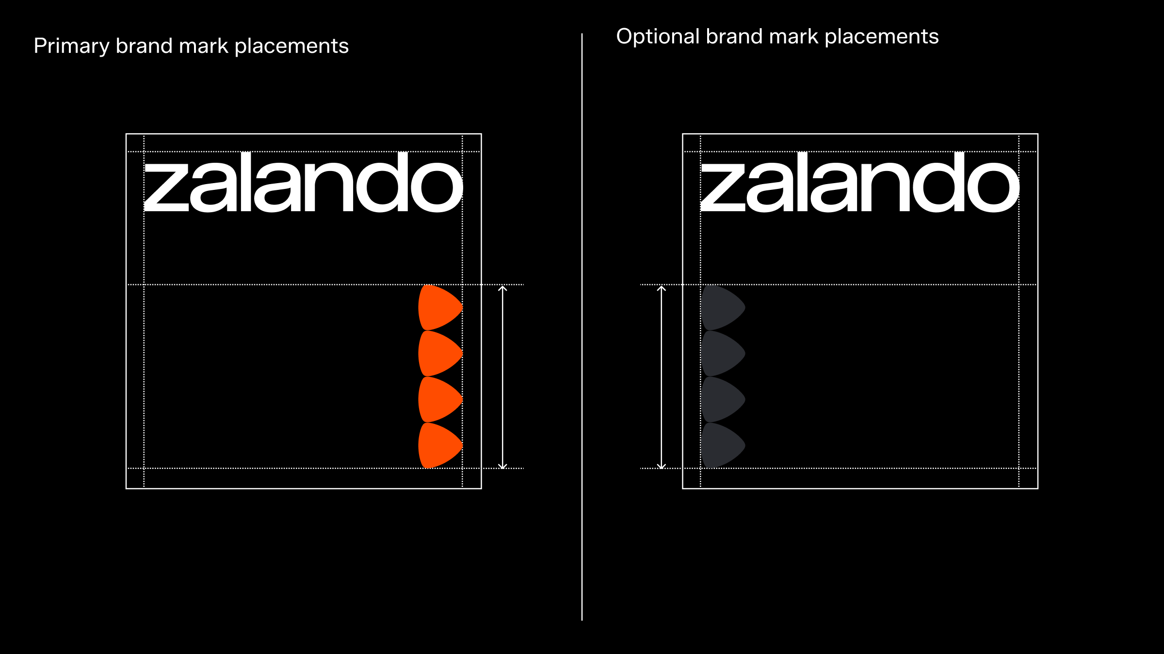
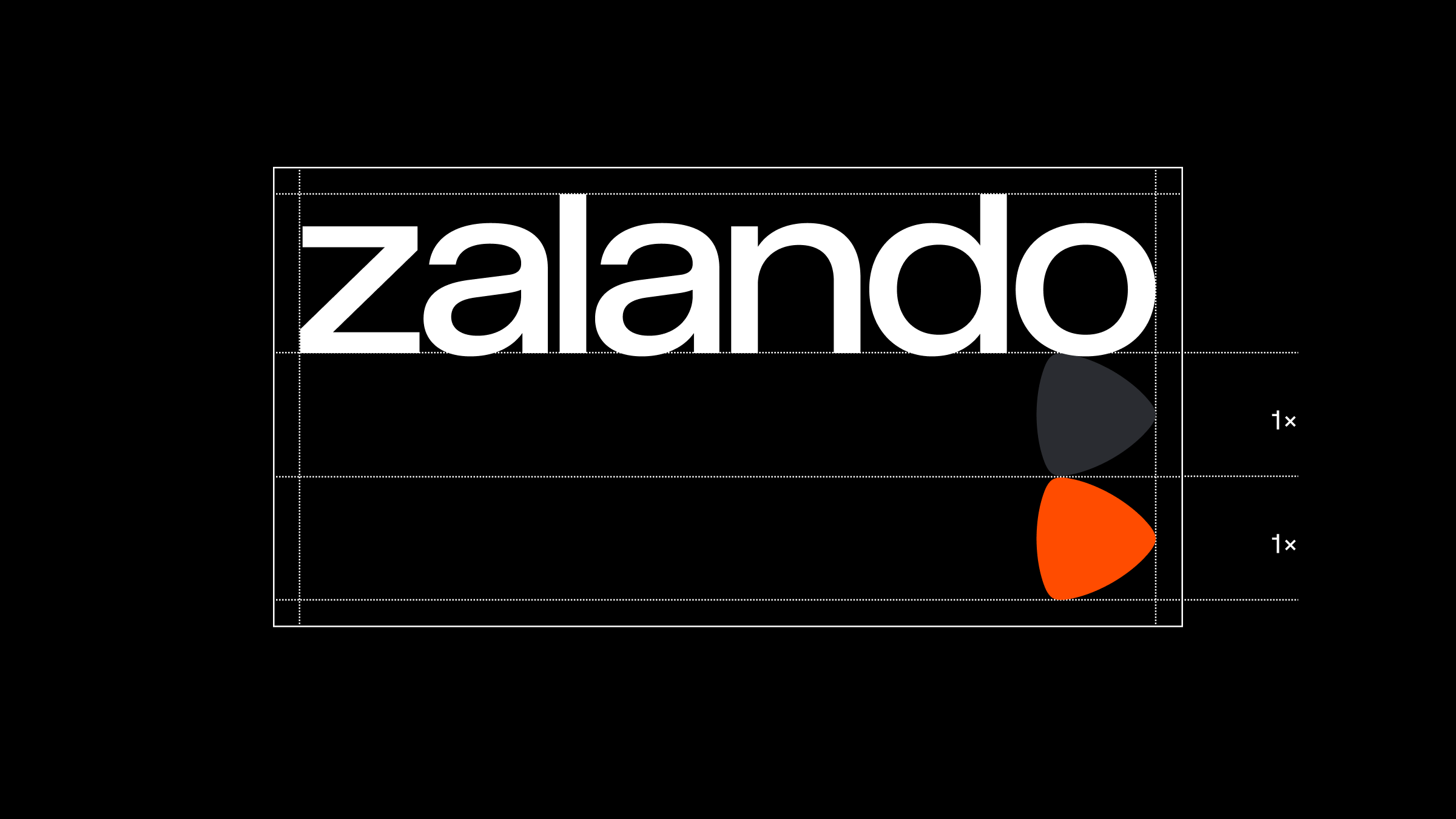
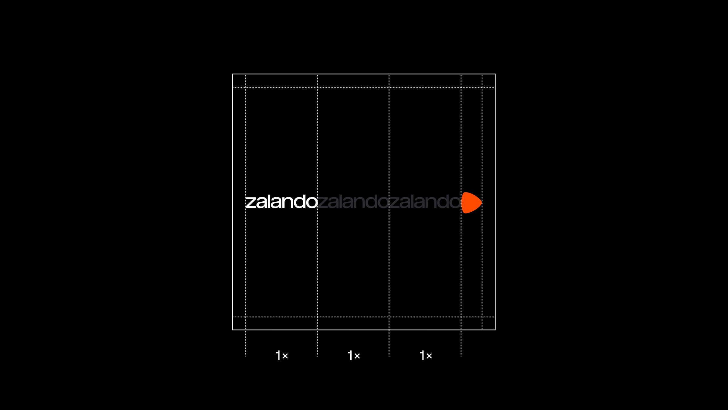
Minimum separation
To ensure both the word mark and brand mark are distinctly highlighted, a minimum separation between them should be considered to avoid competition.
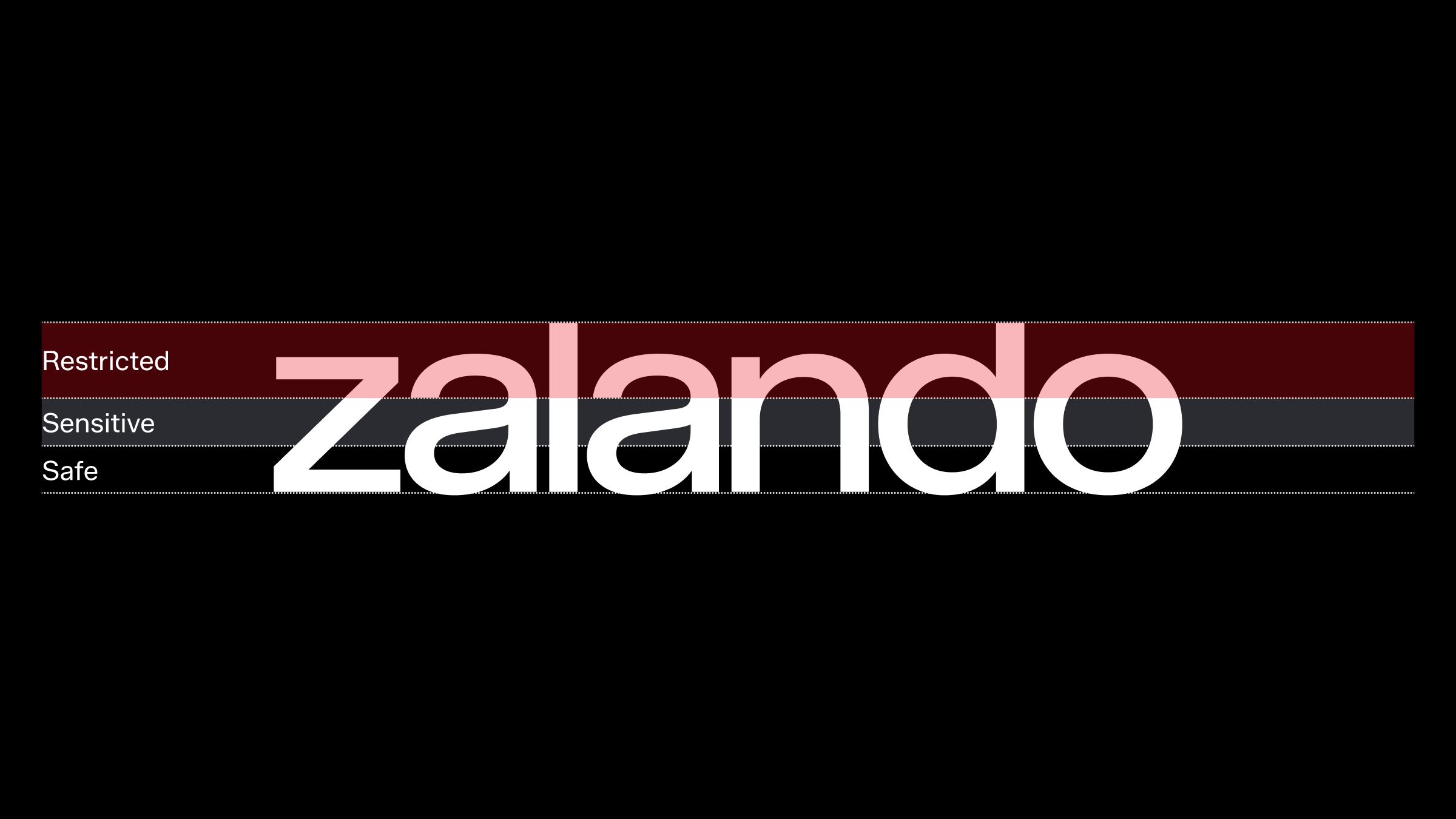
Masthead masking
When utilising a large-scale word mark as a masthead for campaign materials, it is acceptable to obscure a part of the word mark, provided the word remains recognisable and readable.
Avoid covering any specific character; instead, position the covering object between two characters. Refer to the outlined safe and sensitive zones below, along with the provided examples.
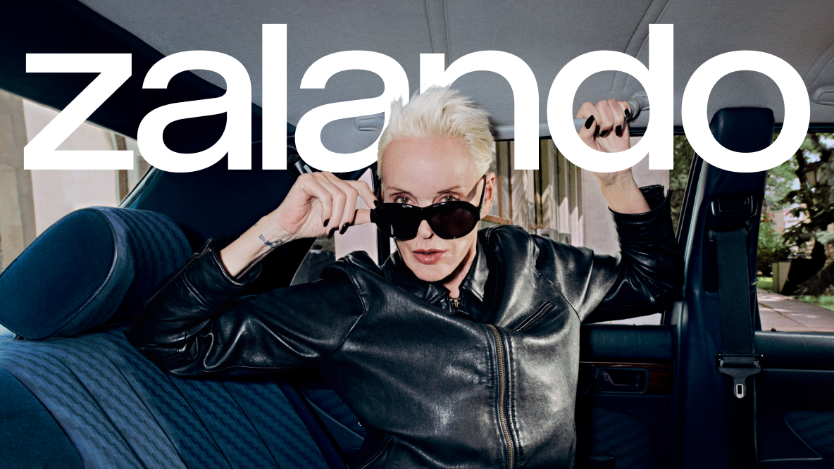
Masthead application in white on image

Masthead application in black on image
Logo misuse
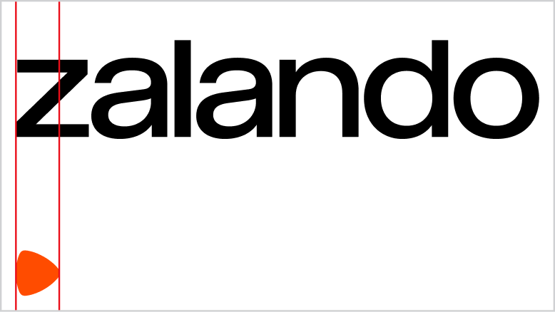
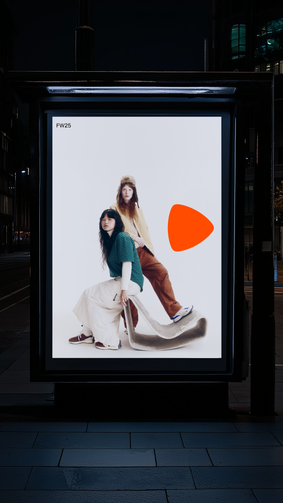
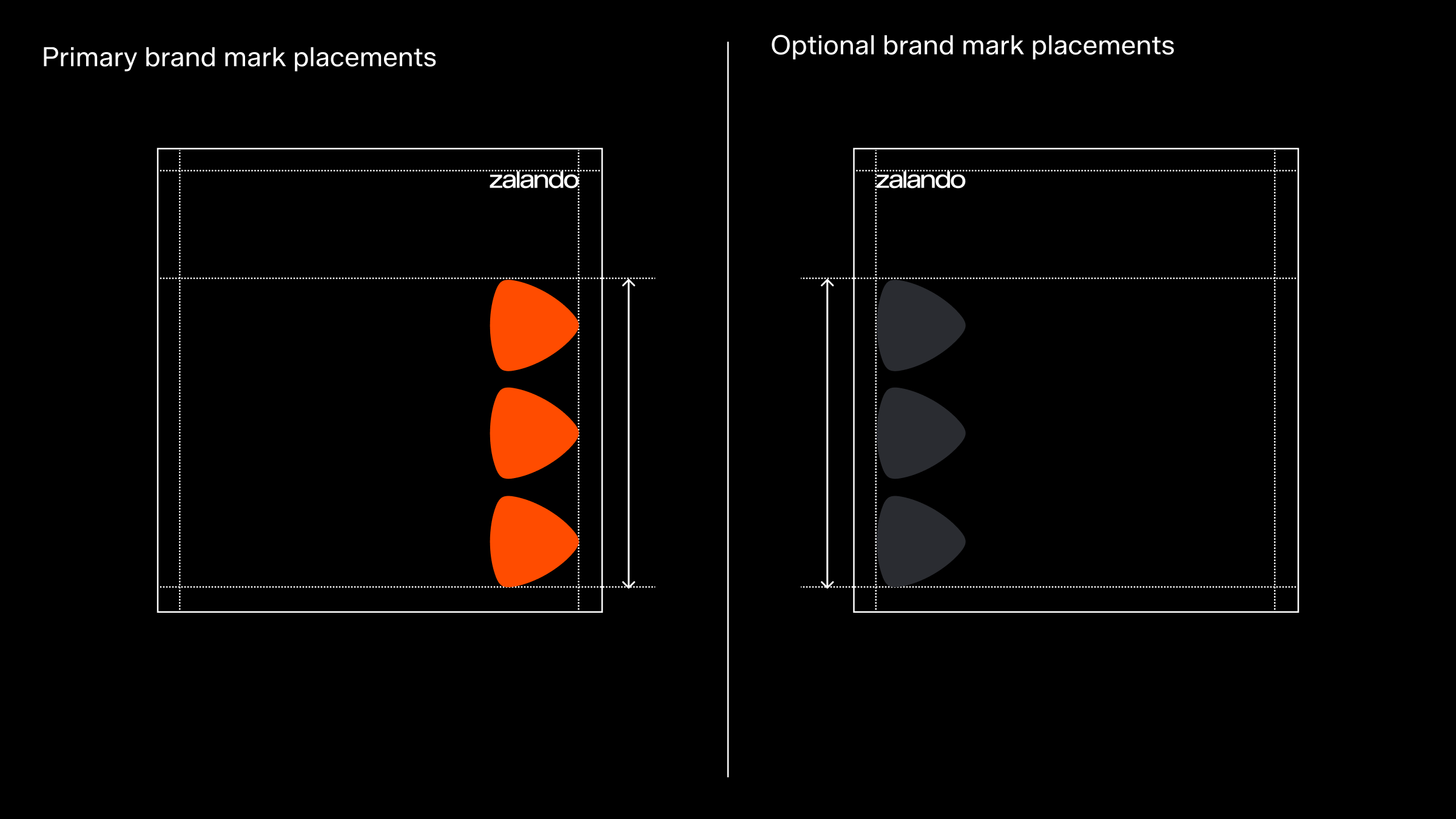
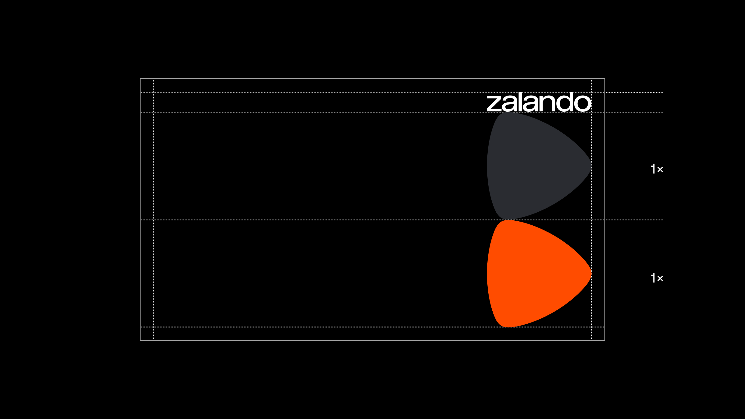
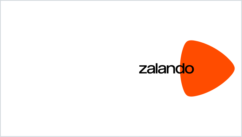
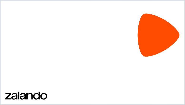
Big brand mark
This is our most playful and disruptive layout, where the brand mark takes center stage and is used most prominently, while the word mark assumes a supportive role and stays in the background. This layout is most suited to be used in more owned markets where brand recognition is already established, allowing us to focus on celebrating our brand mark.
The minimum size of this logo composition is set by the word mark's minimum size, which is 20px in height.
Please note: In order to get optimum balance between the word mark and brand mark, sometimes manual sizing adjustments may be required.
Placement
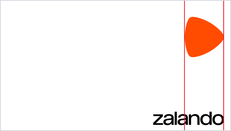
The brand mark is vertically aligned with the word mark and positioned to the right-hand side as a primary setting. Alternative placement to the left is acceptable if more suitable.
To avoid interference with background content like photography, alternative placements are allowed. Our emphasis on whitespace and contrast leads to positioning the brand mark and word mark far apart – one at the top margin and the other at the bottom – creating a clean, modern look that highlights each element distinctly. While this layout ensures clarity and impact, it remains flexible for unique situations.
Avoid putting content towards the bottom margin when in OOH environments for legibility reasons.he word mark assumes a supportive role and stays in the background. This layout is most suited to be used in more owned markets where brand recognition is already established, allowing us to focus on celebrating our brand mark.
The minimum size of this logo composition is set by the word mark's minimum size, which is 20px in height.
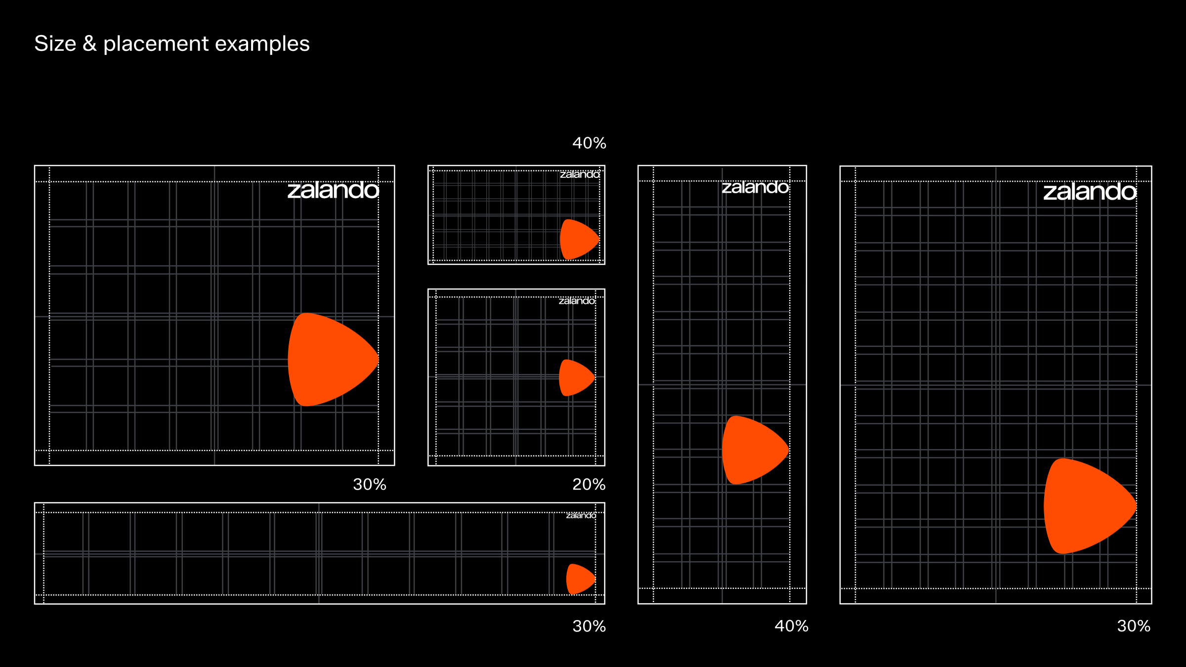
Given the increased size of the brand mark when using this layout, a flexible system is necessary in order to be able to adapt to various images and motifs.
Minimum separation
To ensure both the word mark and brand mark are distinctly highlighted, a minimum separation between them should be considered to avoid competition.
Logo misuse
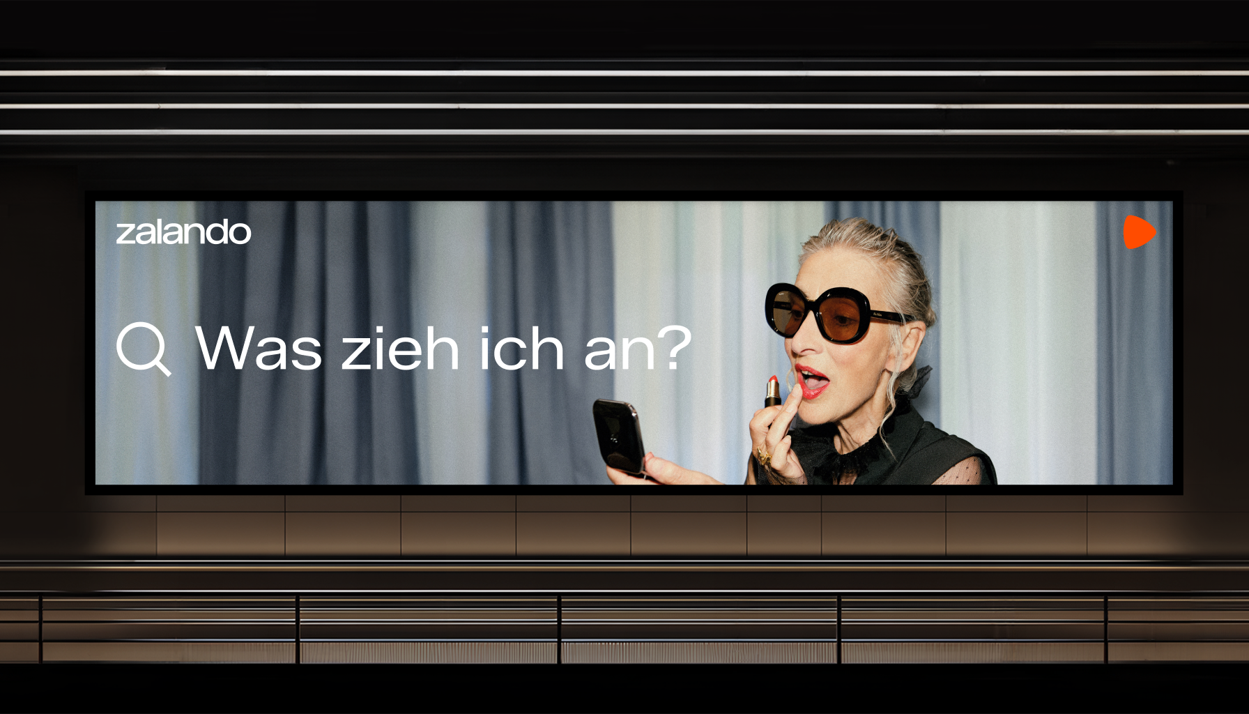
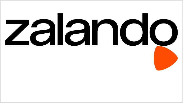
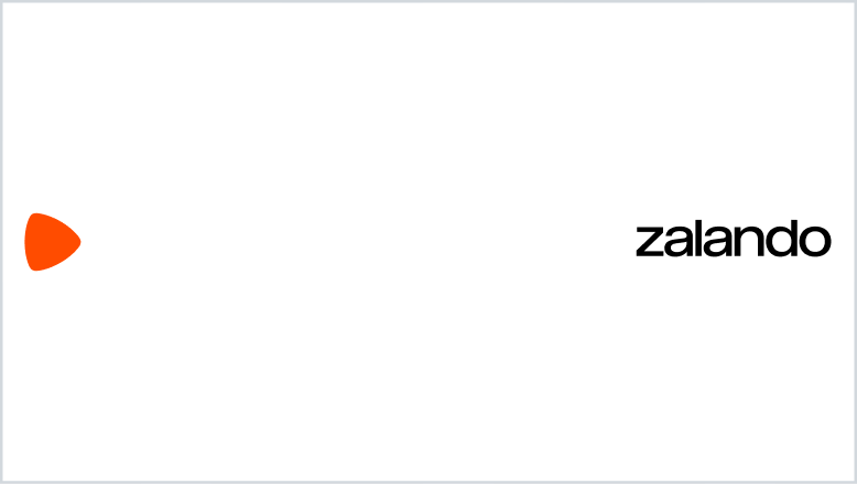
Equal weight
In this layout, the brand mark and word mark are used in harmonious proportion and placed in line with each other. They are displayed in a smaller size, allowing the messaging or other content to take centre stage on the canvas. This approach provides equal weight for specific communication, particularly effective message led campaigns or for corporate presentations and documents.
When using this layout, our brand mark should always be placed to the left of our word mark.
The minimum size of this logo composition is set by the word mark's minimum size, which is 20px/5mm in height.
Please note: In order to get optimum balance between the word mark and brand mark, sometimes manual sizing adjustments may be required.
Placement
Always ensure the brand mark is consistently aligned with the right margin, while the word mark aligns with the left margin.
To avoid interference with background content like photography, alternative placements are allowed. Our emphasis on whitespace and contrast leads to positioning the brand mark and word mark far apart.
For legibility reasons, avoid putting content towards the bottom margin when in OOH environments.
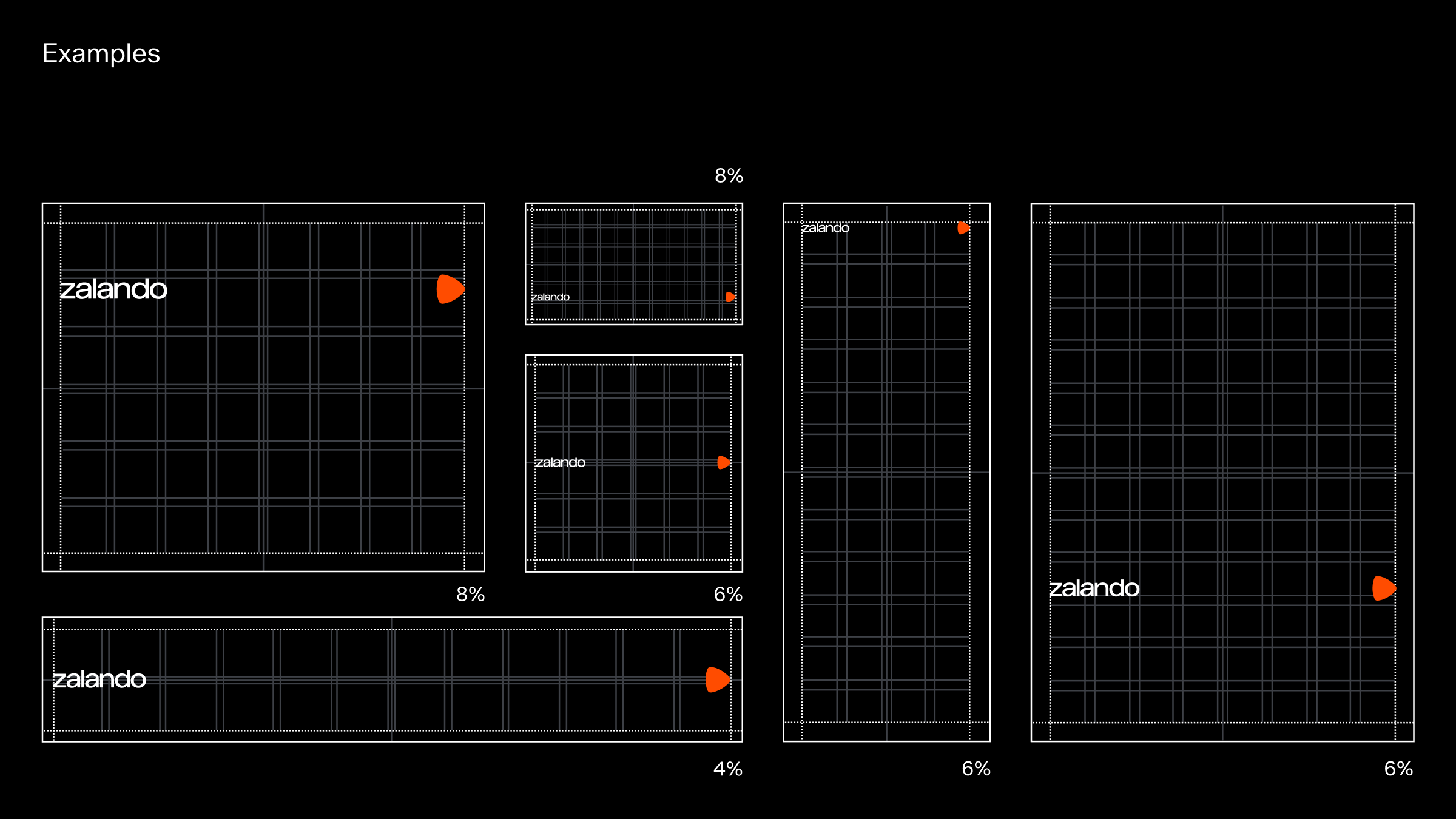
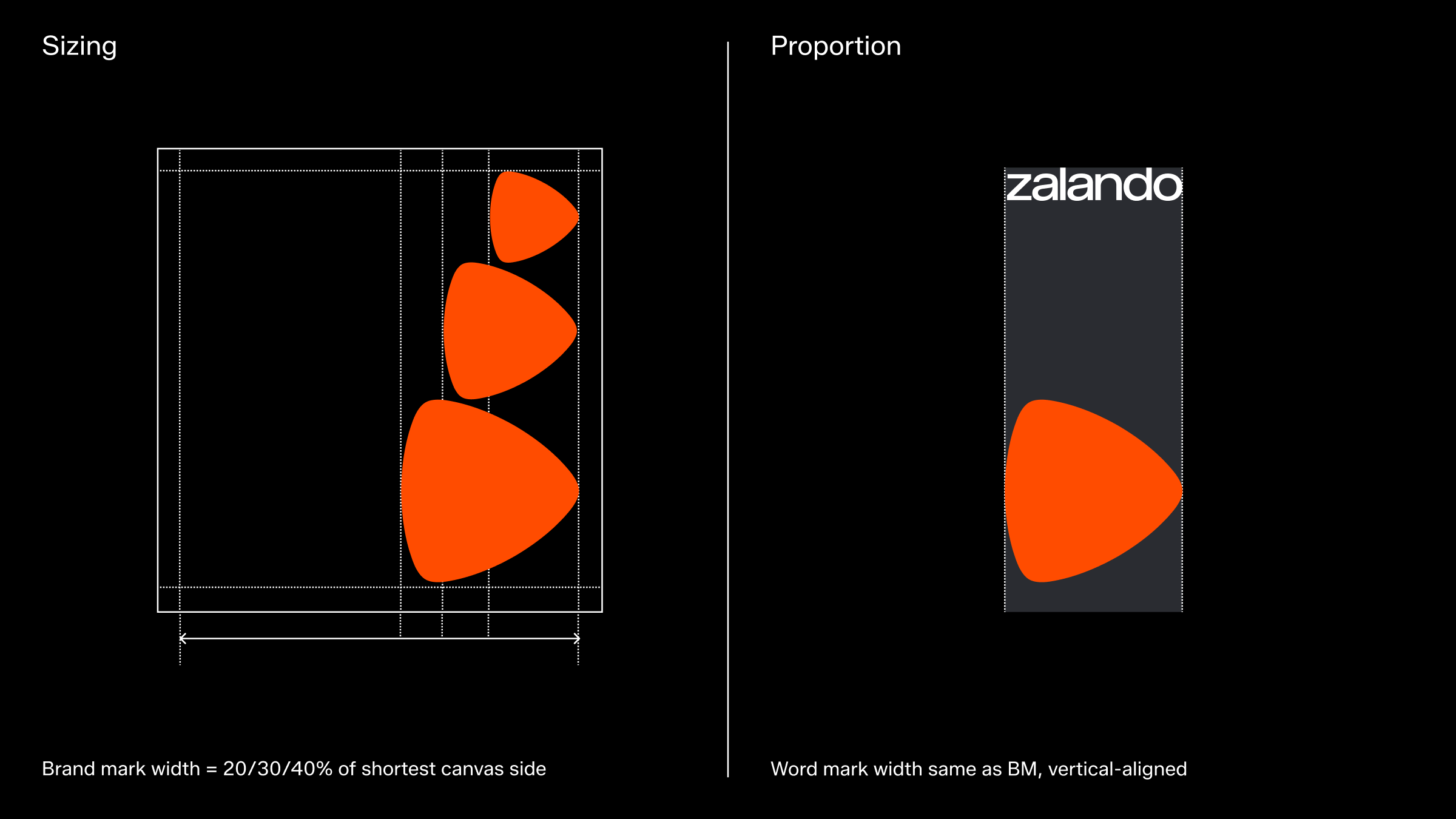
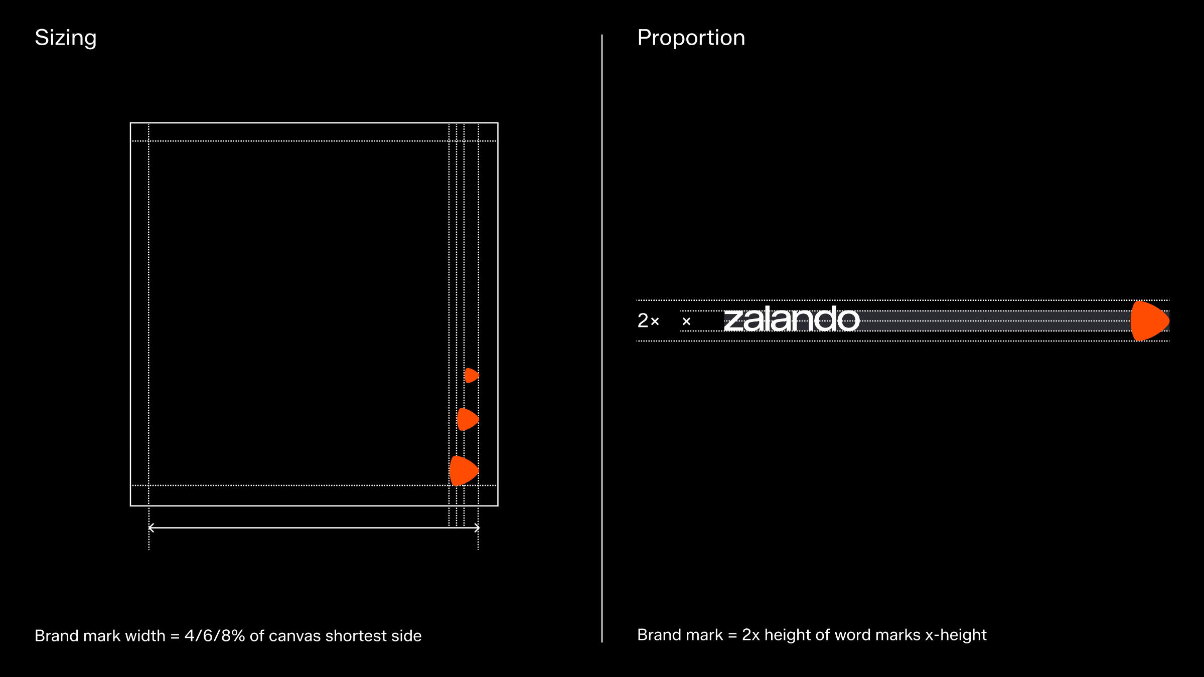
The example above shows the approved size ratios as percentages relative to the shortest side of the canvas.
Minimum separation
To clearly emphasise both the word mark and brand mark, ensure there is sufficient separation between them to avoid visual competition and prevent them from appearing as a lock-up.
Logo misuse
Work mark standalone
In specific applications where only one element can be used, the word mark is prioritised. This choice ensures clarity and recognition by clearly communicating the full company name. Additionally, the pronounceability of the word mark aids in verbal communication, reinforcing brand recall.
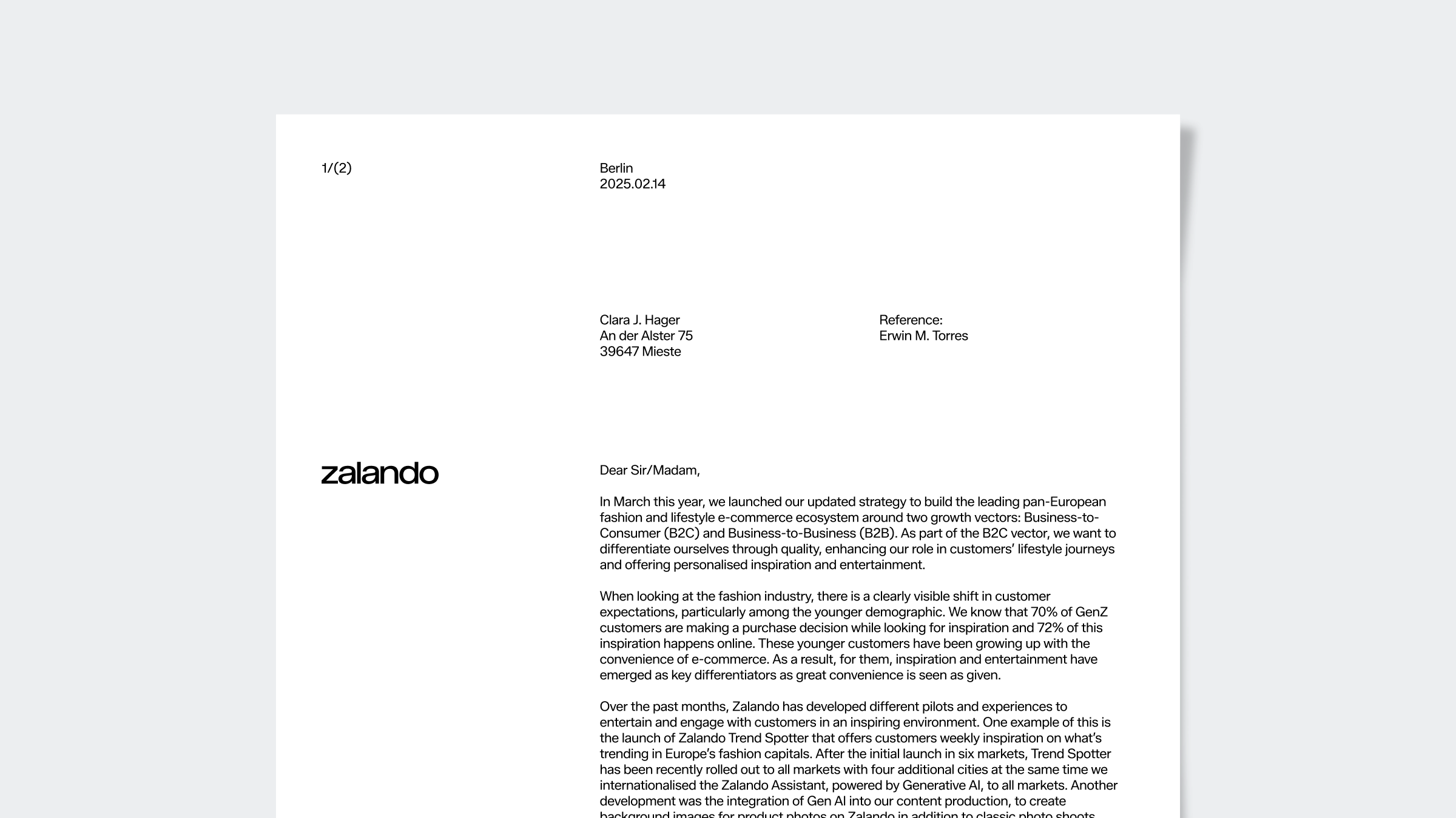
Example of work mark standalone usage on letterhead
Placement and sizing
For standalone usage, the word mark should always align with either the left or right margin, and its size should initially correspond to the column width.
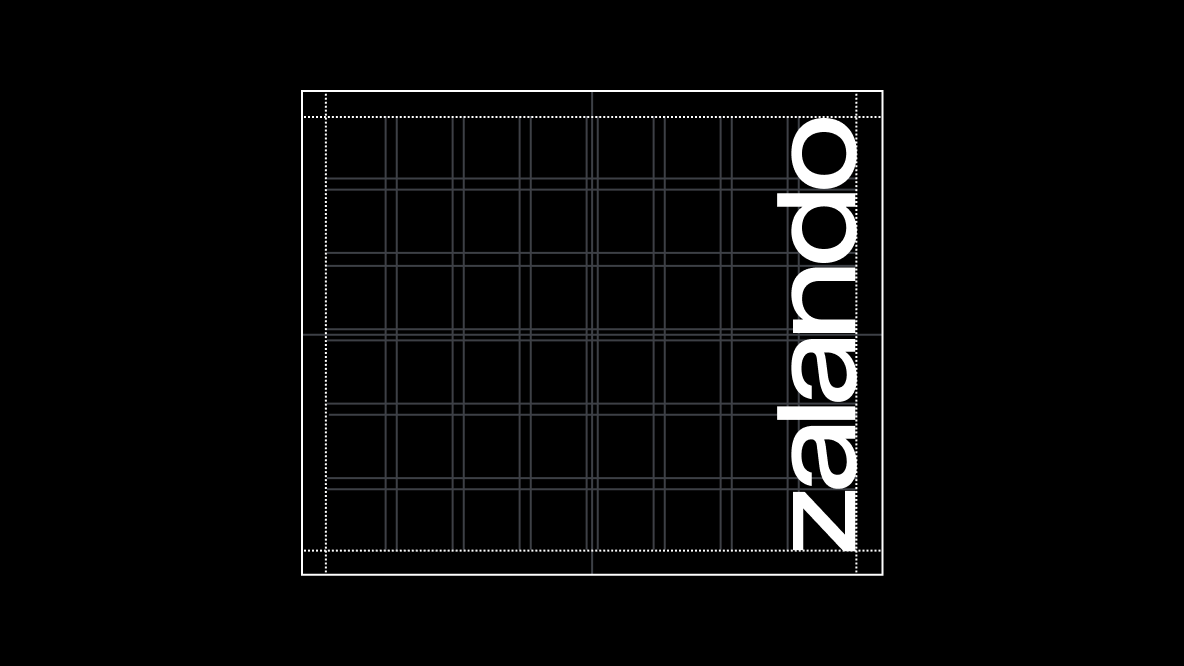
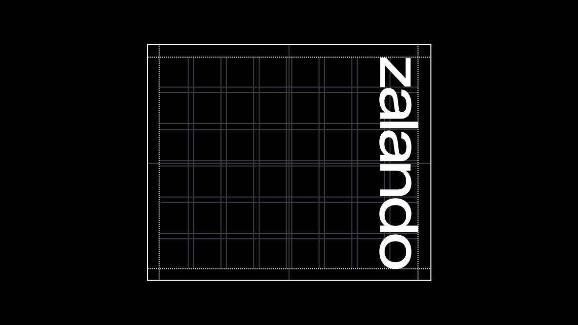
Vertical alignment
When applying the word mark in a vertical orientation with the logo rotated counterclockwise, ensure to use the European standard as exemplified below.
In use