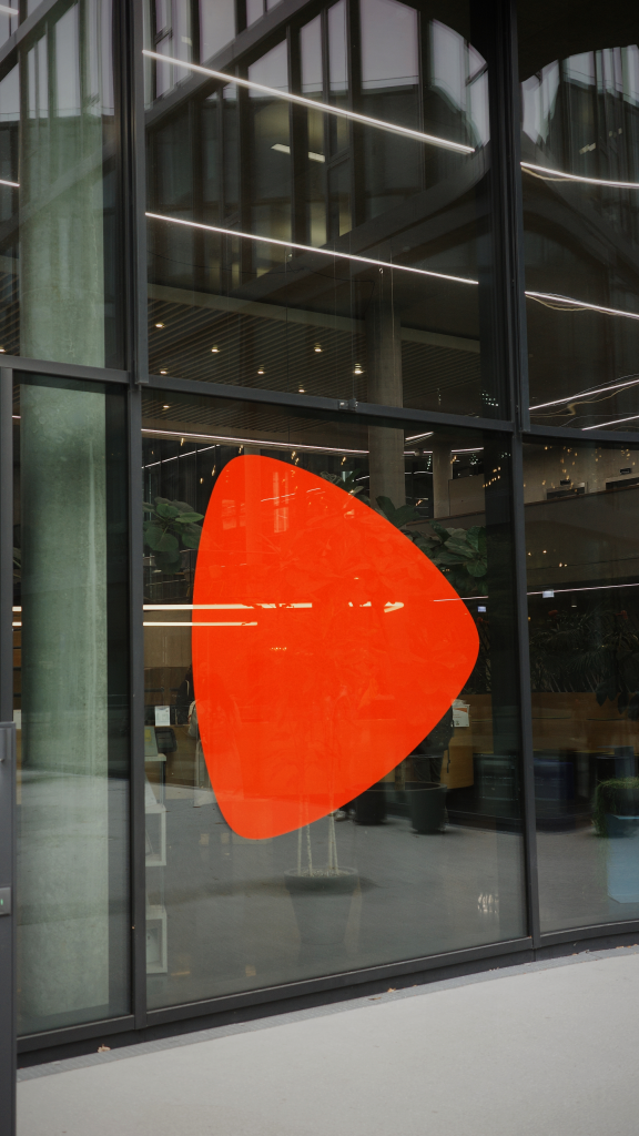
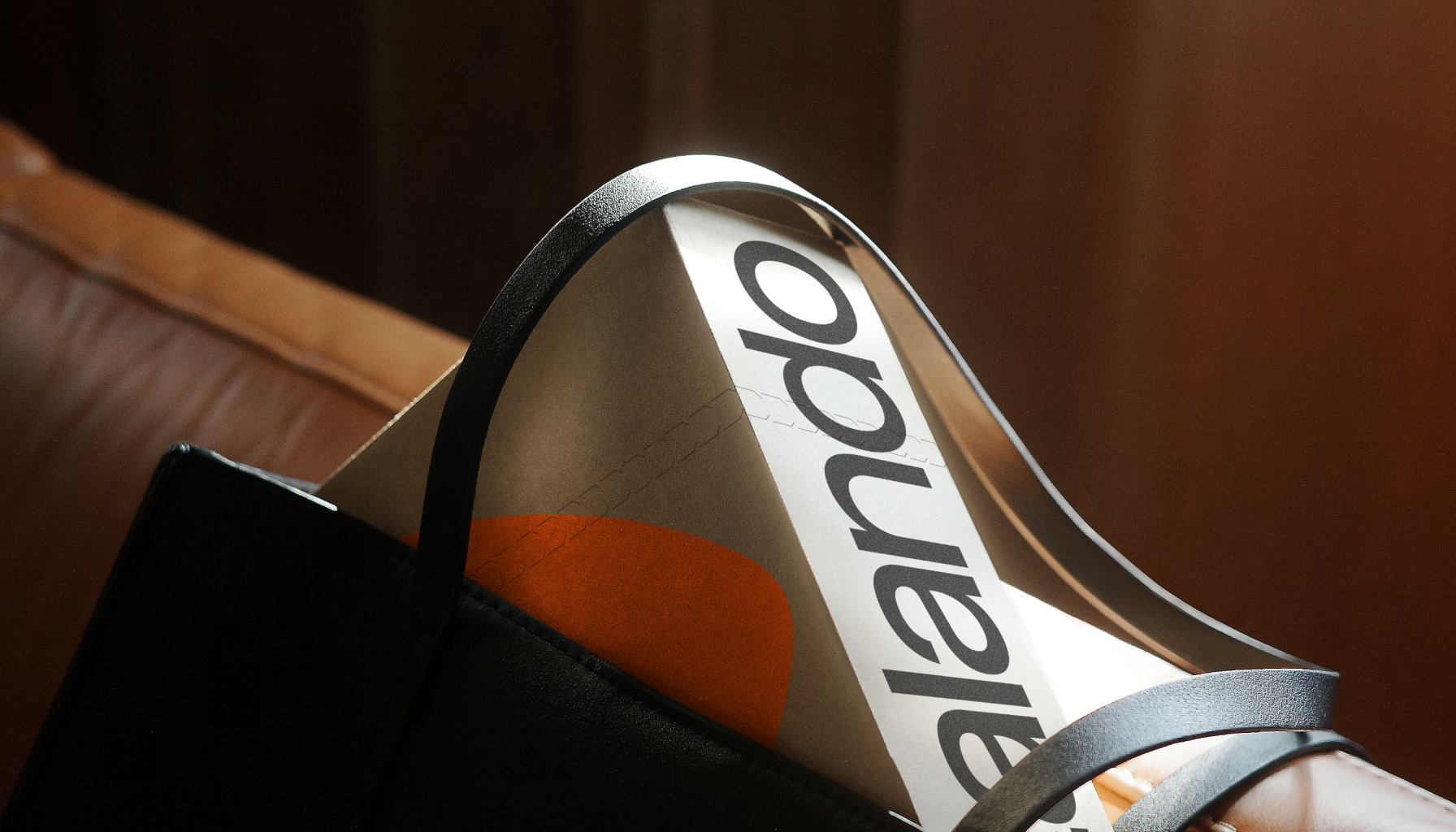
Brand mark
The Zalando ‘Play button’ is an iconic symbol closely associated with our brand. Since its inception, it has been a proud and integral part of our identity. Its vibrant orange colour, adaptable large-scale treatments and dynamic motion effects, bringing it to life in exciting new ways.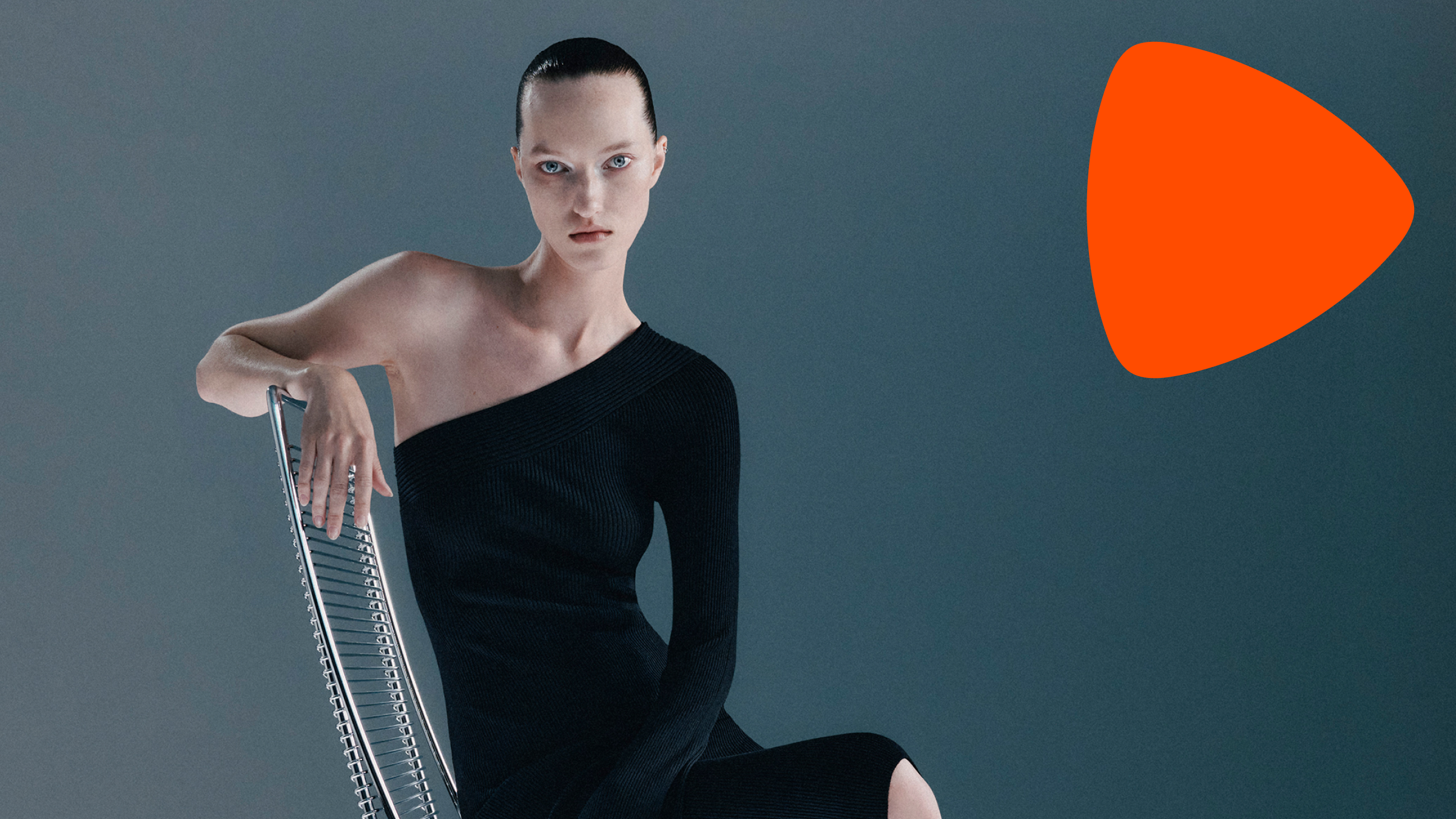
Colour version
The Zalando brand mark should always be used in Zalando orange, regardless of background or motif. It must be applied consistently and should never be altered, stretched or modified in any way.
When the brand mark in Zalando orange is restricted due to technical limitations, such as printing issues, use the word mark in black or white instead.


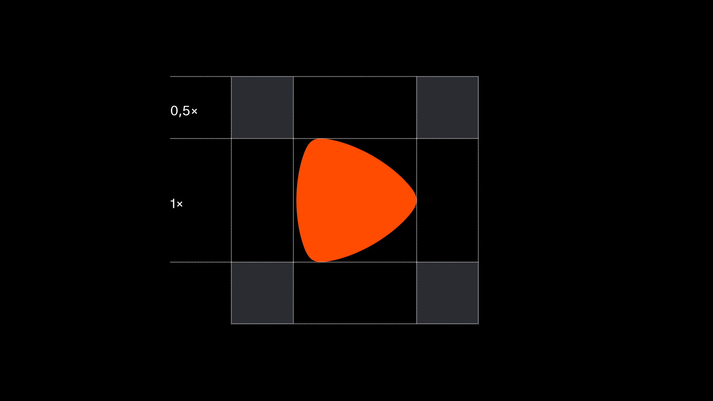
Clear space
The Zalando brand mark should always be surrounded by sufficient clear space in order to appear as clear and distinct as possible. The clear space is based on 1/2 of the height of the brand mark. This measurement is the minimum space allowed around the symbol and should always be applied in all instances. It is important to point out that the defined clear space is minimum, however it is of course allowed and recommended to go above this in order to create clear and consistent designs.
Contrast
To ensure the integrity and visibility of our brand mark, it is crucial that it always maintains sufficient contrast against its background. Whether it is displayed on digital screens, printed materials or physical products, it should stand out distinctly, ensuring that its shape remains clear and well-defined at all times. Proper contrast not only enhances the aesthetic appeal but also reinforces brand recognition and consistency, making our mark instantly recognizable and memorable to our audiences.
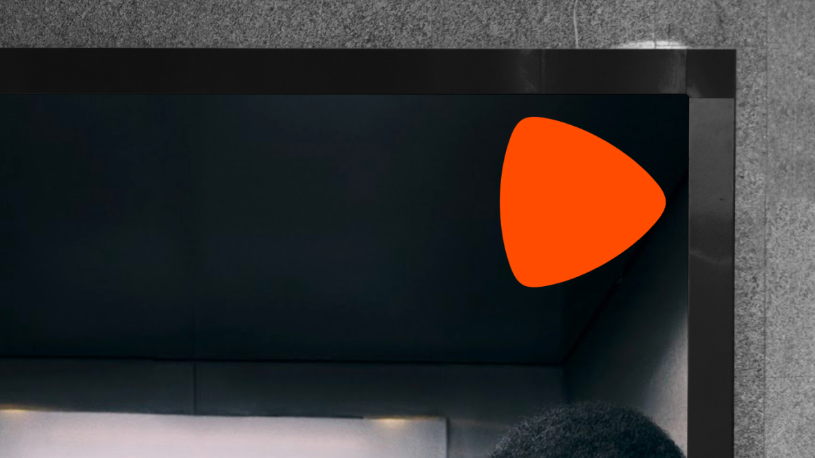
High contrast on dark background

High contrast on light background
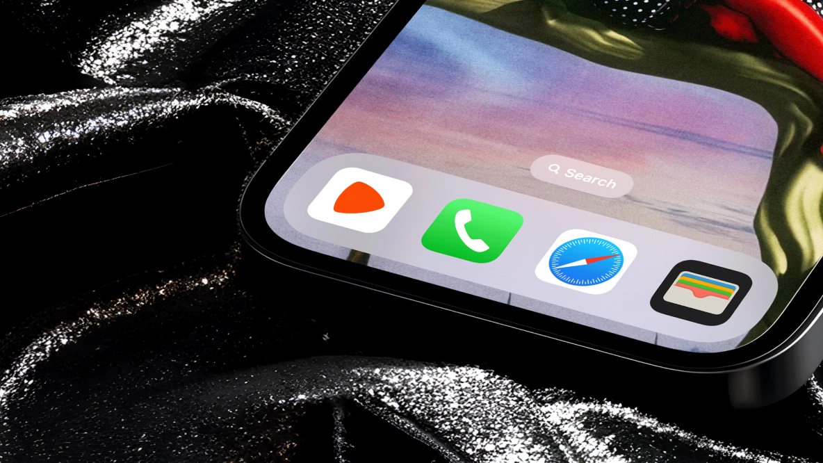
Avatars
Our brand mark for social media avatars, app icons, and favicon adheres to our defined clear space parameters. To ensure a harmonious composition, it has been optically fine-tuned and subtly shifted to the right, creating a more visually balanced appearance. Our mark’s default usage is in our primary Zalando orange, set against a white background. When/where this is not possible, an alternative black background may be used.
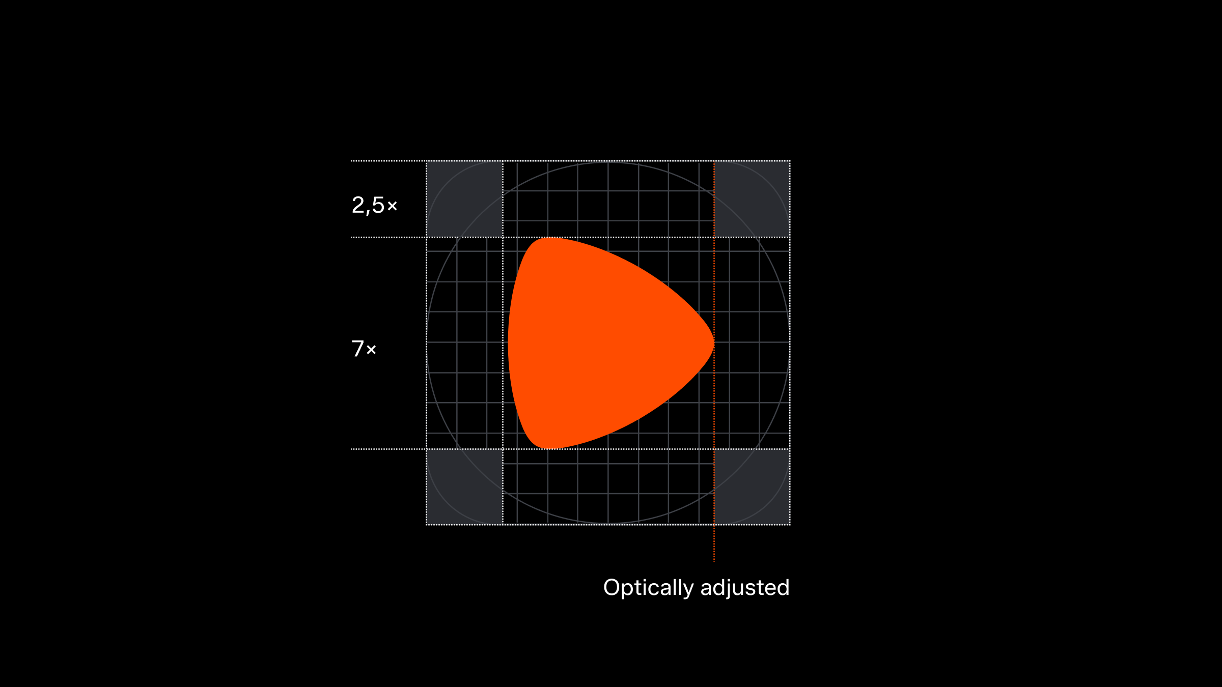
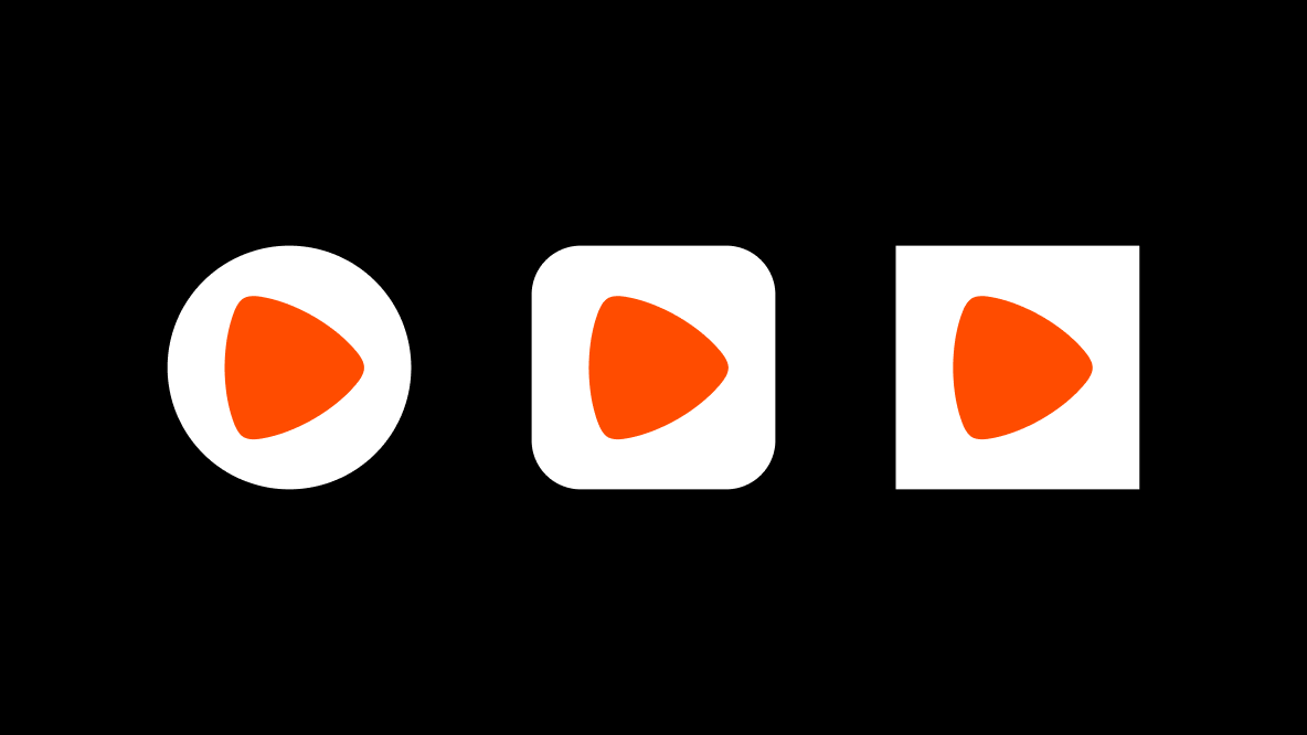
Default
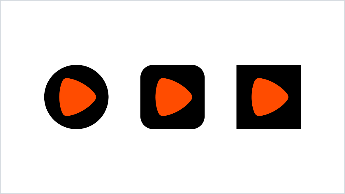
Alternative
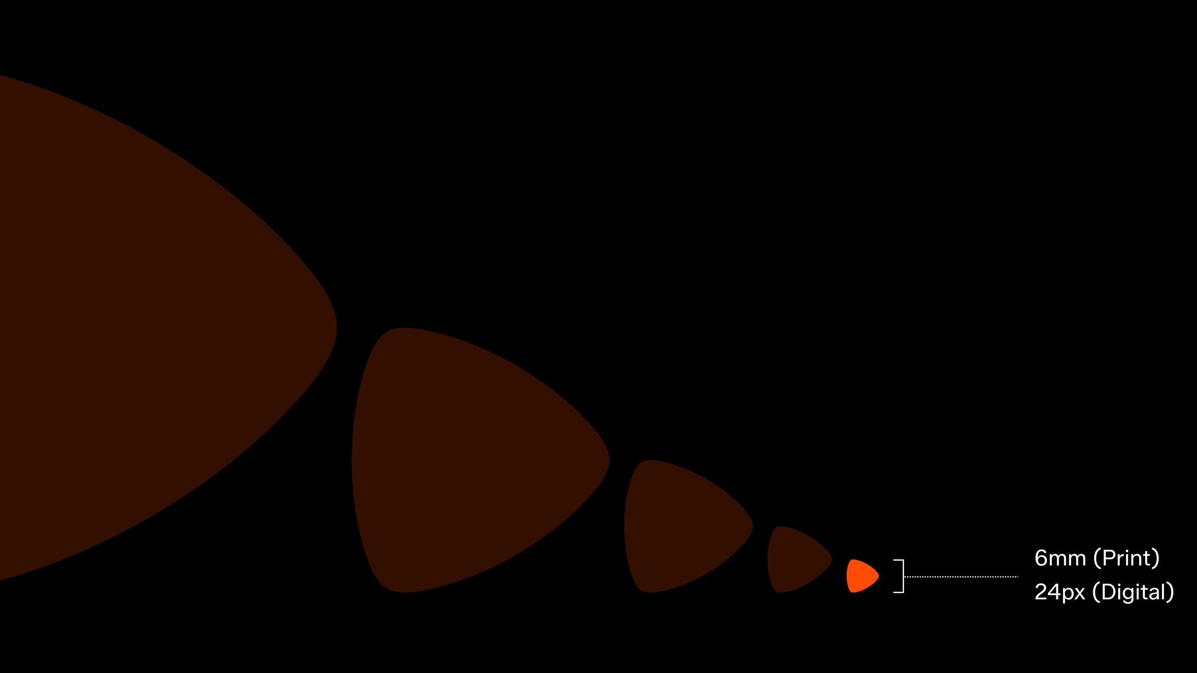
Minimum size
The minimum approved size for our brand mark is 24 pixels in height, reserved for instances where technical constraints apply. However, our brand mark is a key asset and should be given ample space and focus whenever possible. Showcasing it prominently reinforces its significance and enhances our brand's visibility.
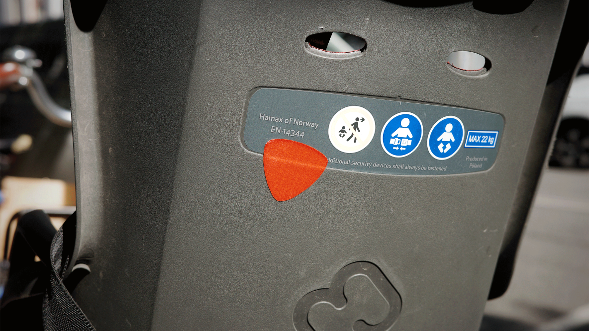
In use