Grid system
Attitude through grid
The grid system is the foundation of our brand identity, serving as our most powerful tool. Though invisible to the consumer, it enables us to create a recognisable and structured presence across all applications.
To maintain consistency in our visual identity, a cohesive yet flexible grid system is essential. It supports us in tailoring layouts to diverse audiences and contexts. Aligning each element to the grid ensures a harmonious and balanced design, reinforcing our brand's strength and clarity.
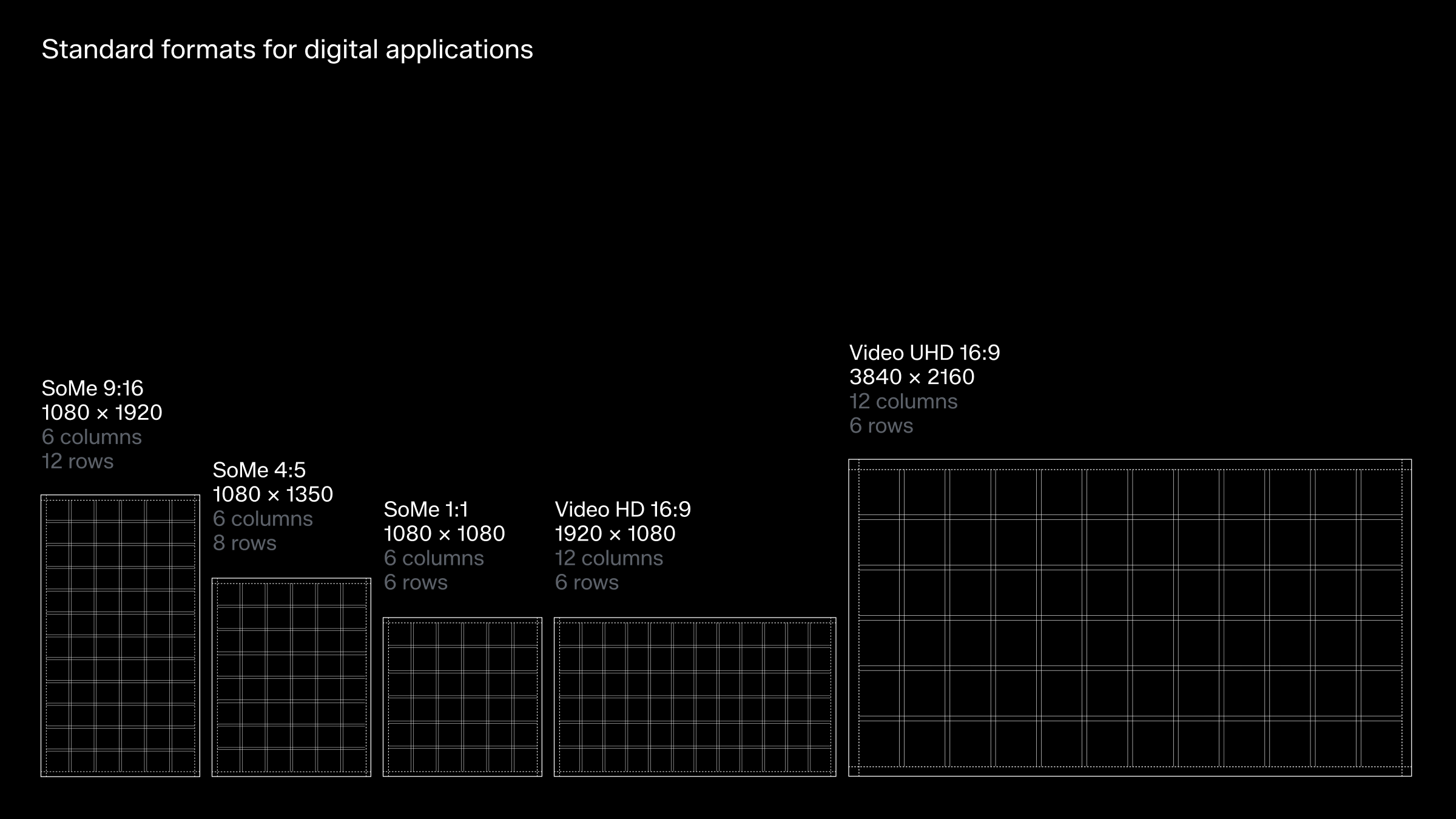
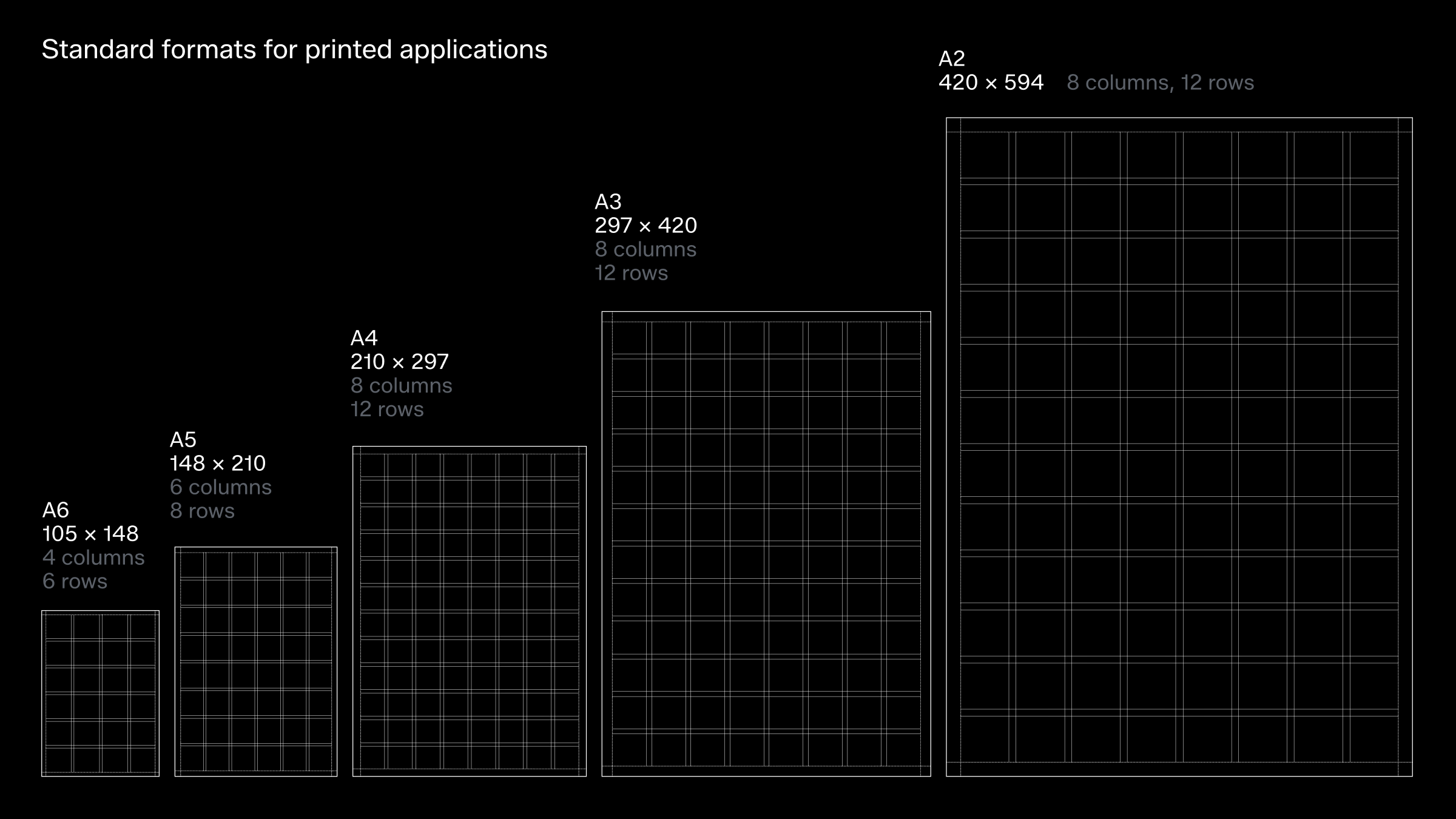
Grids for standard formats
Our golden rule for margins is straightforward: keep them tight. Tight margins reflect the bold attitude of our brand, complemented by a purposeful and simple grid system.
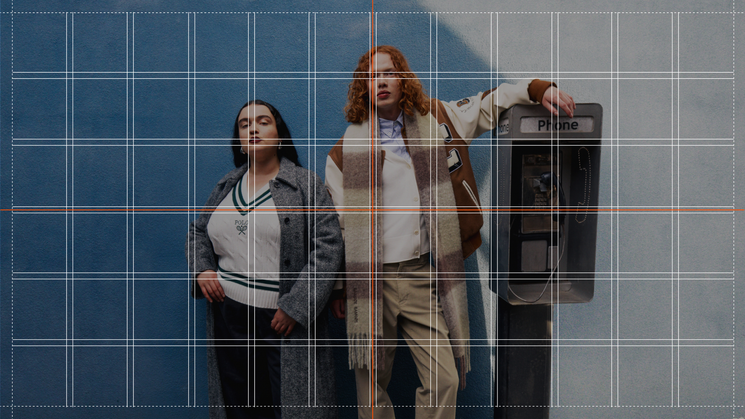
Below, you'll find predefined grids for standard formats, designed for versatility and featuring a centre cross for effortless vertical and horizontal alignment.
Our grid system use increments of two for both columns and rows, aiming for a grid box aspect ratio as close to 1:1 as possible. This approach ensures smooth transitions between portrait and landscape formats, maintaining consistency across orientations.
Grid setup for extreme formats
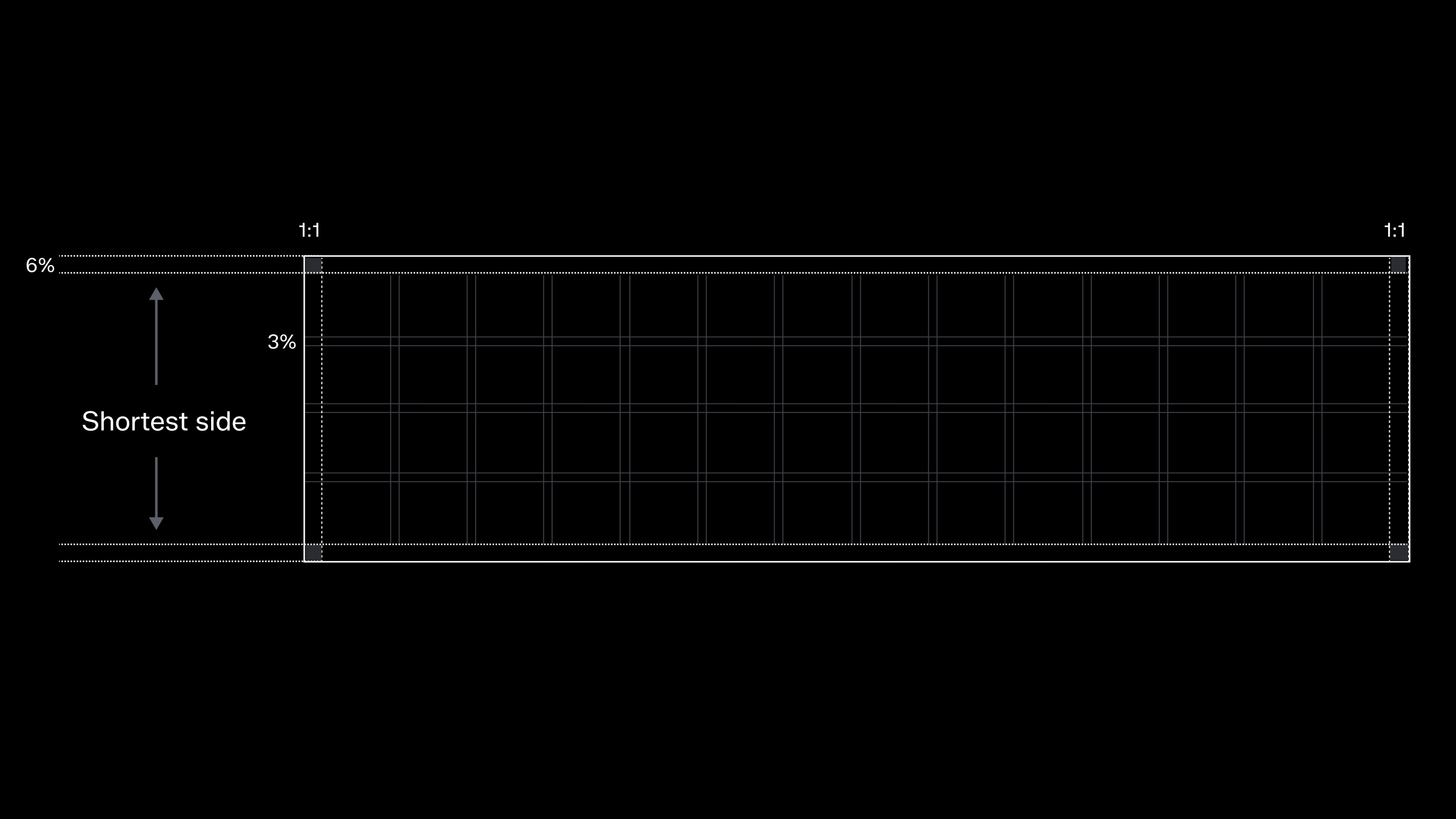
A format is considered extreme if its aspect ratio equals or exceeds 1:3 or 3:1, meaning the width is three times the height or vice versa. These elongated or compressed layouts require special design attention to maintain a cohesive look.
For such formats, set the margin to 10% of the shortest side and the gutters to half that margin. Use increments of two for both columns and rows, aiming for a grid box as close to a 1:1 aspect ratio as possible. This helps ensure smooth transitions between portrait and landscape orientations for consistency.
When designing a grid for a custom format, refer to our predefined grids for standard formats and aim to match their grid density.
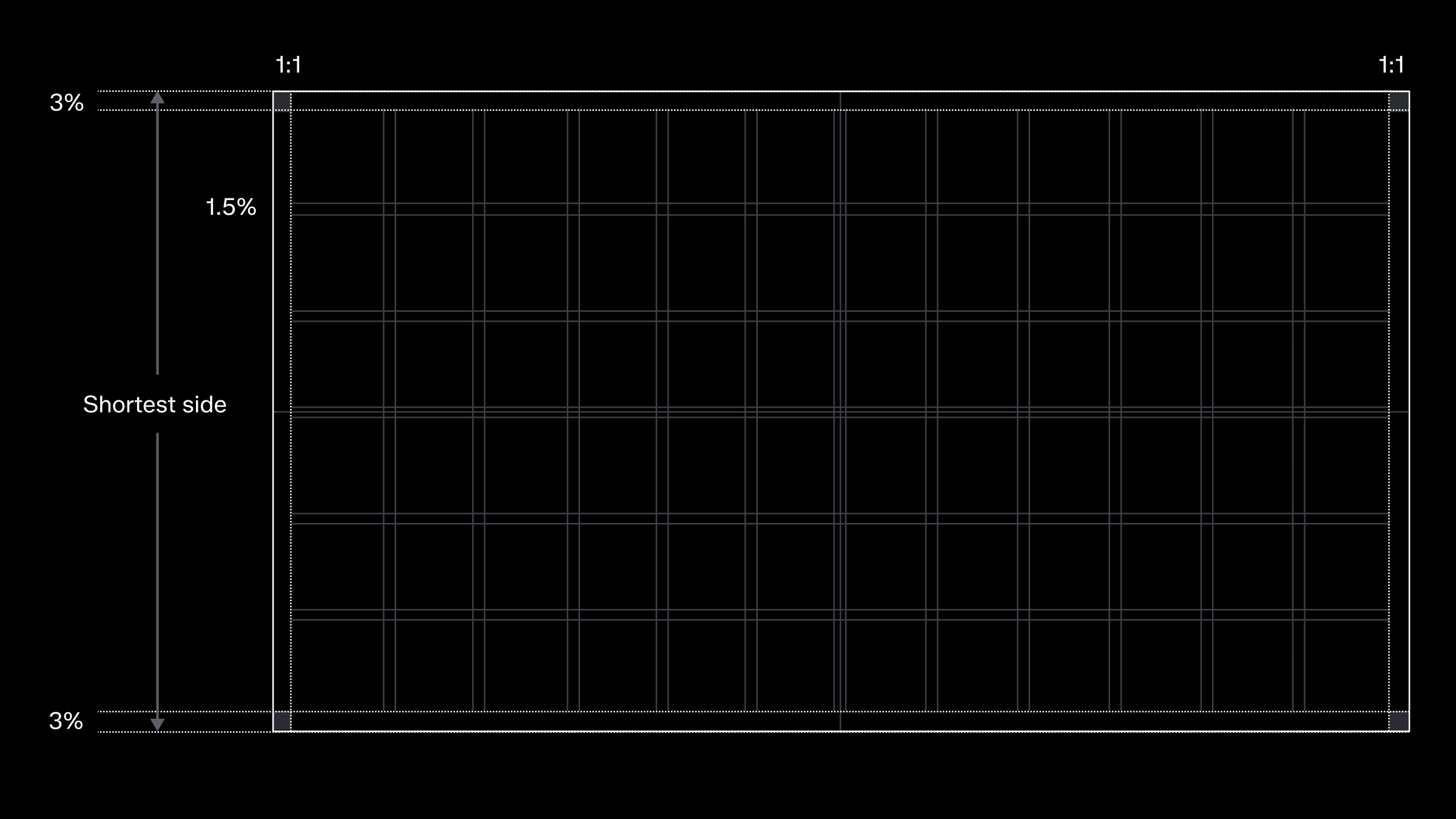
Grid setup for custom formats
To create a consistent grid across materials, start by setting the margin to 3% of the canvas’s shortest side, with gutters at half that margin.
For flexibility, use increments of two for both columns and rows, aiming for a grid box aspect ratio as close to 1:1 as possible. This approach ensures smooth transitions between portrait and landscape formats, maintaining consistency across orientations.
When creating a grid for a custom format, refer to our predefined grids for standard formats and aim for a comparable grid density.
Logo and text alignment
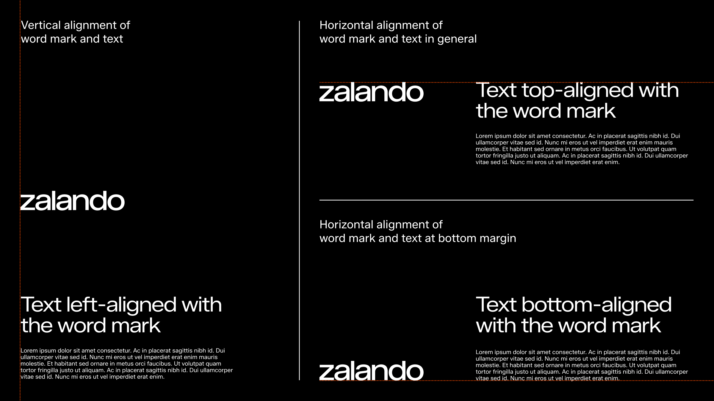
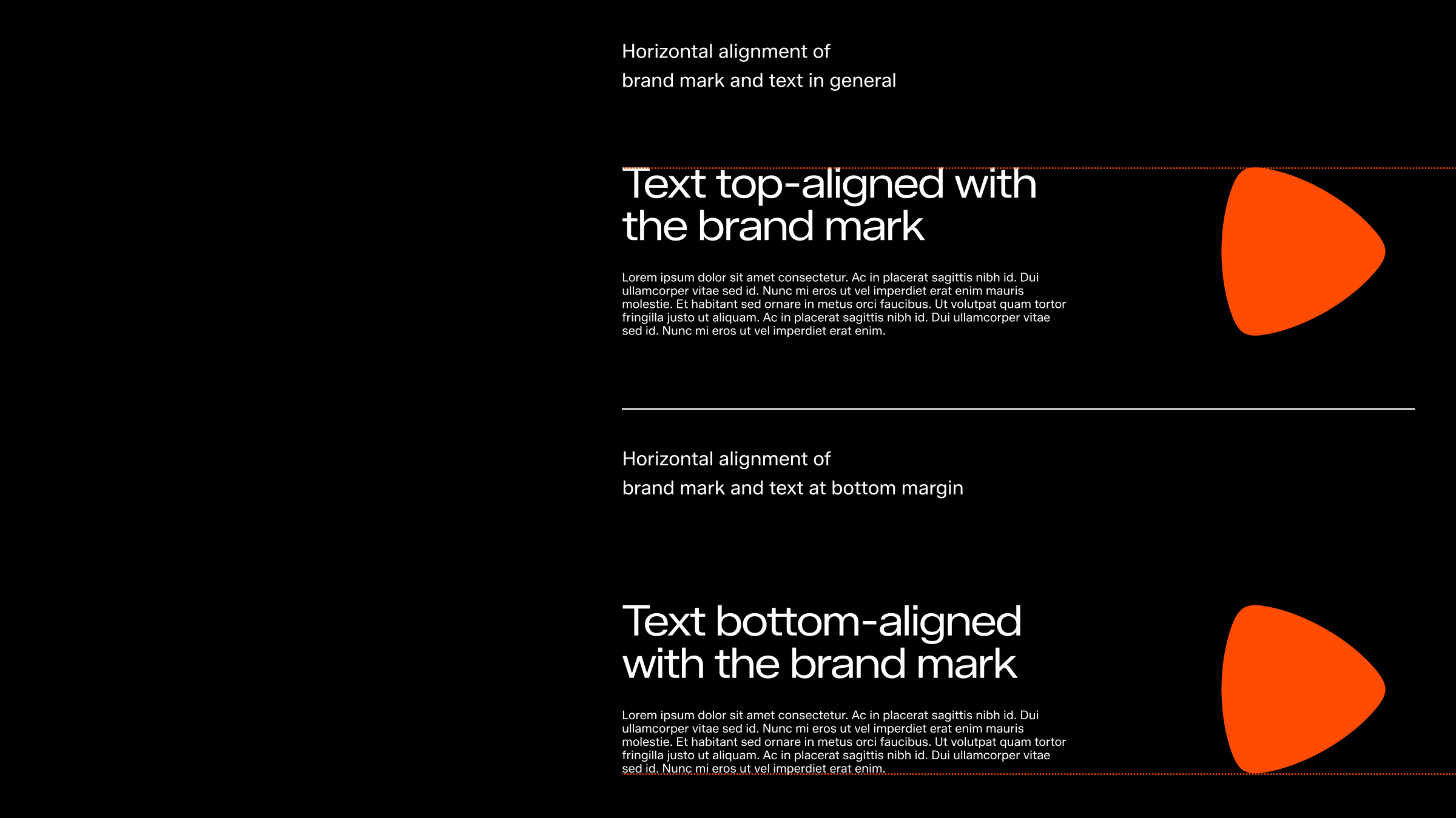
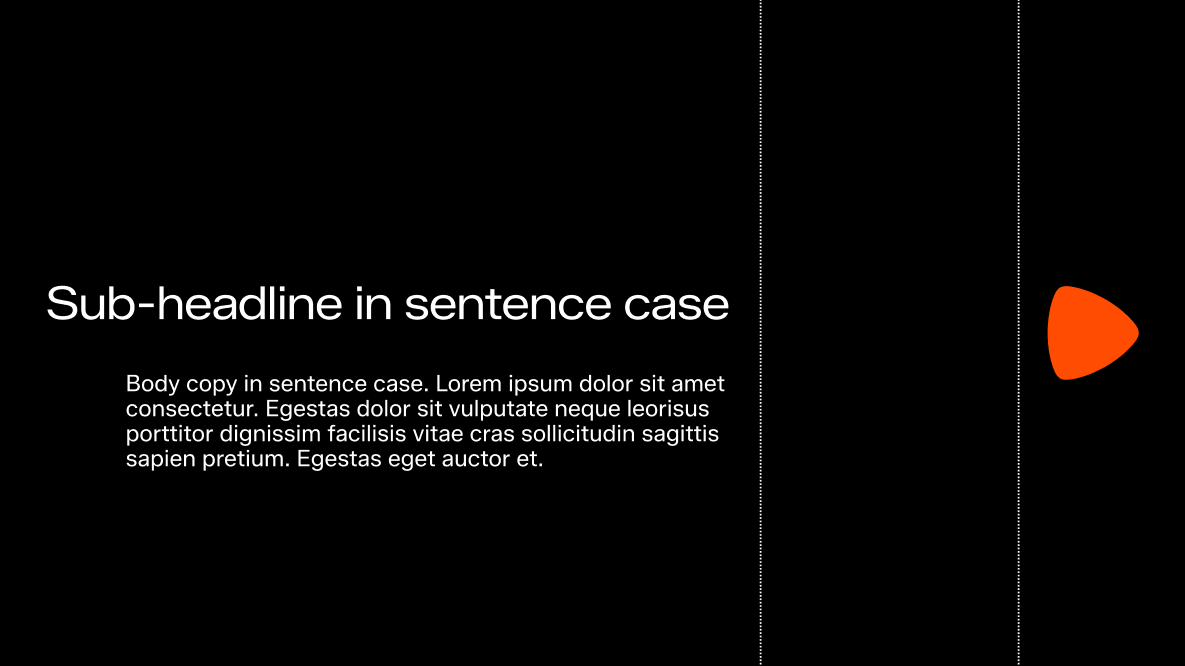
We align text with the edge of the brand mark and word mark. For balanced layouts, text can align with either the top or bottom of the word mark, depending on the composition’s placement.
For precise alignments, please refer to the examples below.
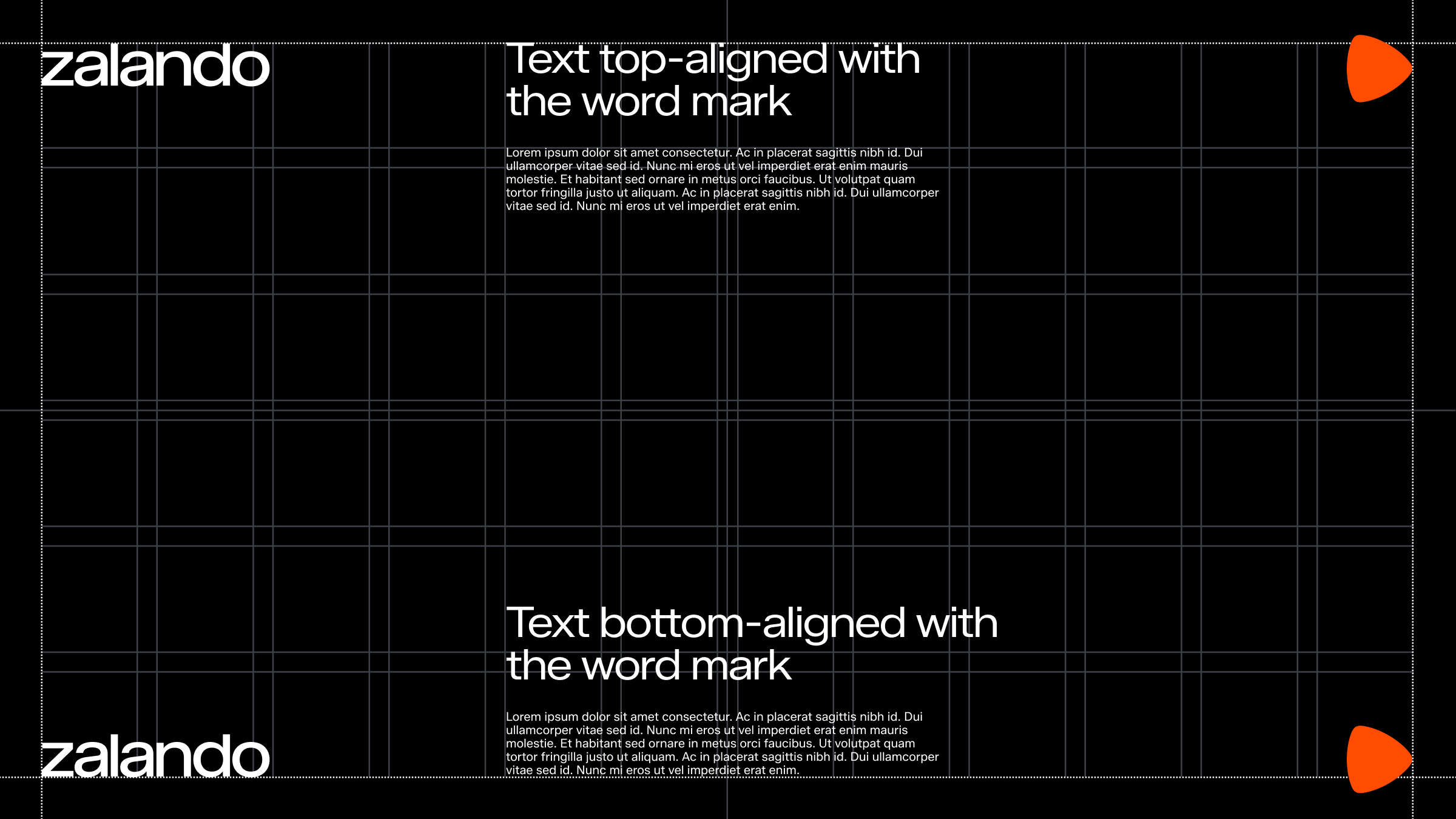
The example above shows an equal weight text alignment exception.
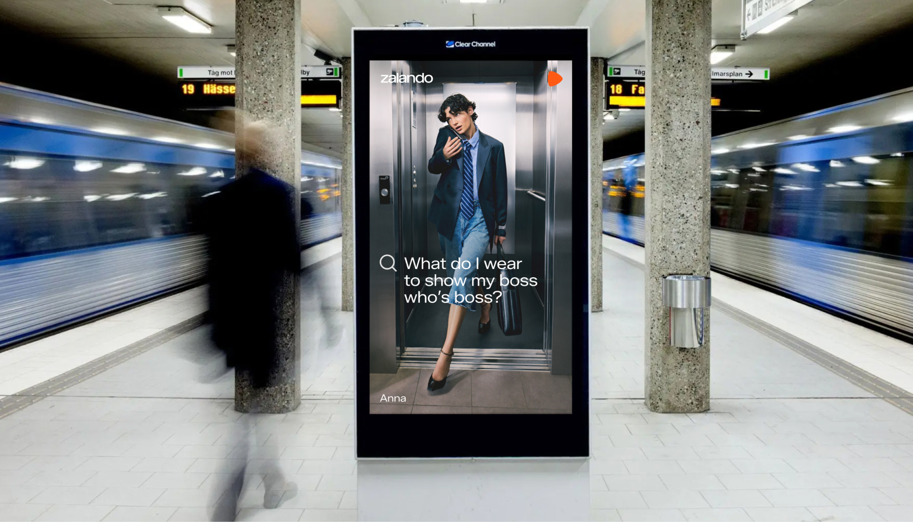
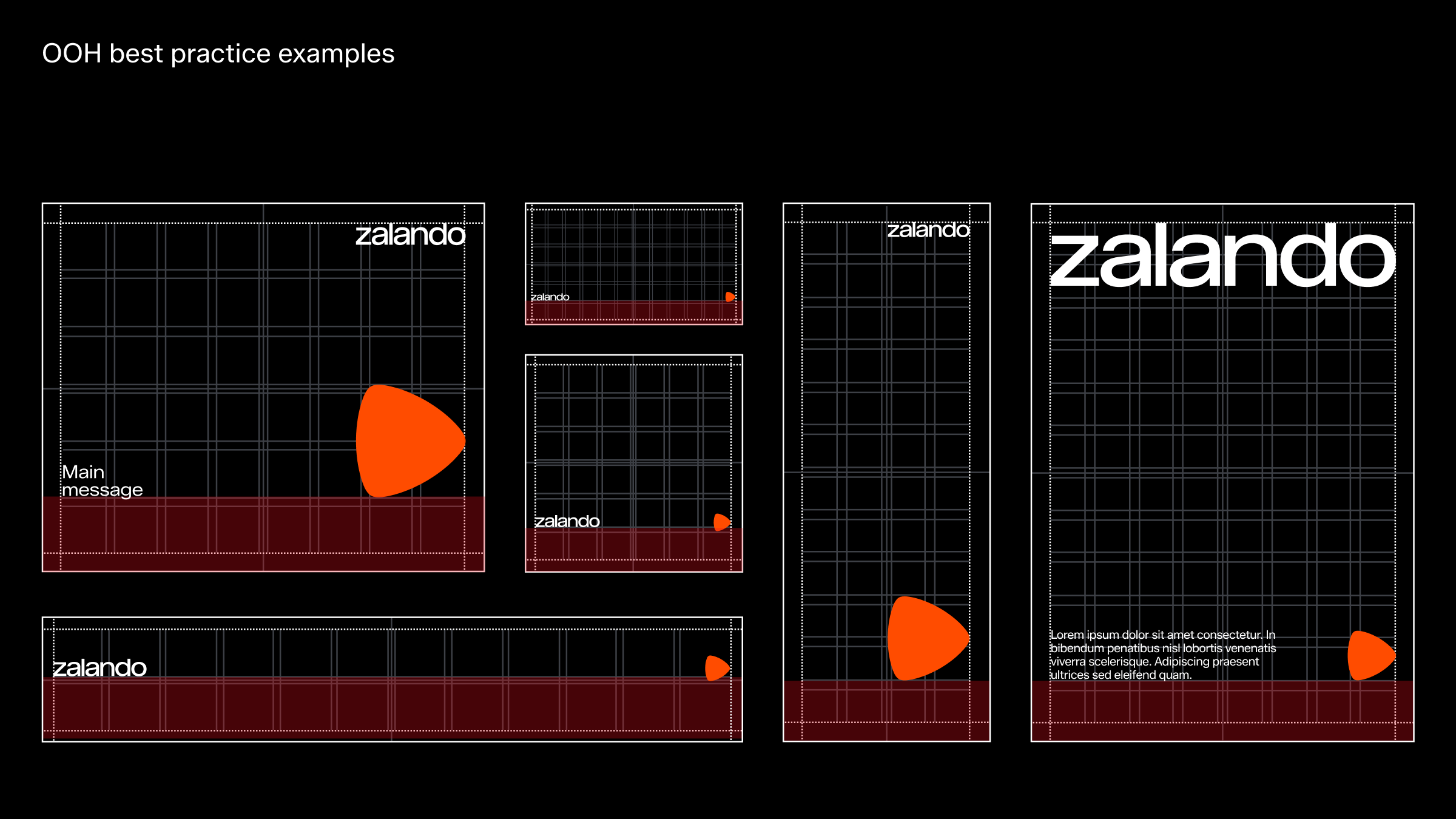
OOH best practices for legibility
Avoid putting content towards bottom margin when in OOH environments for legibility reasons.
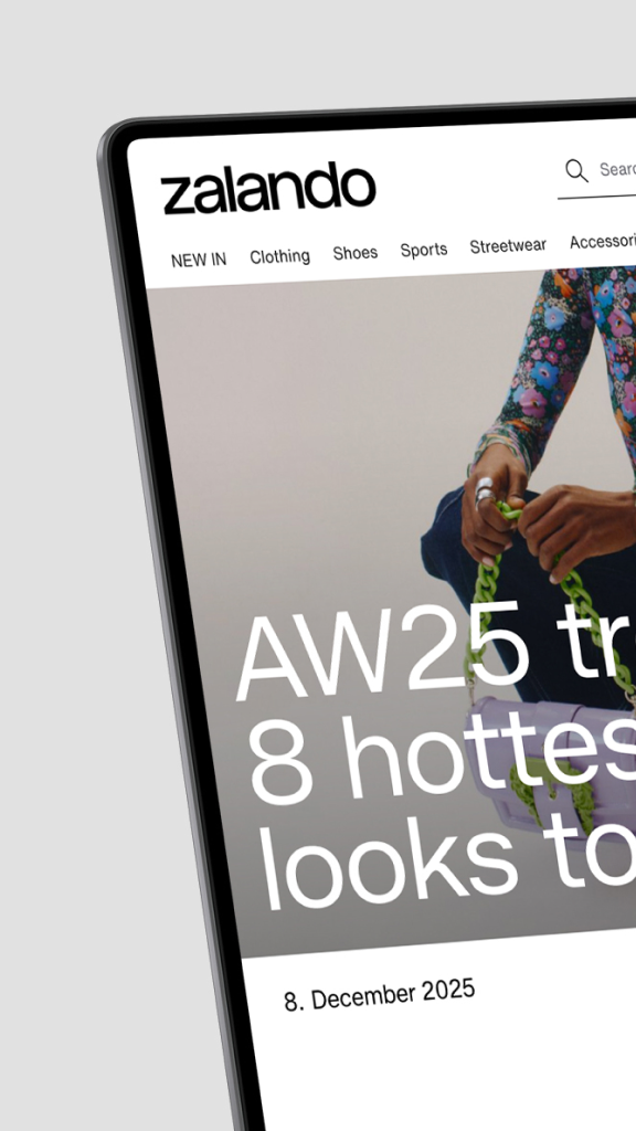
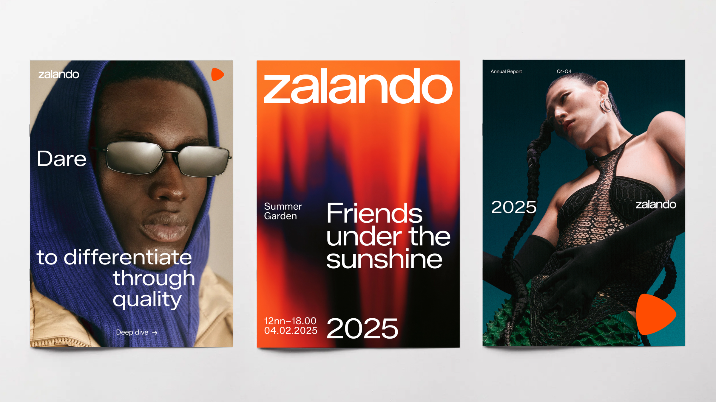
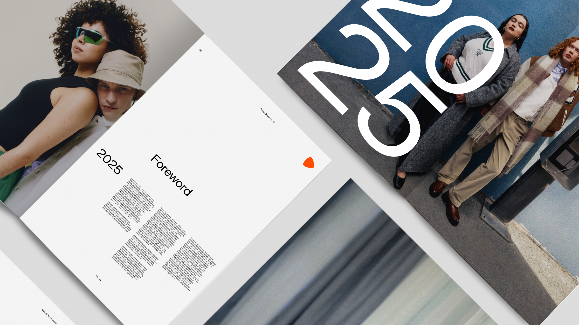
In use