Identity system
Flexible, yet purposeful
In the brand identity, layout is where flexibility meets purpose. We choose our layout expressions based on the specific needs of each application, fostering openness to diverse design solutions rather than sticking to one approach.
A well-designed layout ensures every communication piece is visually appealing and aligns with our brand. Legibility is crucial, ensuring layouts are adjusted for specific uses.
By balancing adaptability with intention, we create a cohesive and recognisable identity across all platforms. Thoughtful layout design builds a strong, enduring brand expression.
We embrace dynamics and avoid settling on a single design. There's no one-size-fits-all; instead, we allow three flexible expressions.
Purposeful layout
To know which expression is the right one for a layout is to understand the main purpose of it. The main purpose, if not clear enough, can be identified by understanding what is most important to communicate. It could be the visual (image), the main message (text) or even the format (print, digital, motion).
But it can also depend if the sender needs more focus (logo mechanics), or if the receiver (co-branding) should be taken more in consideration. Even the amount of production-time and budget opportunities (external/internal) can have more importance as a purpose.
The purpose can then help to dictate if the expressions should be more functional for clarity, or if it can carry a more expressive state for a different purpose.
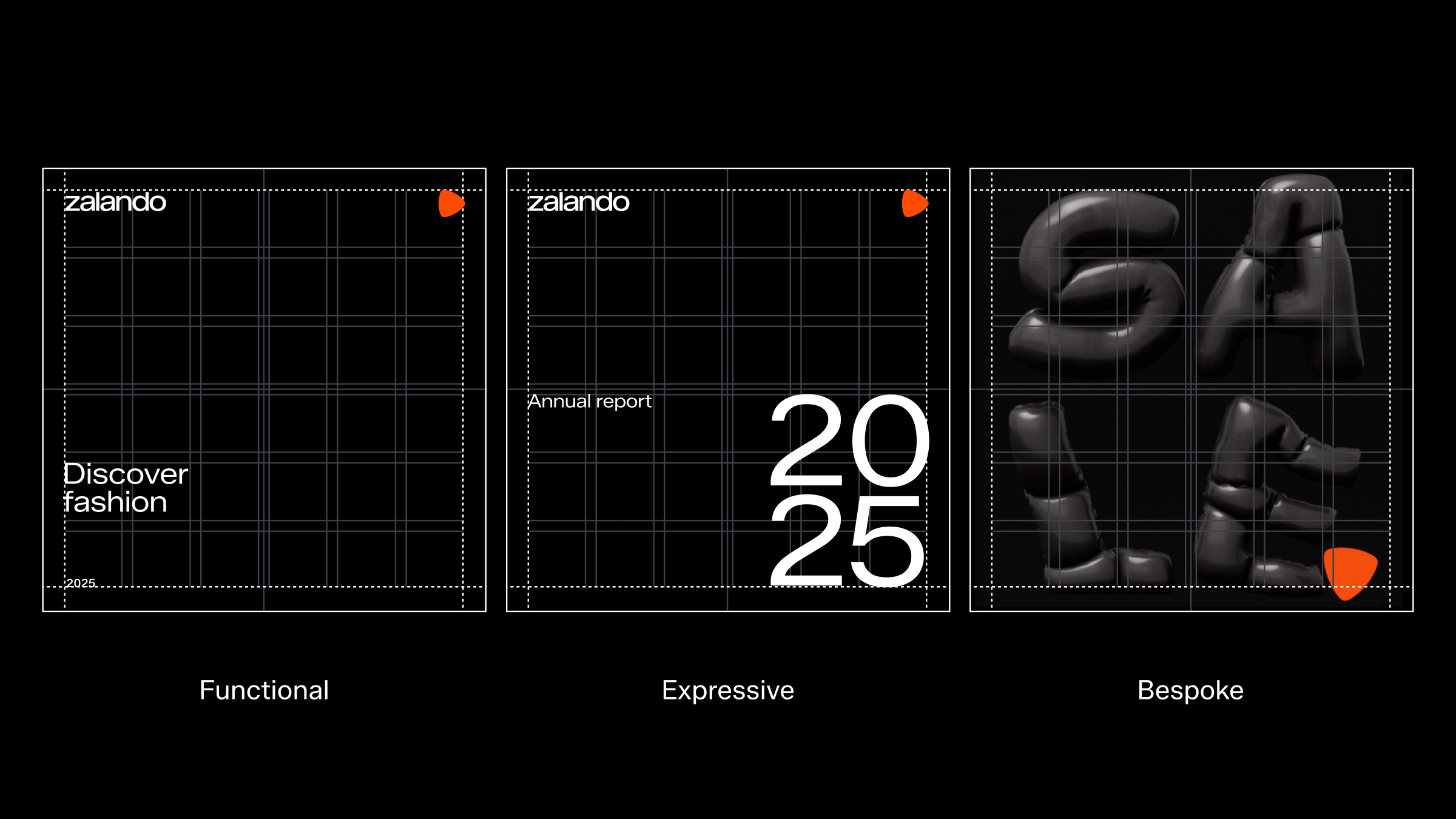
Our flexible system is all based on the same grid system which supports a range of layouts. From practical designs for everyday use to sophisticated layouts that highlight hero visuals, and expressive designs where typography takes center stage.
Layout principles
Our layout DNA can be distilled into four guiding principles that create a confident and bold “Zalando attitude.” By following these guiding principles as a starting point, we ensure every Zalando layout is both recognisable and consistently impactful.
1. Strive for contrast
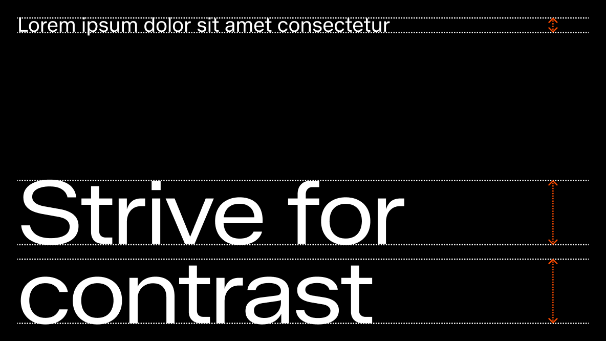
Work with strong contrasts between elements in our layouts, particularly in typography. By using fewer but more distinctive font sizes, we create a clear and striking hierarchy.
2. Snap to margin
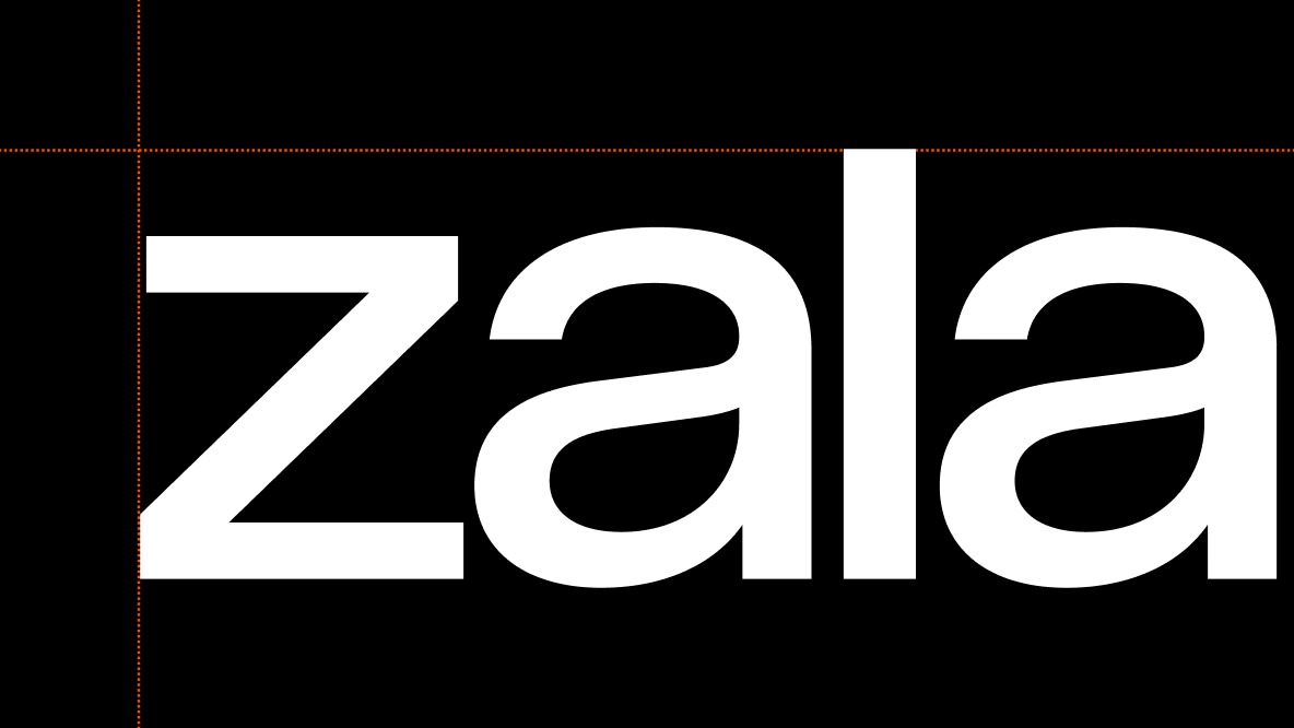
Extend elements to the very edges, leveraging the margins to infuse our layout with boldness and a sense of defiance.
3. Embrace space
We are not afraid of negative (empty) space. We embrace it to give our designs room to breathe and to celebrate our toolbox. Do not clutter layouts with too many elements.
4. Left align text
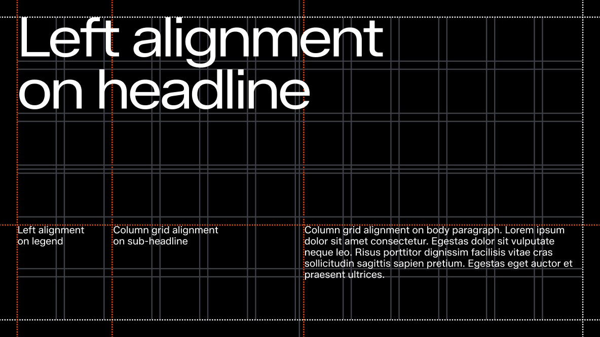
Left-aligned text ensures structure and enhances readability.
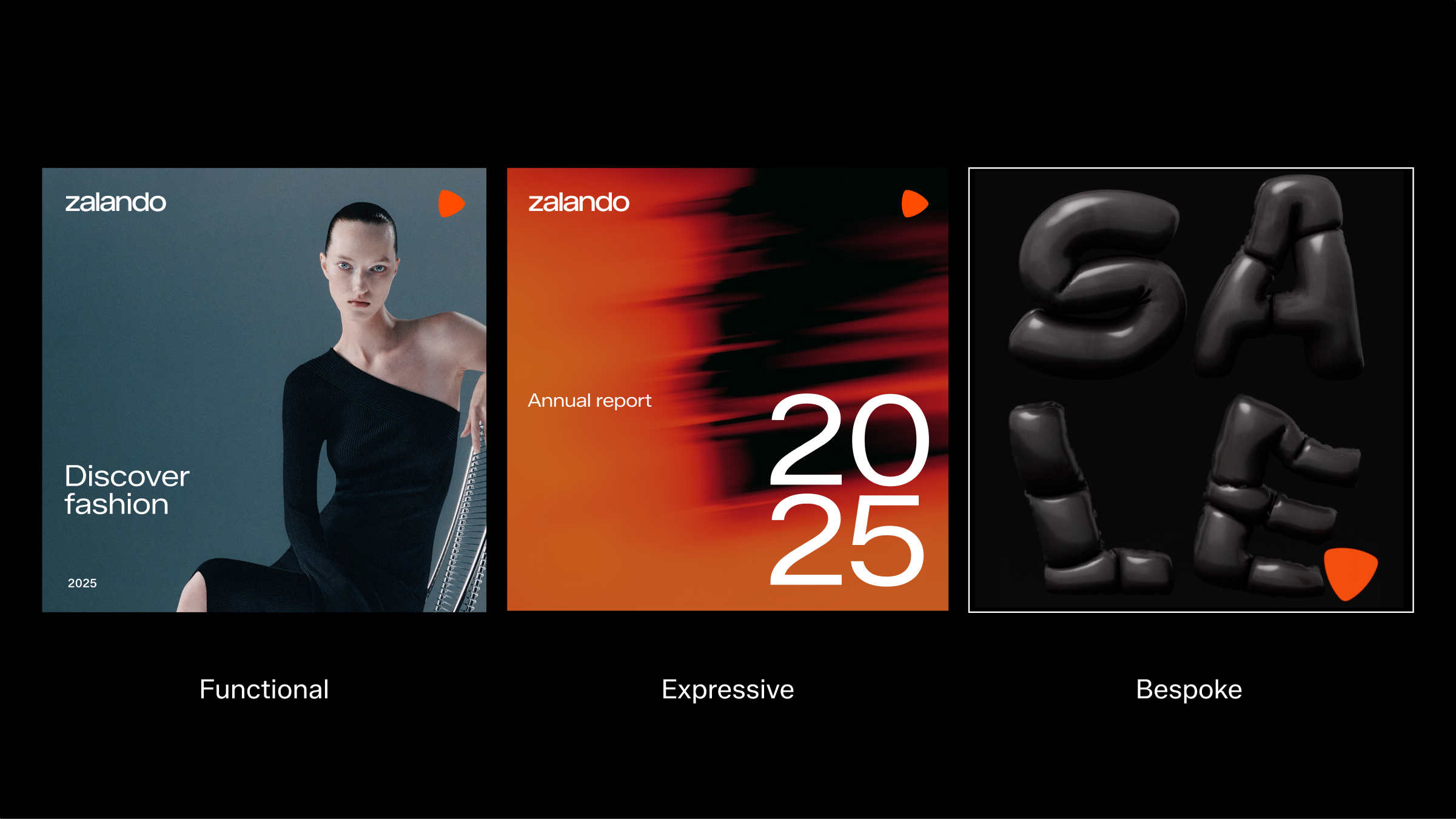
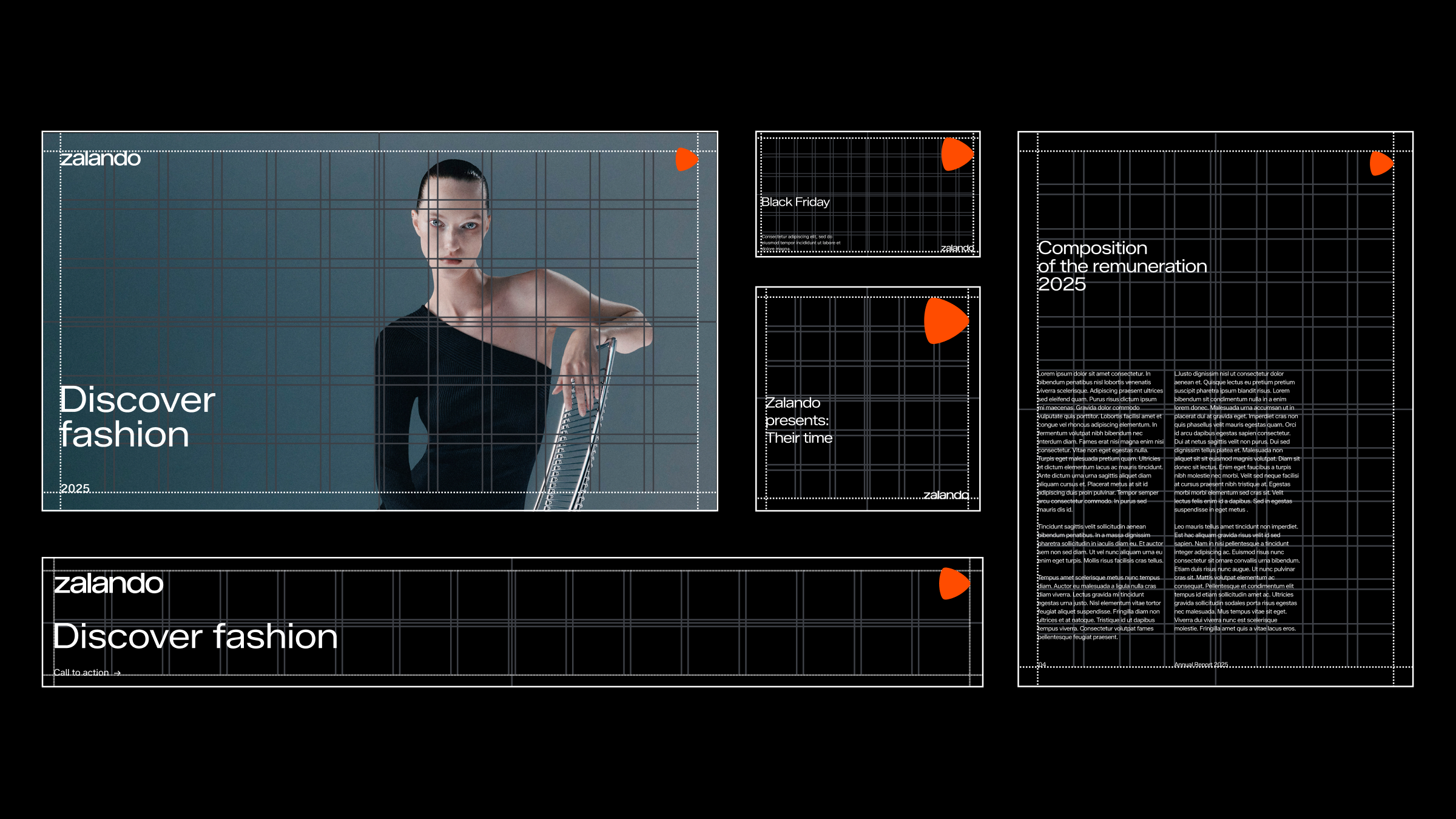
Functional
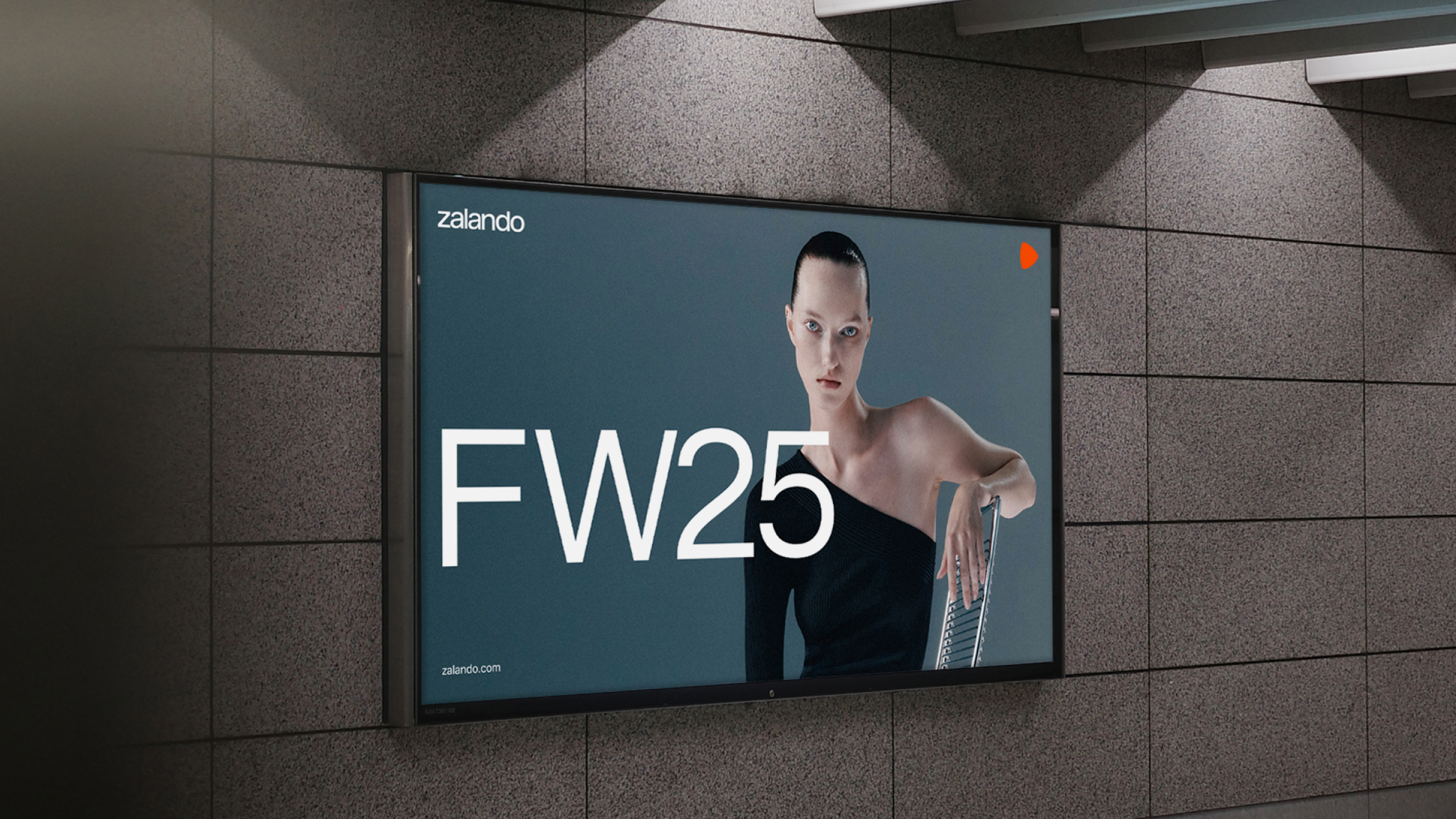
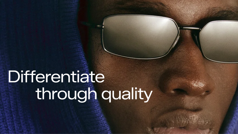
Our “functional” layout is the foundation of Zalando. It is a clear, practical and reliable expression that encapsulates our layout principles.
This is the most useful and reliable option, and should always be the starting point (or fallback option) for any solution. This layout focus more on letting the image to function as the main purpose.
Clarity is enhanced by using the grid’s outer margin, this is to let the image be in focus. Always left-align text and apply a clear text hierarchy to ensure simple, reliable layouts where information is easy to read and to leave room for key content to stand out. Never clutter with too much content or information, let the content breathe.
We need it for functional reasons, and functionality should always be followed. It is practically suitable for any on- or off market communication both for internal and external use.
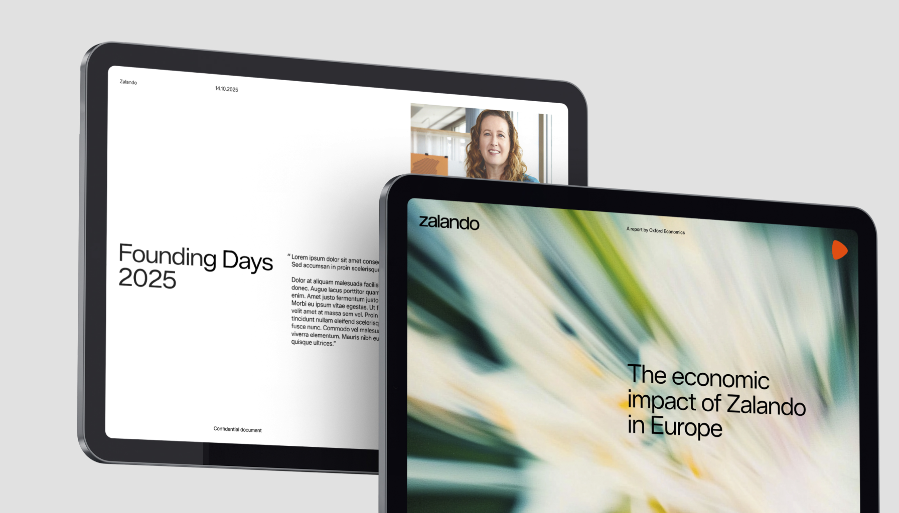
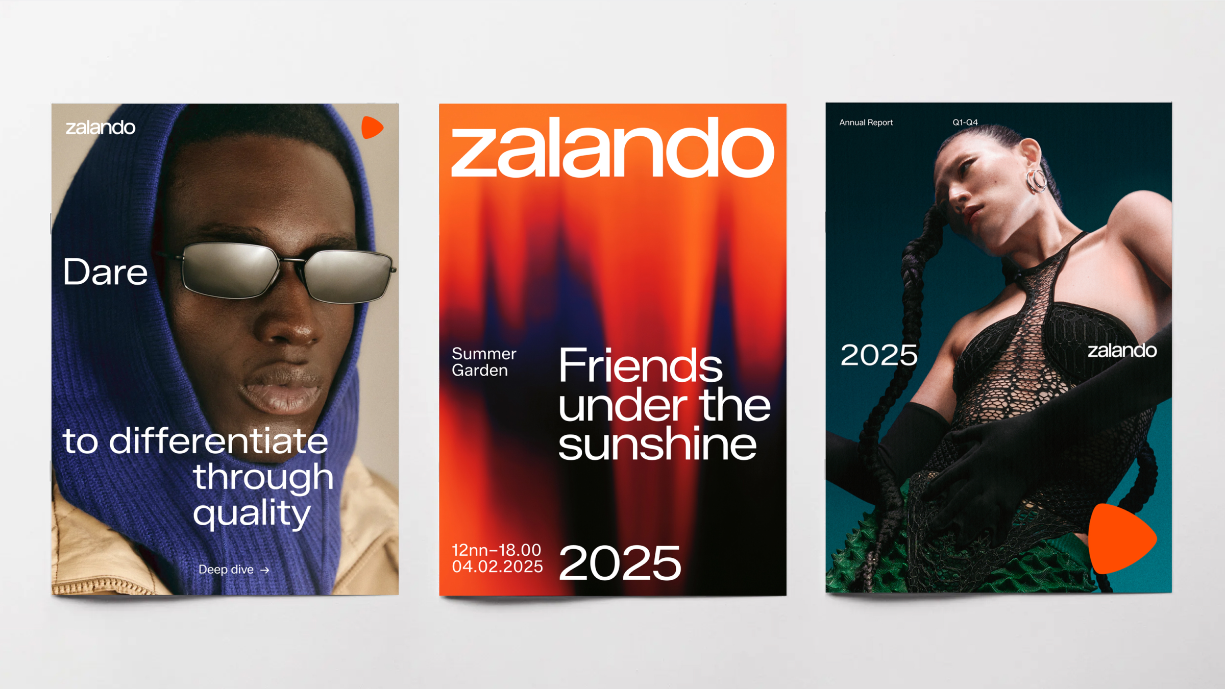
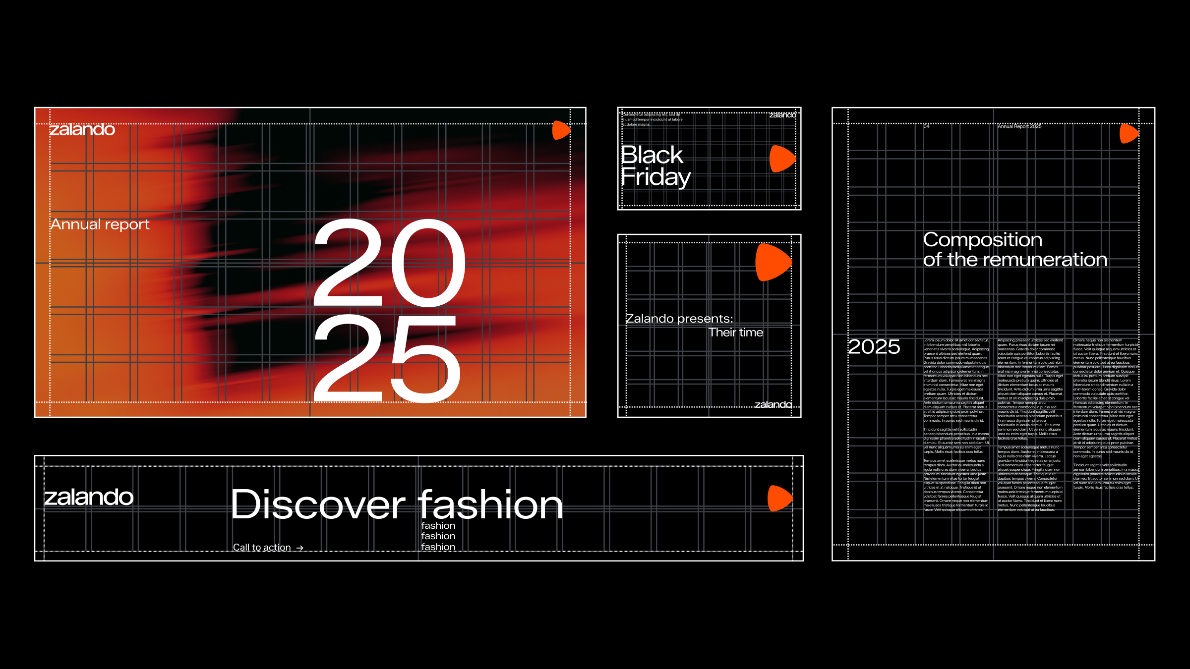
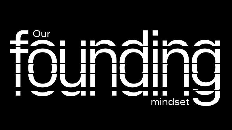
Expressive
Our "expressive" layouts embrace a more dynamic use of the grid, encouraging the creation of engaging designs with character, especially with typography as the focus.
The grid plays a more important role here, allowing for diverse element placements while maintaining grid alignment. This allows for control of the information while still creating engaging content. A bolder typographic size hierarchy or indented headlines add more expression, emphasizing messaging or storytelling.
Content and visuals can also be more creative when space or purpose allows. If key visuals are not available, you can create even more inspiring typographic expressions by elevating "text as graphics," though this requires a high level of skill. Image content can be enhanced or produced through stylistic treatments or by using generative imagery (see chapter "Visual assets").
These layouts are intended to be skilfully executed to engage the content or audience and should never be exaggerated for the sake of it. Expressive layouts should always complement, not compete with, hero images or key messages.
Expressive layouts also includes our layout principles in order to maintain brand recognition. And we still always left-align text and follow the logo mechanics (see chapter “Mechanics”).
Typographic indentation
Text as graphics

Stylistic treatments
Bespoke
For “bespoke” layouts, always consult with Zalando brand. These solutions relies on imagery or custom artworking where we don’t always have resources/budget. These are all highly custom and dependent on content.
It includes content that we do not have daily access to and must tailor for a specific situation. This can include, for example, photographic images, motion, custom typography, or illustrations.
These expressions are still heavily based on our grid system. The layout principles and logo system mechanics applies when necessary to maintain brand recognition.
In use