Secondary colours
Functional palette
The secondary palette includes more supportive and functional colours. The greyscale is mainly used as the backbone for UI elements (such as frames, lines and backgrounds), for both light and dark mode. The muted red is for deal, while the vibrant red is limited to system feedback colour alongside black.

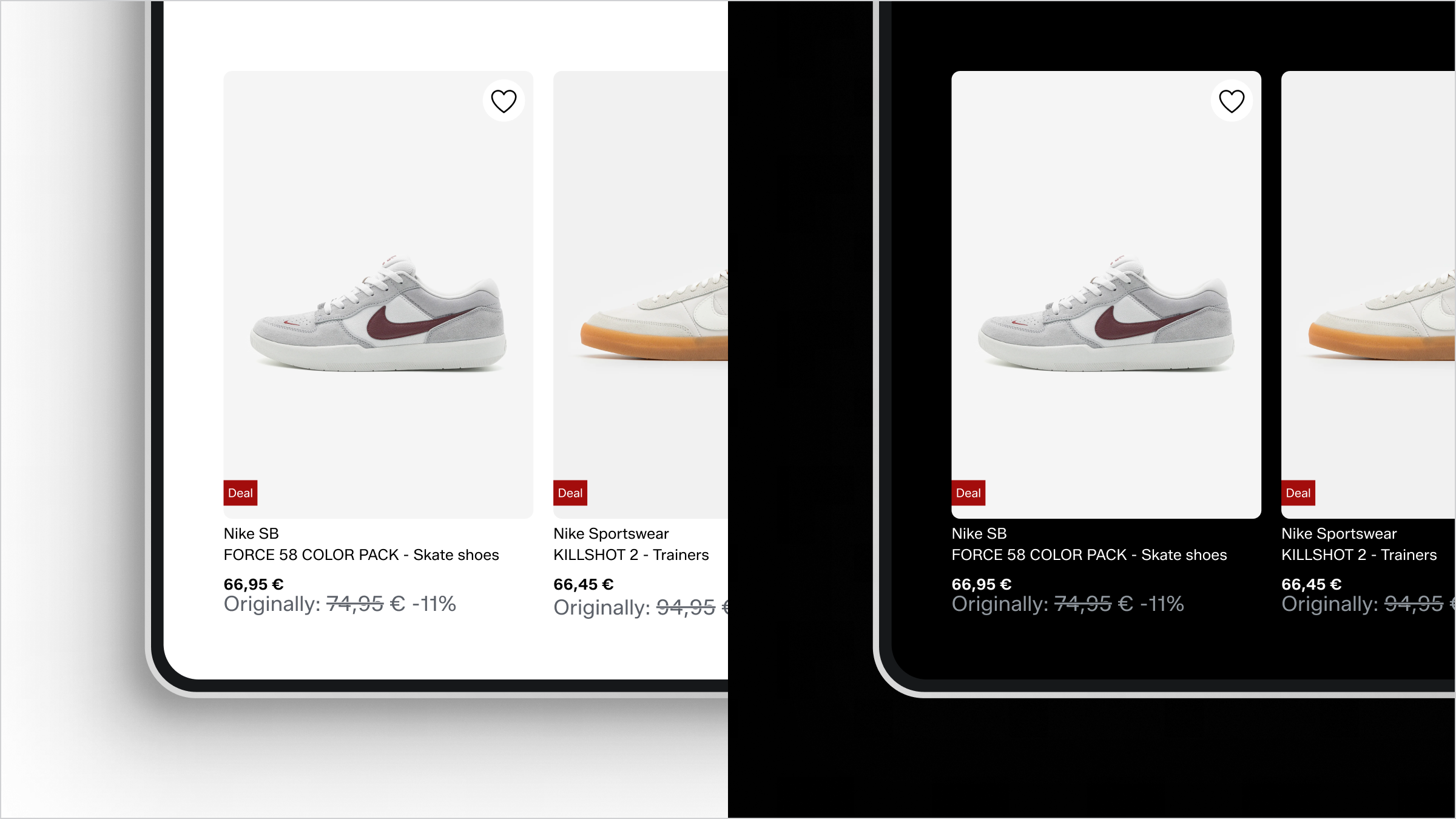
Deal red
Deals and offers use the same red colour. The muted tone never conflicts with the vibrancy of our hero orange.

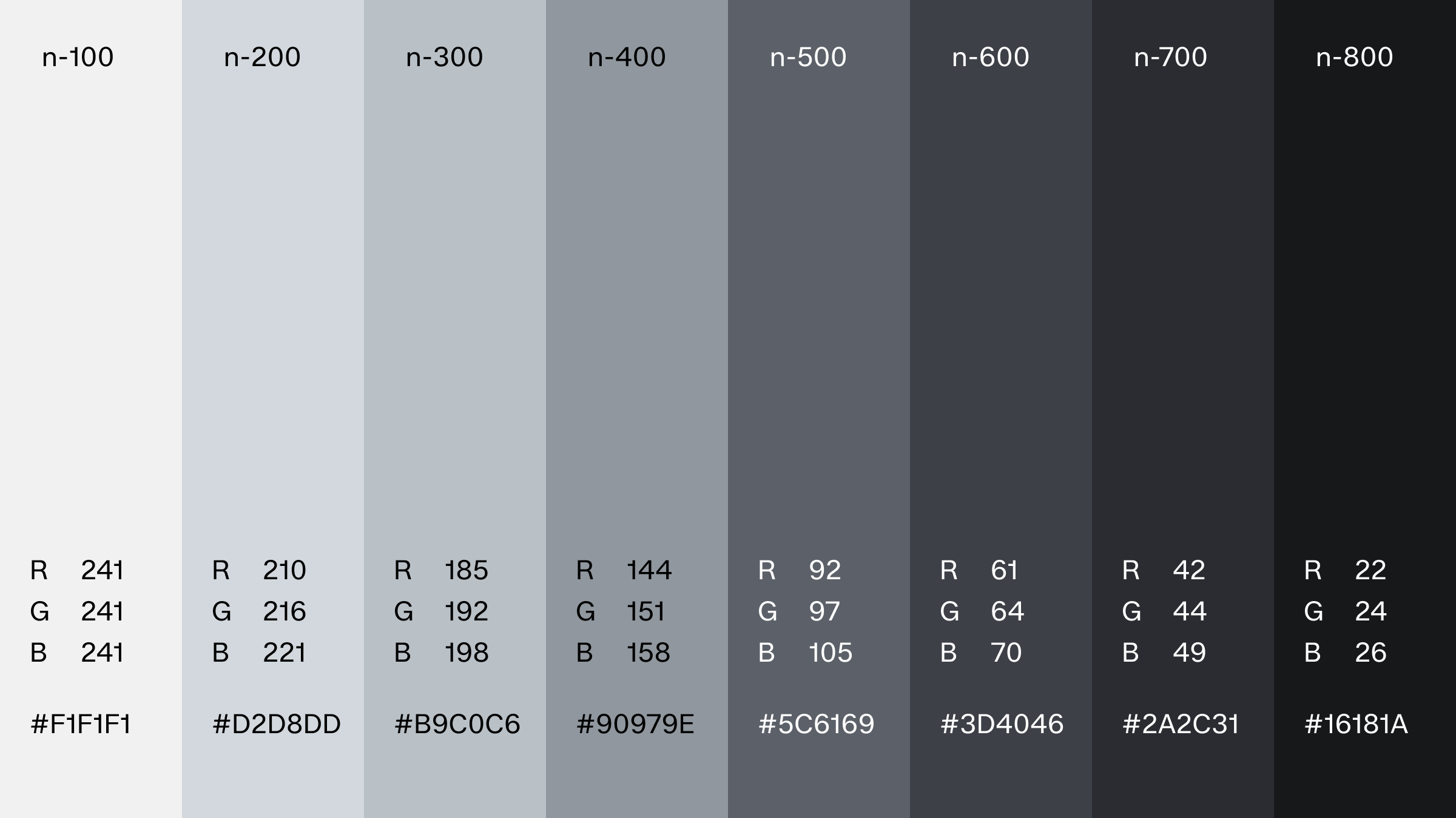
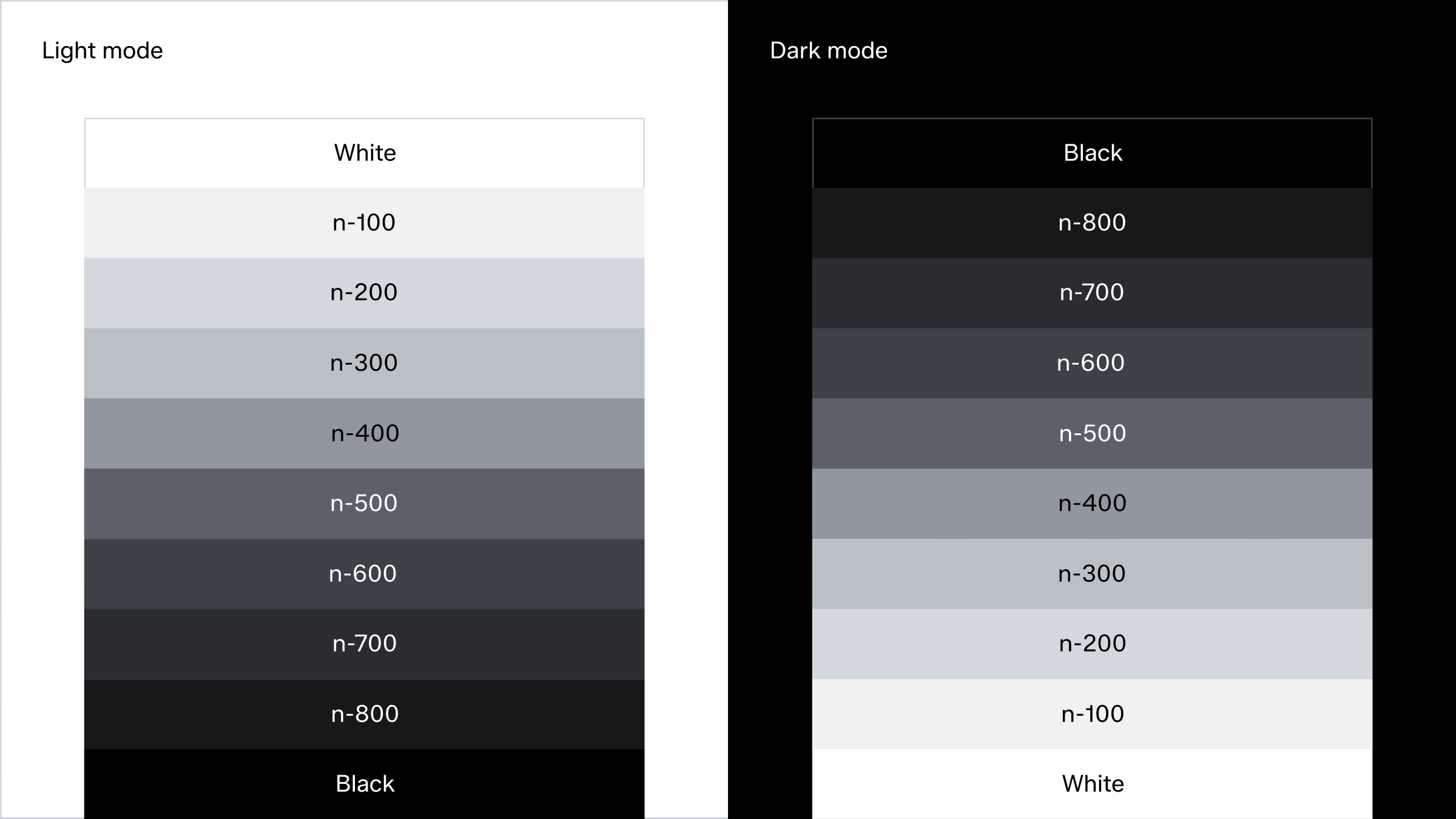
Neutral palette
The neutral palette is a great tool when developing UI-elements, alternative text and as supporting background shades to elevate product or images. Each step is equally balanced and can be used for both light and dark mode. The same grayscale works effectively in both light and dark modes by reversing the sequence.
Text in colour
Grey typography is an available option within the product, used to establish a content hierarchy or serve functional purposes, such as indicating inactive states.

Black and grey on white (Reserved for sale purposes)

Grey on white (Reserved for UI elements in light mode)

Grey on black (Reserved for UI elements in dark mode)
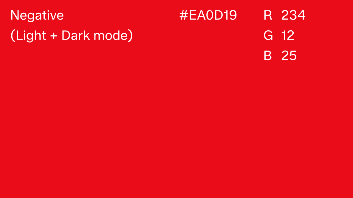
System feedback colours
The system feedback colour red is only to be used for error and warning state. It has a deliberately different red tone to have enough contrast from the red deal scale. Success, information and interactive states use black (or white) from the grey scale.
Error and warning state
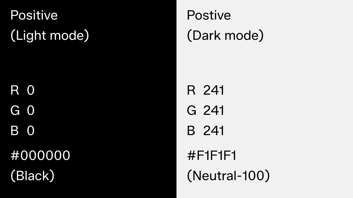
Success, information and interactive state
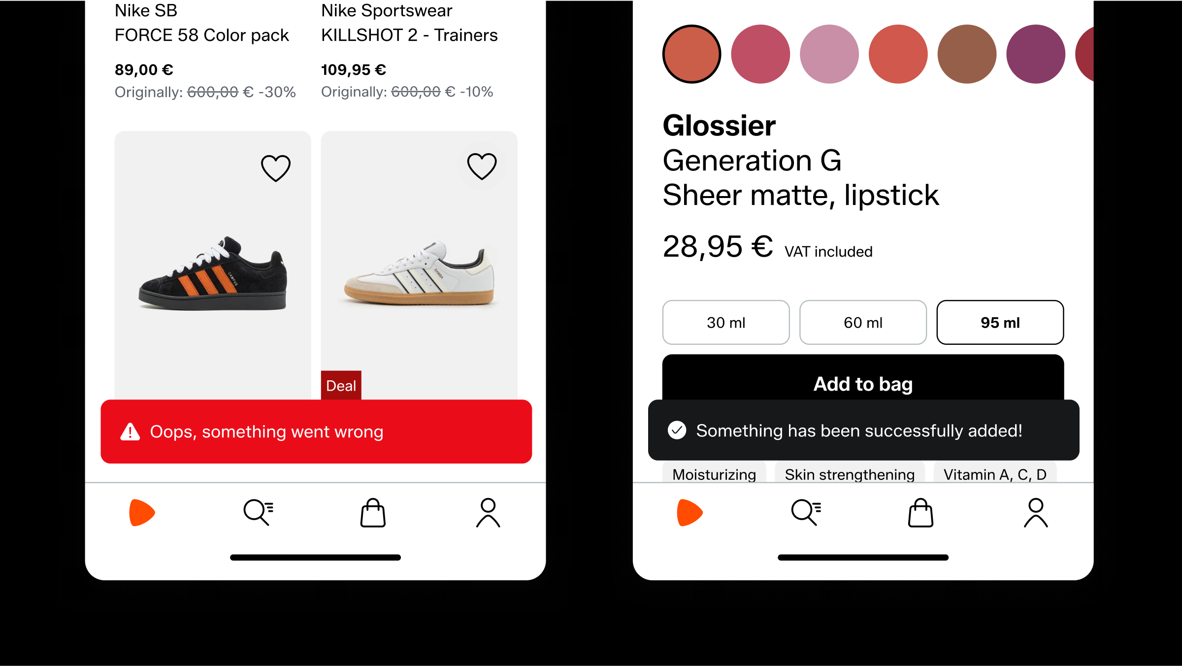
Examples on light mode
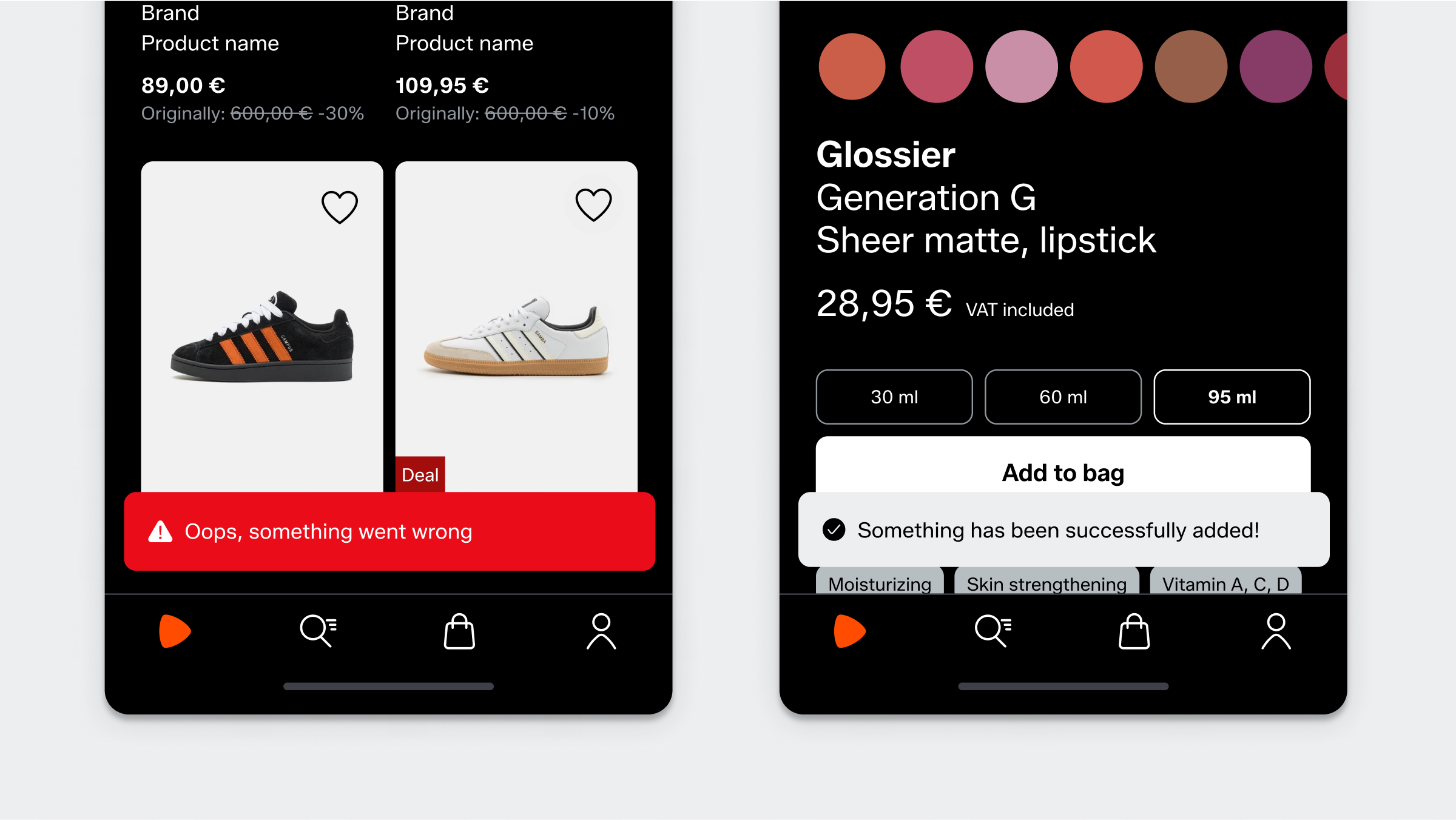
Examples on dark mode
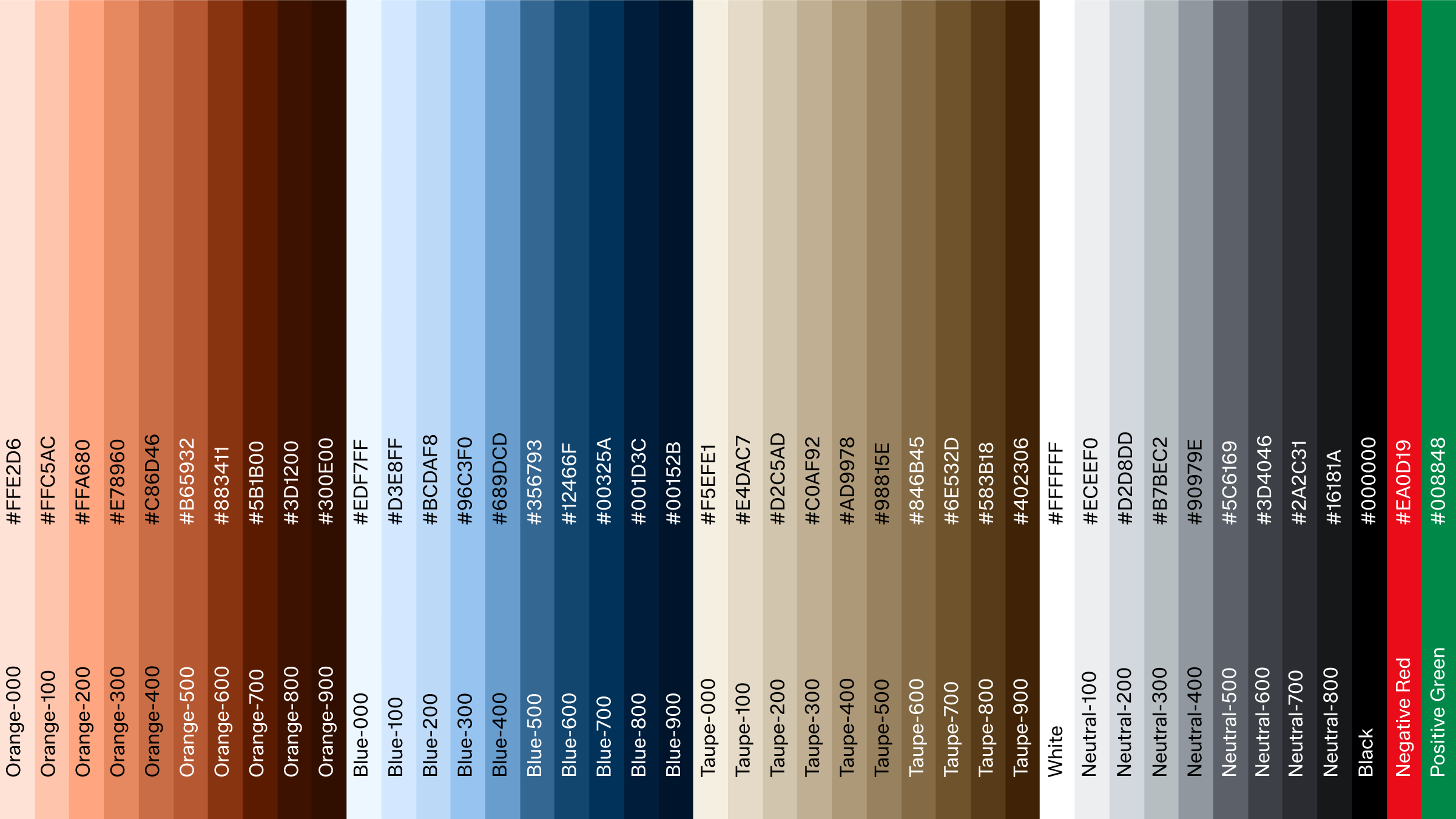
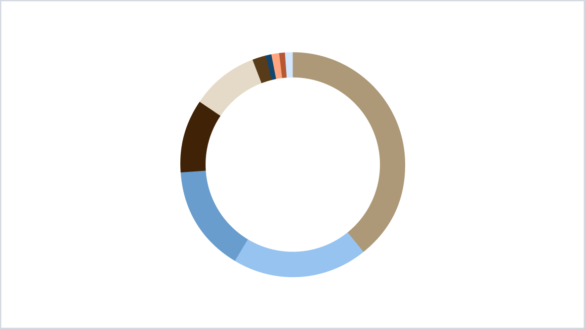
Extended palette
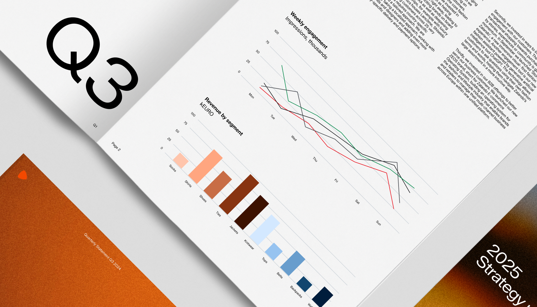
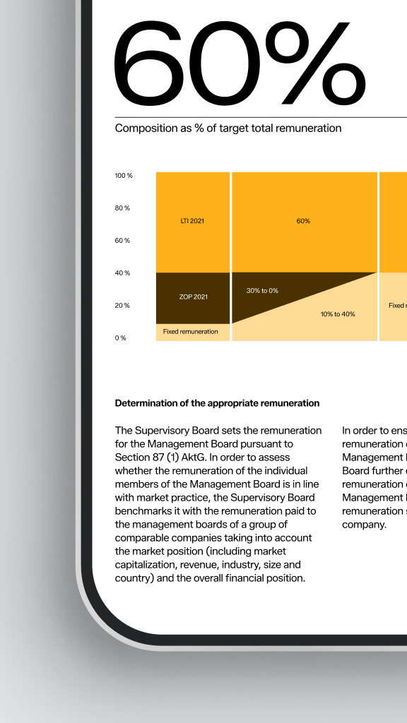
Our extended palette is primarily reserved for data visualizations (through graphs and charts) for internal and external use.
The extended palette is not allowed to be used outside of data visualisations. For any questions regarding usage, please contact the Brand Design Team.
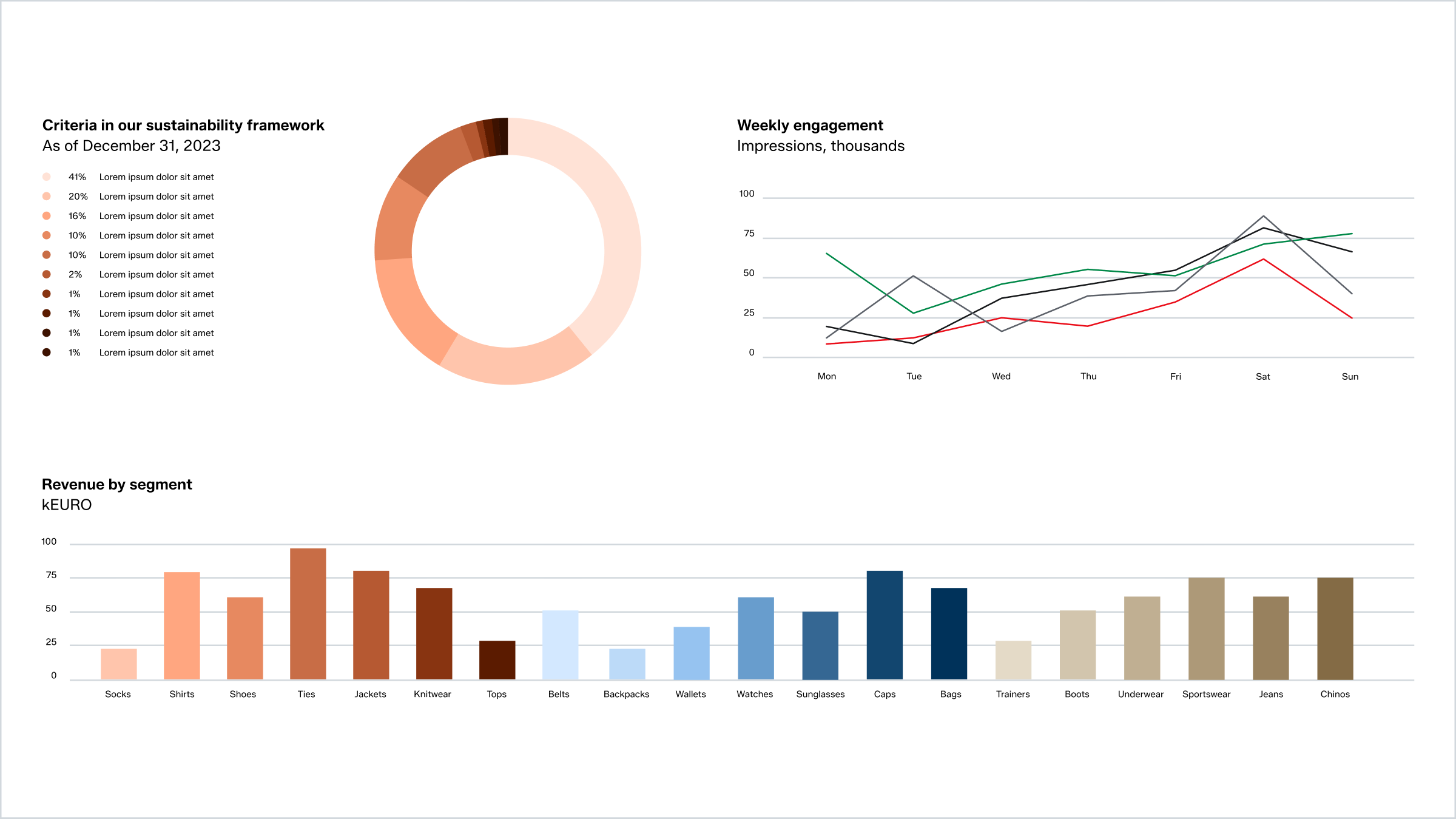
Usage
This data visualization palette is designed to clearly differentiate results in graphs and charts. The various shades help identify distinct measuring points and are adaptable for both light and dark modes.
Primarily, we use each color spectrum separately. Each step gives enough contrast to work together. But for fewer values – use more steps in-between (see examples below). For multiple values, different color spectrum can be combined with equal amount of shades.
Don’t mix this extended palette with the primary or secondary colors to create unique combinations.
Examples of colour usage in graphs
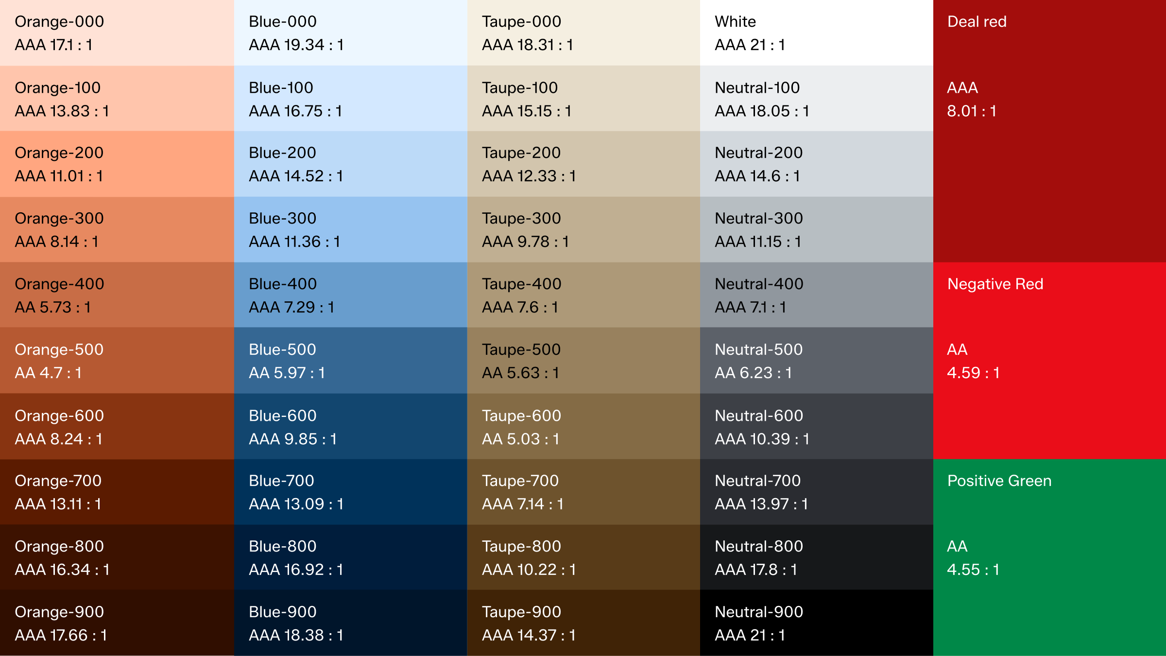
Accessibility
These are the contrast ratios for our primary palette, based on the Web Content Accessibility Guidelines (WCAG).
In use