Primary colours
Core palette
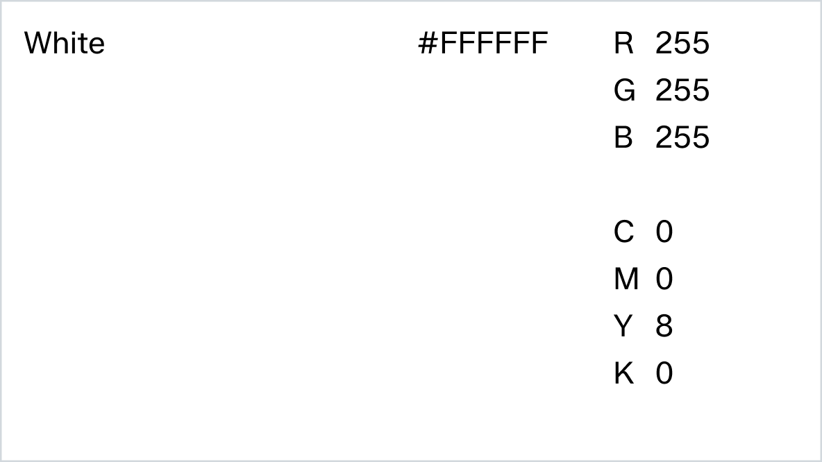
Our primary colour palette is central to Zalando's identity. White serves as our core base, while black is used for engaging content, such as marketing applications. The vibrant orange, a nod to our heritage, remains key for capturing attention and reinforcing brand recognition. Each colour is thoughtfully chosen to serve a distinct purpose in our brand identity.

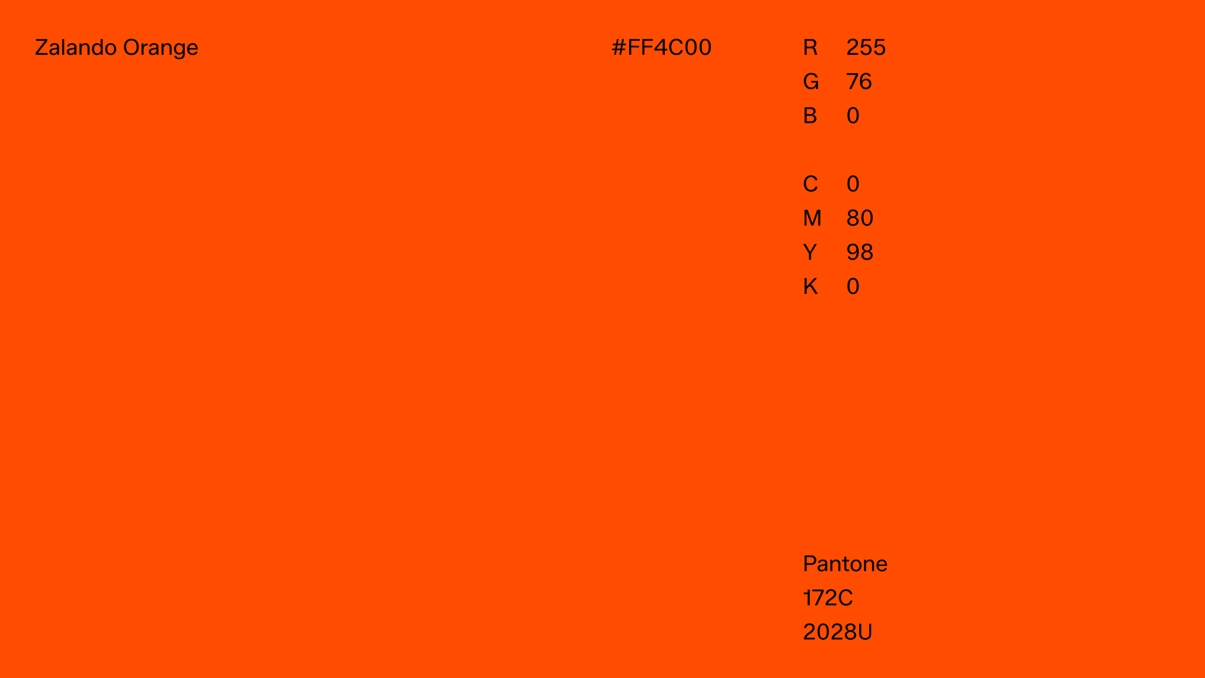
Zalando orange
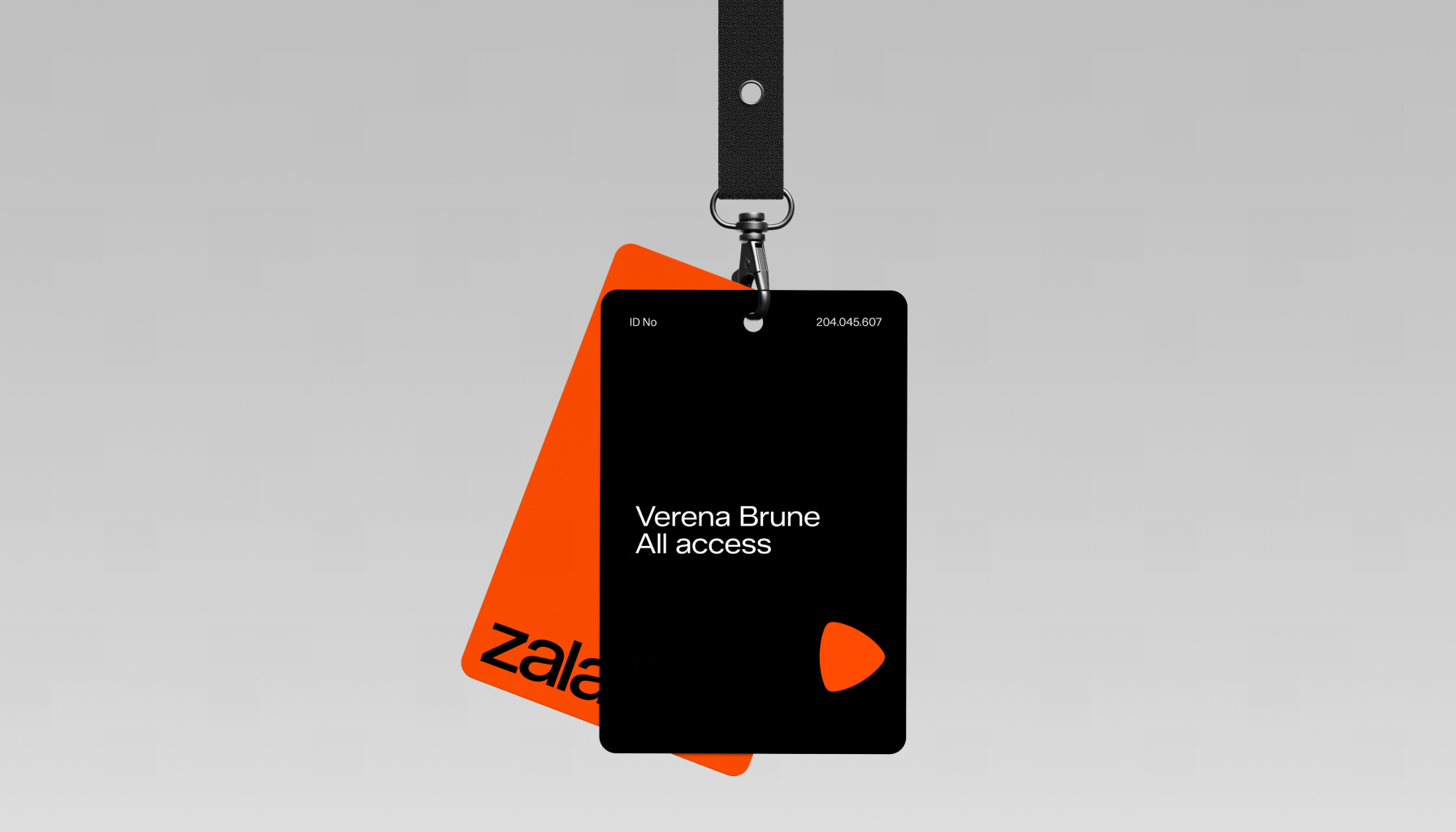
Zalando orange is one of our hero colours, deeply connected to our brand and heritage, and has been a core element since the very beginning. This colour carries energy and vibrancy, embodying the spirit of Zalando.
Please note that colour variances may occur due to differences in print stock. We recommend a print test for any new materials, in particular uncoated paper stock.
Black and white
Black and white are the foundational colours of the Zalando brand, creating a neutral backdrop that allows our brand elements to stand out. They are also essential for typography, ensuring that colored text is never used while maintaining flexibility for readability across diverse backgrounds.

Colour hierarchy
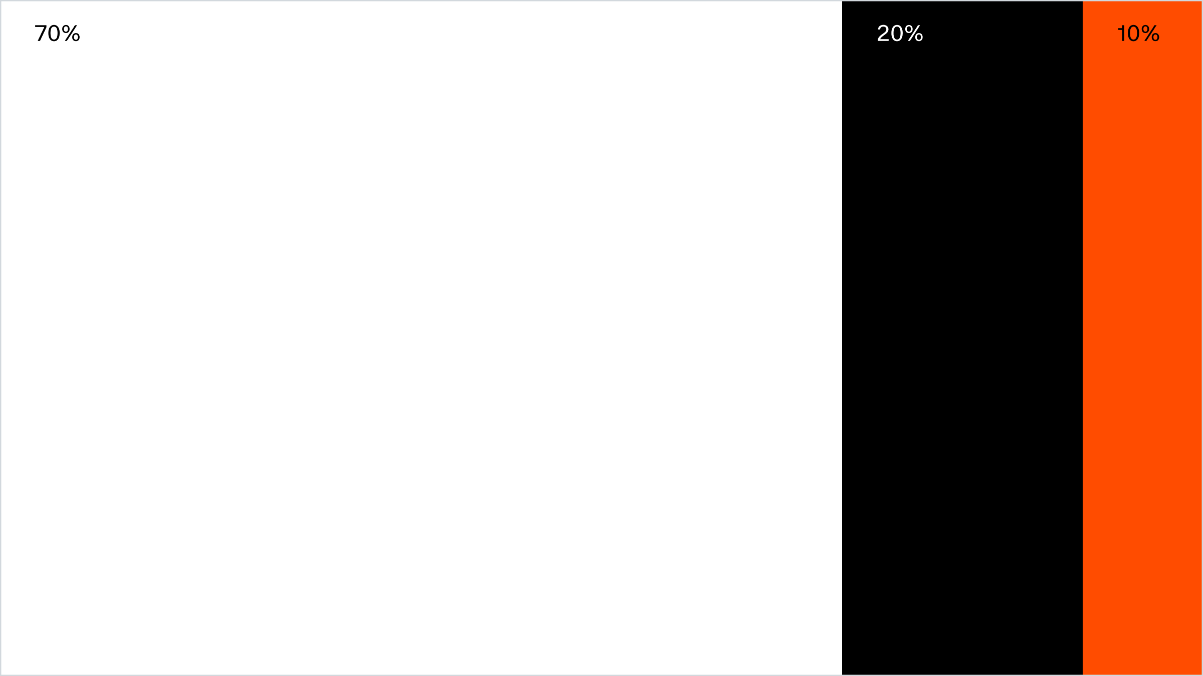
When balancing colour usage, our external strategy focuses on a dominant use of white and black, positioning our brands or content at the forefront while Zalando acts as the gallery backdrop. Orange serves as an accent, drawing attention and functioning as a proof stamp.
Internally, however, the colour palette hierarchy can be more versatile, offering greater flexibility and creative freedom in its application across various scenarios.
Brand mark colour version
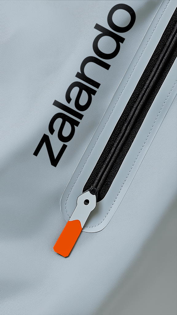
The Zalando brand mark should always be used in Zalando orange, regardless of background or motif. It must be applied consistently and should never be altered, stretched, or modified in any way.
When the brand mark in Zalando orange is restricted due to technical limitations, such as printing issues, use the word mark in black or white instead.


Contrast
To ensure the integrity and visibility of our brand mark, it is crucial that it always maintains sufficient contrast against its background. Whether it is displayed on digital screens, printed materials or physical products, it should stand out distinctly, ensuring that its shape remains clear and well-defined at all times. Proper contrast not only enhances the aesthetic appeal but also reinforces brand recognition and consistency, making our mark instantly recognizable and memorable to our audiences.

High contrast on dark background

High contrast on light background
Word mark colour
Our word mark “zalando” is available in black and white version. It can be placed on top of Zalando orange, black and white solid colour background. It can also be put on images if the contrast is hight enough. It is never set in Zalando orange or any other colour than stated above.

White on black

Black on white

Black on Zalando Orange
Typography colour
Text is only set in black or white. Text readability is the most important aspect, so background colour or image need have a high enough contrast for good legibility. For smaller text details, a grey tone can be used. Text should never be set in Zalando orange.

White on black

Black on white

Black on Zalando Orange
White on image

Black on image
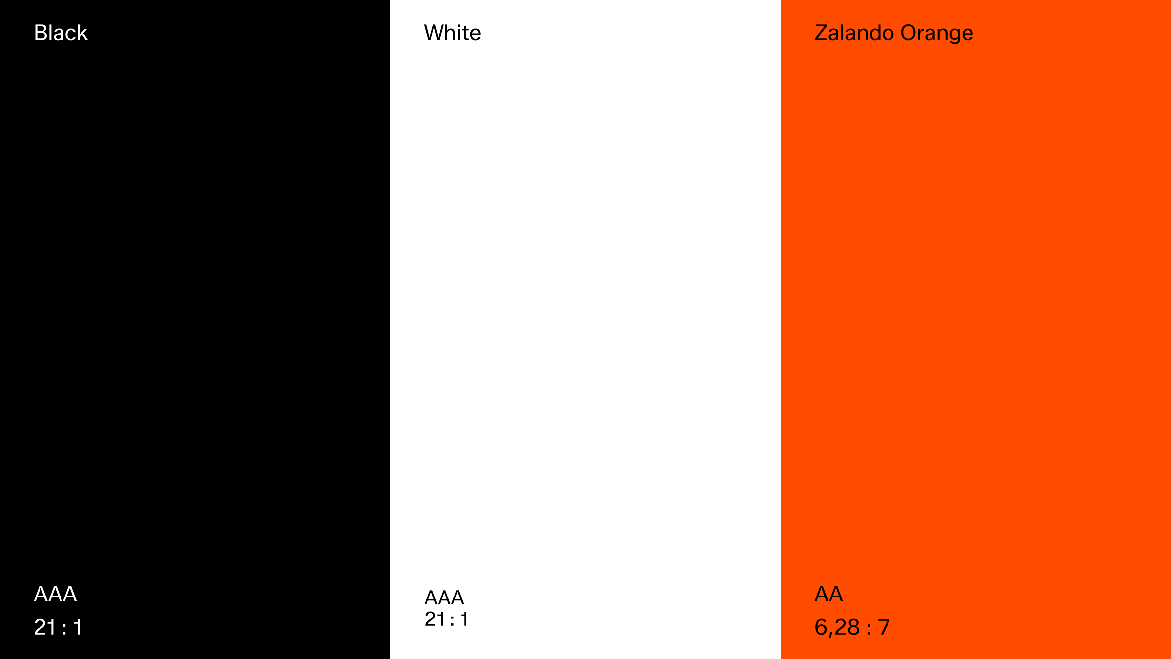
Accessibility
These are the recommended WCAG (Web Content Accessibility Guidelines) standard combinations for our primary colours.
Colour misuse
Do not diminish the value of our identity. Avoid the following treatments.


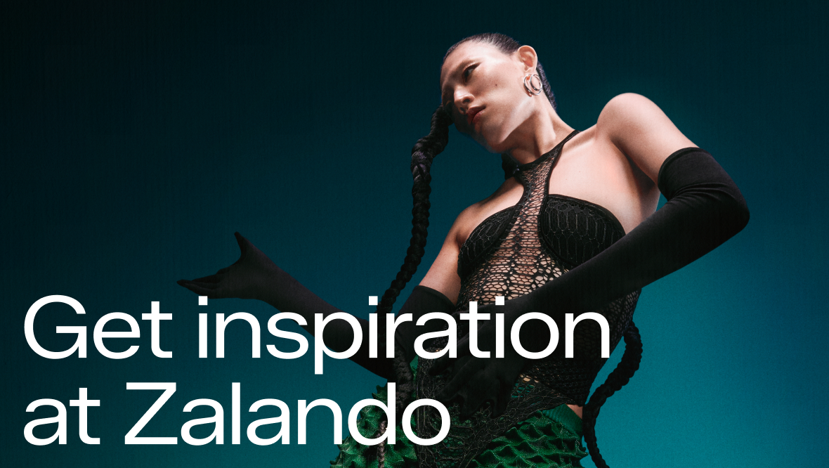
In use